
Benjamin Moore Under (1675) is a rich, mysterious shade that evokes a sense of calm sophistication. This deep, muted blue-green hue blends elements of the natural world with understated elegance, making it a versatile choice for both modern and traditional interiors. With its moody depth and captivating charm, Under (1675) creates a grounded yet luxurious atmosphere that works beautifully in a wide range of spaces.
Under (1675) boasts an intriguing blend of undertones that add complexity and depth to its appearance. The primary base is a dark blue, softened by green undertones that impart a tranquil, earthy quality. Hints of gray weave through the color, tempering its vibrancy and lending it a muted, smoky finish. This balance of blue, green, and gray undertones creates a color that feels both dramatic and soothing, perfect for creating intimate environments.
Benjamin Moore Under (1675) pairs beautifully with a range of complementary and contrasting colors, allowing for endless design possibilities.
Under (1675) is a versatile color that can be used to create impactful spaces, whether as a statement wall or an all-encompassing hue. Its rich and moody nature lends itself to a variety of design styles, from sophisticated and traditional to modern and edgy.
Create a cozy, luxurious retreat by using Under (1675) on walls in living rooms. Pair it with plush cream furniture, metallic accents, and subdued lighting to bring out its elegant undertones.
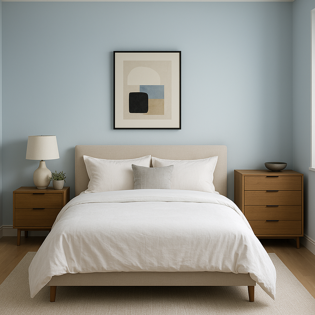
Under (1675) is perfect for bedrooms, where its calming qualities promote relaxation. Contrast it with soft white bedding and natural wood tones for a serene, hotel-like atmosphere.
For formal dining rooms, Under (1675) adds drama and refinement. Pair it with rich wood finishes, crystal chandeliers, and gold accents for a glamorous look.
Transform bathrooms into spa-like sanctuaries by using Under (1675) on walls or cabinetry. Complement the color with marble countertops, brushed nickel fixtures, and crisp white towels.
If you're looking for a way to introduce Under (1675) without overwhelming the space, consider using it for an accent wall. This works particularly well in offices, entryways, or behind a statement piece of furniture.
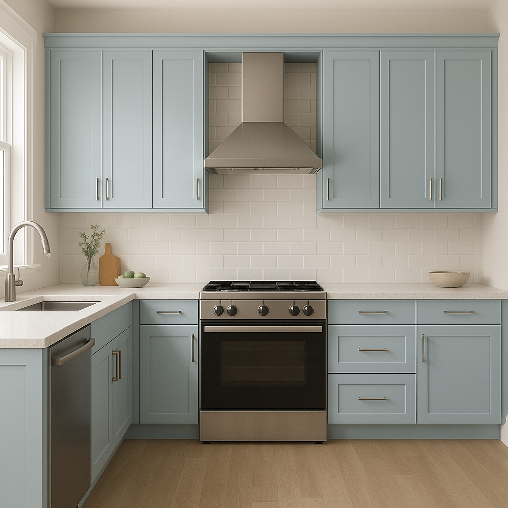
Under (1675) is an excellent choice for cabinets in kitchens or built-ins in libraries, offering a bold yet understated look. Pair it with white or light gray countertops to maintain balance.
Benjamin Moore Under (1675) is more than just a color; it’s a mood. Its deep, tranquil tones create an atmosphere of quiet confidence and luxurious comfort. Whether you're designing a cozy reading nook or a dramatic dining room, this color adapts beautifully to a variety of settings. Its versatility, paired with its timeless appeal, ensures Under (1675) will remain a cherished choice in your design palette for years to come.
This stunning shade, with its serene undertones and ability to pair effortlessly with a wide range of colors, is the perfect choice for creating spaces that feel both grounded and refined. Let Benjamin Moore Under (1675) inspire your next interior design project!
View Colors Only by Brand (No Imagery):
Sherwin-Williams
|
Benjamin-Moore
|
Behr
|
Valspar
Live on the Eastern Slope of Colorado and looking for a local painting professional, check out all our painting services and reach out for a free estimate.
Copyright © 2026 : Wild Fox Painting Inc. : 12435 Mead Way, Littleton, CO 80125


