
Benjamin Moore Colonial (1677) is a rich, captivating green that exudes a sense of timeless sophistication and natural depth. This shade is ideal for creating spaces that feel grounded, welcoming, and effortlessly stylish. With its harmonious balance of boldness and restraint, Colonial fits seamlessly into both traditional and modern interiors, making it a versatile choice for homeowners and designers alike.
Colonial (1677) carries deep, earthy undertones that lean slightly toward a grayish base, giving it a muted and refined appearance. This makes it more subdued than brighter greens, contributing to its versatility and ability to complement a wide variety of palettes. The underlying gray prevents it from feeling overly saturated, making Colonial an excellent choice for those looking to achieve a subtle yet impactful statement in their design.
This green also has subtle hints of olive, which add warmth and a touch of softness. These undertones make it particularly suited for spaces aiming to evoke a cozy, organic atmosphere without leaning toward overly vibrant or tropical greens.
Benjamin Moore Colonial (1677) pairs beautifully with a variety of coordinating hues, both neutral and bold. Here are some suggestions for creating a well-balanced palette:
Neutral Pairings:
Bold Pairings:
Wood and Metal Accents:
Colonial pairs wonderfully with natural wood tones, such as walnut or oak, as well as brass or matte black fixtures, allowing the color to feel both earthy and modern.
Benjamin Moore Colonial (1677) is remarkably versatile and can be used to elevate different areas of your home or commercial space. Here are some ideas for incorporating this timeless hue:
Colonial can be used as a feature wall or throughout a room to create a cozy, intimate atmosphere. Pair it with warm lighting and plush textures like velvet or wool for a luxurious ambiance.
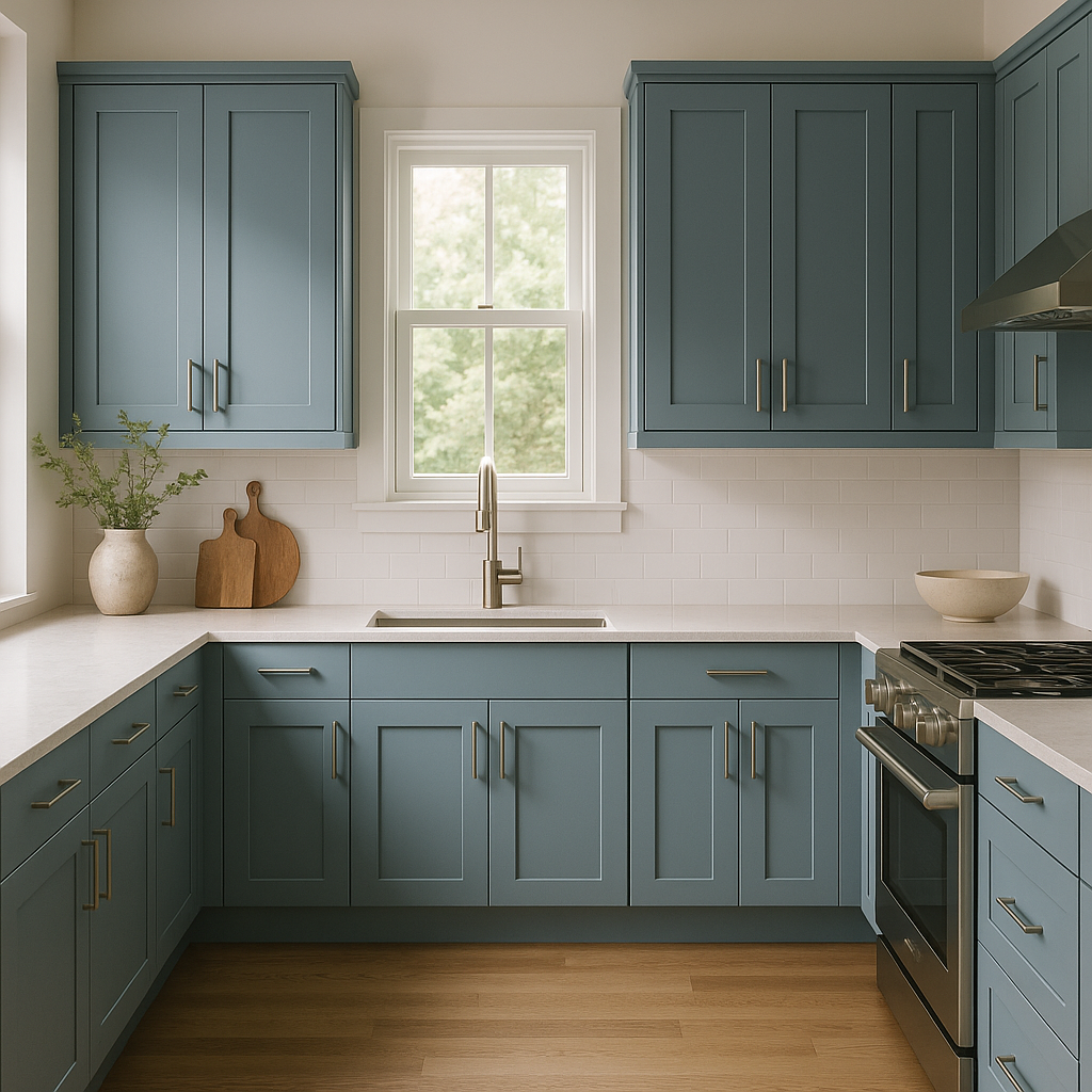
This green is perfect for cabinetry, especially when paired with brushed brass hardware and white marble countertops. It brings a sense of nature-inspired sophistication to the heart of the home.
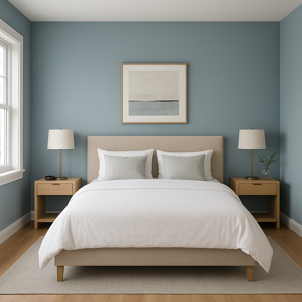
Using Colonial on bedroom walls can create a restful retreat. Pair it with soft, neutral bedding and natural wood furniture to evoke calm and serenity.
For a spa-like vibe, combine Colonial with crisp white tiles, matte black fixtures, and lush greenery. It works well in small spaces, adding depth without overwhelming the area.
Create a bold first impression by using Colonial in your entryway or as an accent wall in larger spaces. It pairs beautifully with statement artwork and metallic accents.
Colonial is more than just a color—it’s a design statement that bridges the gap between tradition and modernity. Its versatile undertones, compatibility with a wide range of shades, and ability to evoke both warmth and sophistication make it a standout choice for any interior design project. Whether you’re refreshing a single room or reimagining your entire space, Benjamin Moore Colonial (1677) is a timeless hue that will bring your vision to life.
View Colors Only by Brand (No Imagery):
Sherwin-Williams
|
Benjamin-Moore
|
Behr
|
Valspar
Live on the Eastern Slope of Colorado and looking for a local painting professional, check out all our painting services and reach out for a free estimate.
Copyright © 2026 : Wild Fox Painting Inc. : 12435 Mead Way, Littleton, CO 80125


