Benjamin Moore Blue 1678 is a sophisticated, versatile shade that exudes tranquility and timeless charm. As part of Benjamin Moore's exquisite color palette, this hue is a soft medium blue with subtle undertones that make it a popular choice for both traditional and modern interiors. Its balanced saturation and calming presence make it suitable for a wide range of design styles, from coastal-inspired spaces to refined urban interiors.
One of the most captivating aspects of Benjamin Moore Blue 1678 is its subtle undertones. This shade features cool gray undertones that add depth and sophistication. The gray influence keeps the blue from feeling overly vibrant, allowing it to maintain a serene and grounded appearance. In certain lighting conditions, you may also detect a faint hint of green, giving the color a slightly earthy quality that enhances its versatility.
These undertones make it adaptable to various lighting scenarios, whether it’s natural daylight or soft artificial lighting. In brighter light, the blue appears crisp and airy, while in dimmer spaces, it transforms into a cozier, more muted tone.
Benjamin Moore Blue 1678 pairs beautifully with a variety of complementary and coordinating colors, enabling you to create a harmonious, well-balanced color scheme. Here are some recommendations for seamlessly incorporating this shade into your design:
Neutral Pairings: For a clean and minimalist look, pair Benjamin Moore Blue 1678 with warm whites like Benjamin Moore White Dove (OC-17) or cooler whites like Chantilly Lace (OC-65). These neutrals highlight the blue's softness while keeping the overall aesthetic light and airy.
Earthy Tones: To emphasize its subtle gray-green undertones, combine it with earthy shades like Revere Pewter (HC-172) or Pale Oak (OC-20). This pairing works beautifully in transitional or rustic-inspired spaces.
Bold Accents: For a striking contrast, consider pairing this blue with deep, dramatic hues like Hale Navy (HC-154) or Kendall Charcoal (HC-166). These darker shades add depth and sophistication, making them ideal for accent walls or furniture pieces.
Soft Pastels: Add a touch of femininity by pairing it with blush tones like First Light (2102-70) or gentle greens like Sea Haze (2137-50). These combinations are perfect for creating a serene and romantic atmosphere.
Wood Tones: Natural wood finishes, whether light oak or rich walnut, bring warmth and texture to spaces featuring Benjamin Moore Blue 1678. This pairing is especially effective in Scandinavian or farmhouse designs.
Benjamin Moore Blue 1678 is a versatile hue that works well in a variety of spaces, making it a favorite among interior designers. Here are some of the most effective ways to use this color:
Living Rooms: Create a calm and inviting atmosphere by using Blue 1678 as the main wall color in your living room. Pair it with plush furnishings, textured throws, and neutral decor for a cozy yet elegant look.
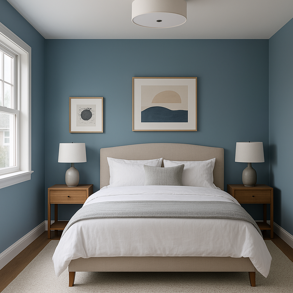
Bedrooms: The soothing qualities of this blue make it an excellent choice for bedrooms. Use it on walls to promote restful sleep and pair it with crisp white linens or muted gray bedding for a serene retreat.
Bathrooms: Incorporate Blue 1678 into your bathroom for a spa-like feel. It pairs beautifully with white subway tile, marble countertops, and chrome fixtures for a clean, polished look.
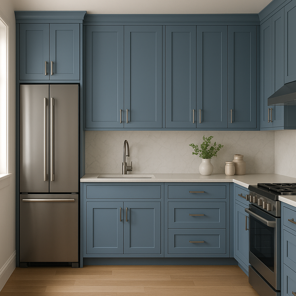
Kitchens: Add a pop of color to your kitchen by using Benjamin Moore Blue 1678 on cabinetry or a feature wall. Pair it with brass hardware and light wood accents for a modern, chic aesthetic.
View Colors Only by Brand (No Imagery):
Sherwin-Williams
|
Benjamin-Moore
|
Behr
|
Valspar
Live on the Eastern Slope of Colorado and looking for a local painting professional, check out all our painting services and reach out for a free estimate.
Copyright © 2026 : Wild Fox Painting Inc. : 12435 Mead Way, Littleton, CO 80125


