Benjamin Moore Amber (168) is a versatile and inviting paint color that evokes a sense of warmth, sophistication, and understated elegance. As a part of Benjamin Moore’s collection of timeless shades, Amber is a medium-tone golden beige with earthy undertones that make it an excellent choice for both contemporary and traditional interiors. Its subtle balance of warmth and neutrality allows it to harmonize beautifully with a variety of design styles and palettes.
Amber (168) carries rich golden undertones, giving it a warm, sunlit glow that feels cozy yet refined. These undertones have a slightly earthy quality, reminiscent of natural materials like sandstone or caramel-hued wood. The color strikes a perfect balance between yellow and beige, ensuring it doesn't appear too bright or too muted in any light. Depending on your room’s lighting conditions, Amber may lean toward a soft golden beige in sunny spaces or deepen into a richer, warmer hue in dimmer settings. This adaptability makes it ideal for rooms that require both character and neutrality.
Amber's versatility allows it to coordinate seamlessly with a wide variety of colors and finishes. Here are some suggestions for creating a cohesive color palette:
Neutral Pairings: Pair Amber with creamy whites like Benjamin Moore White Dove (OC-17) or Simply White (OC-117) to highlight its warm undertones and create a fresh, airy feel. These combinations are ideal for modern, minimalist spaces or transitional interiors.
Earthy Accents: Complement Amber with deeper earth tones like Benjamin Moore Kendall Charcoal (HC-166) or Rustic Taupe (2161-50). These pairings work beautifully in traditional or rustic spaces, adding depth and richness.
Bold Contrasts: For a more dramatic look, pair Amber with jewel tones like Benjamin Moore Hale Navy (HC-154) or Hunter Green (2041-10). These striking contrasts can infuse your space with energy and sophistication.
Metallics and Textures: Amber works wonderfully with metallic accents like brushed gold, copper, or bronze, enhancing its golden undertones. Incorporate textured finishes such as reclaimed wood or woven fabrics to elevate the natural warmth of the shade.
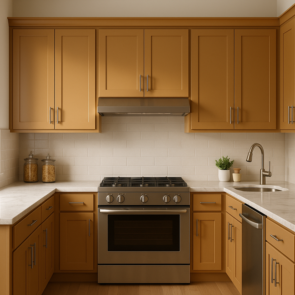
Amber (168) is a true multitasker and can be used effectively throughout your home in a variety of ways:
Living Rooms: Its warm and grounding qualities make Amber perfect for living spaces. Pair it with plush furniture and layered textures for a cozy yet sophisticated atmosphere.
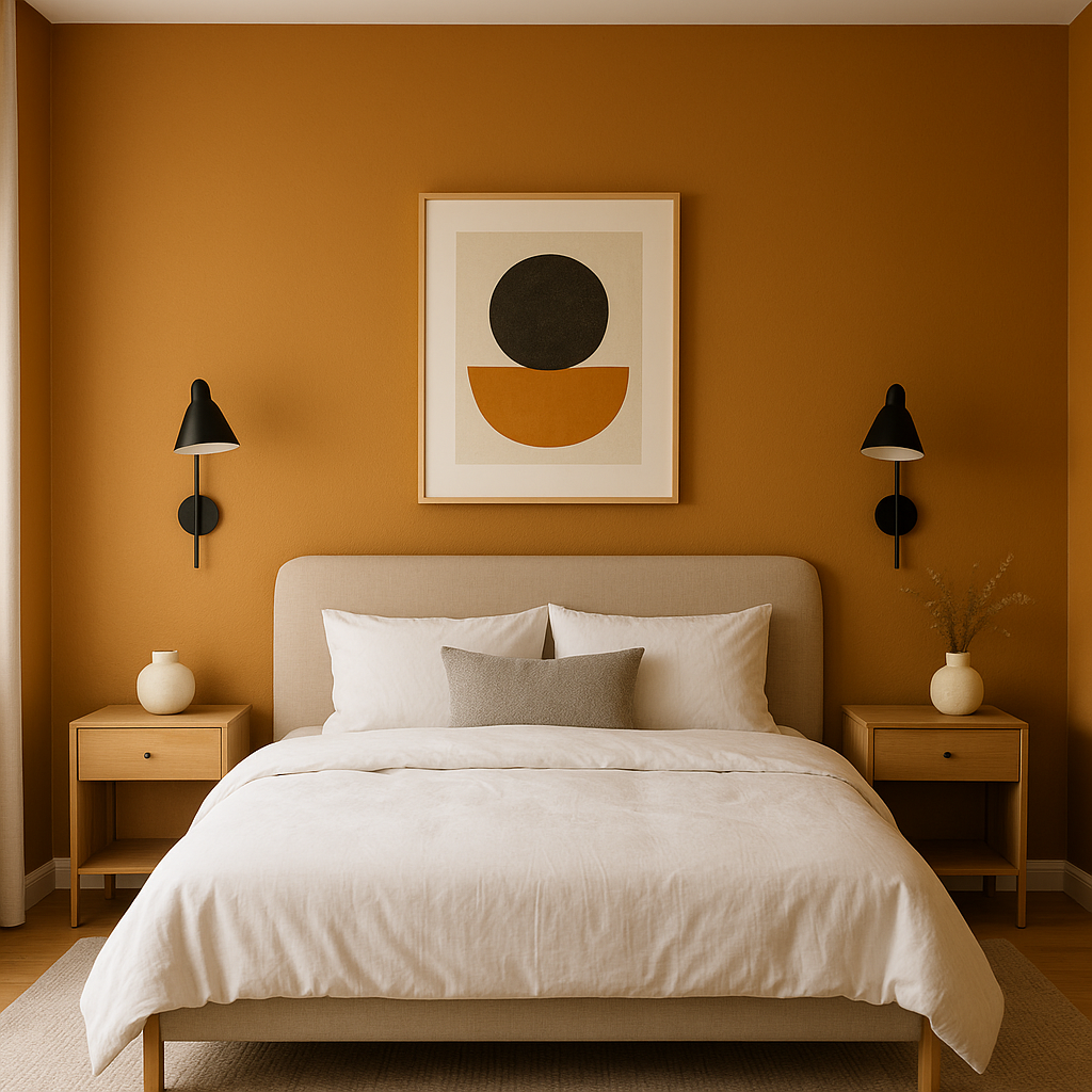
Bedrooms: Use Amber in bedrooms to create a serene and cocoon-like retreat. Pair it with soft linens and subdued lighting for a calming ambiance.
Dining Rooms: Amber's richness lends itself well to dining areas, where it can create an inviting and intimate environment for gatherings. Enhance its warmth with wood finishes and ambient lighting.
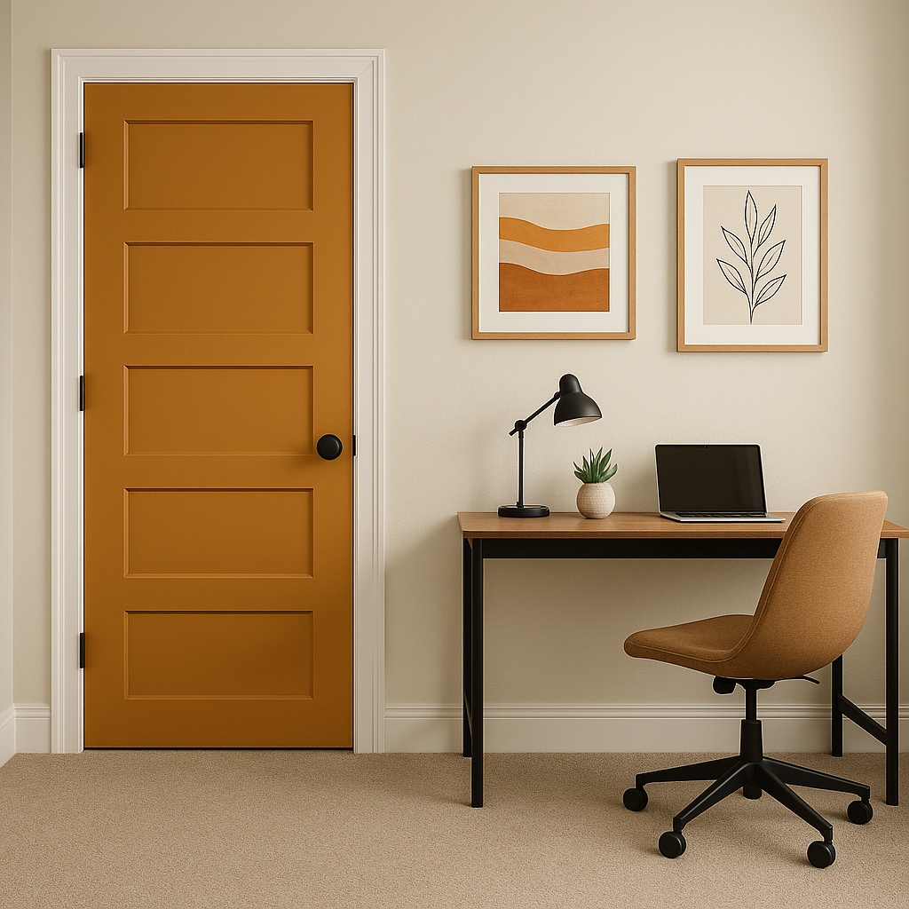
Hallways and Entryways: Amber is an excellent choice for transitional spaces like hallways and entryways, where its neutral yet distinctive tone can provide a seamless flow between rooms.
Accent Walls: Consider Amber for an accent wall to add depth and character to your space. Pair it with lighter neutrals on surrounding walls for a balanced and dynamic look.
Benjamin Moore Amber (168) is more than just a paint color—it’s a design statement. Its timeless appeal, subtle warmth, and versatility make it an ideal choice for those seeking a color that can adapt to evolving trends while remaining classic. Whether you're looking to create a cozy retreat, a lively gathering space, or a polished office environment, Amber is a reliable choice that effortlessly enhances any room.
By incorporating coordinating colors, thoughtful decor, and the right lighting, you can unlock the full potential of Benjamin Moore Amber (168) and transform your spaces into stylish havens of warmth and elegance.
View Colors Only by Brand (No Imagery):
Sherwin-Williams
|
Benjamin-Moore
|
Behr
|
Valspar
Live on the Eastern Slope of Colorado and looking for a local painting professional, check out all our painting services and reach out for a free estimate.
Copyright © 2026 : Wild Fox Painting Inc. : 12435 Mead Way, Littleton, CO 80125


