Benjamin Moore Hudson (1680) is a versatile and elegant gray that effortlessly blends modern sophistication with classic charm. This mid-tone shade offers a balanced depth, making it a favorite among interior designers for its ability to create serene atmospheres while maintaining a sense of refinement. Whether you're looking to elevate a cozy living room, refresh a modern kitchen, or add character to a bedroom, Hudson (1680) delivers a timeless aesthetic that adapts beautifully across various design styles.
Hudson (1680) carries subtle blue undertones, which give it a cool and calming quality. These undertones ensure the gray remains fresh and contemporary while avoiding harshness. The blue hints allow Hudson to pair seamlessly with cooler color palettes, though its versatile nature also complements warmer tones when carefully coordinated. The undertones make this shade ideal for spaces seeking a tranquil, understated sophistication without feeling overly clinical.
Hudson (1680) opens up endless possibilities for color coordination, making it a dream for designers. Here are some top recommendations for pairing with this versatile gray:
These coordinating colors allow Hudson (1680) to shine in a variety of combinations, whether you're designing a monochrome retreat or a bold, contrasting space.
Hudson (1680) is incredibly versatile and can be used in virtually any room or design concept. Here are some of its best applications:
Hudson's calming blue undertones make it a wonderful choice for living rooms, especially when paired with soft textures like plush rugs, linen curtains, and upholstered furniture. Combine it with light whites and natural wood tones for a Scandinavian-inspired aesthetic, or pair it with darker accents for a more dramatic vibe.
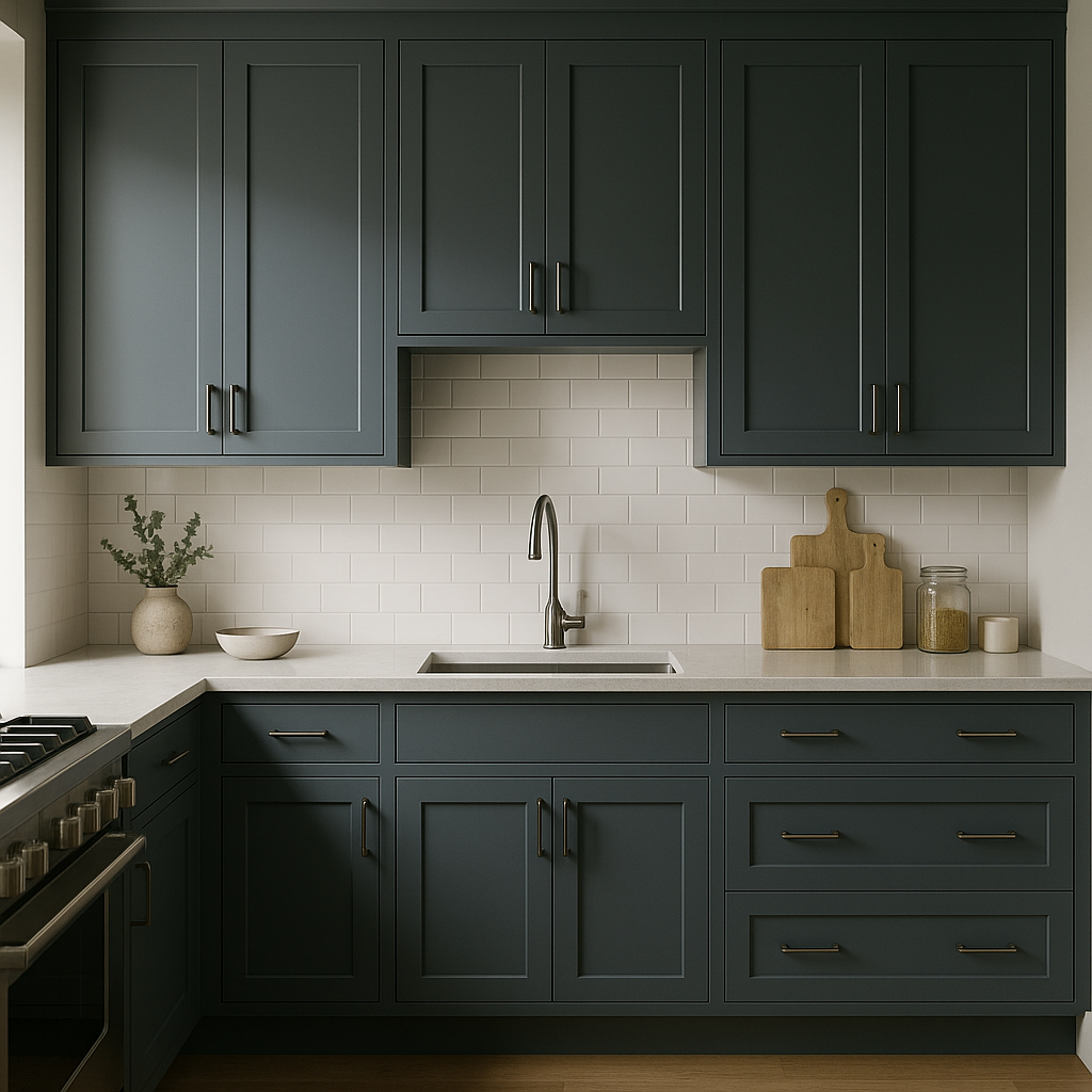
In kitchens, Hudson (1680) is a fantastic choice for cabinetry or walls, especially when paired with marble countertops and brushed nickel hardware. Its cool undertones create a clean and modern space that feels welcoming and fresh.
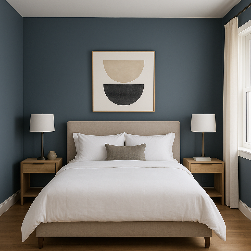
For bedrooms, Hudson (1680) offers a serene and tranquil environment. Pair it with soft whites and muted blues for a coastal-inspired escape or layer it with deep jewel tones for a luxurious, moody retreat.
Hudson (1680) thrives in bathrooms, where its cool undertones can enhance the crispness of white tile, chrome fixtures, or natural stone. Consider using it on walls or vanity cabinets to create a spa-like atmosphere.
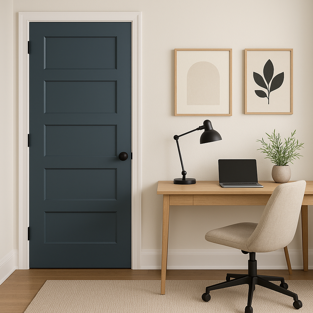
In office spaces, Hudson (1680) promotes focus and calm. Pair it with minimalist furniture and clean lines for a productive environment that feels modern and professional.
Benjamin Moore Hudson (1680) is the epitome of versatility and sophistication. Its ability to adapt to various styles, spaces, and palettes makes it a go-to gray for interior designers. The subtle blue undertones lend a fresh, calming quality that transforms any space into a sanctuary. Whether you're designing a contemporary loft, a classic home, or a transitional space, Hudson (1680) is a timeless choice that will remain stylish for years to come.
View Colors Only by Brand (No Imagery):
Sherwin-Williams
|
Benjamin-Moore
|
Behr
|
Valspar
Live on the Eastern Slope of Colorado and looking for a local painting professional, check out all our painting services and reach out for a free estimate.
Copyright © 2026 : Wild Fox Painting Inc. : 12435 Mead Way, Littleton, CO 80125


