Benjamin Moore Happily (173) is a serene and inviting shade of light blue that brings a sense of tranquility and optimism to any space. This color’s airy quality makes it a perfect choice for homeowners seeking a soft, uplifting hue that doesn’t overwhelm but still adds character to a room. Whether you’re updating a coastal-inspired living room, refreshing a nursery, or creating balance in a modern kitchen, Happily (173) offers endless possibilities.
What sets Happily apart from other blues is its harmonious undertones. This color features subtle green and gray undertones that give it depth and versatility. The green undertone adds a fresh, natural vibe, reminiscent of clear skies over a lush landscape, while the gray undertone grounds the color, creating a sophisticated and calming effect. These undertones ensure that Happily (173) adapts well to various lighting conditions, from bright daylight to soft, ambient evening light.
In spaces with cooler light, Happily leans more blue, while warmer lighting can bring out its gentle green undertone, making it a dynamic and ever-changing shade.
Benjamin Moore Happily (173) works beautifully with a range of complementary colors, making it a versatile choice for both monochromatic and multi-color schemes. Here are some excellent coordinating options:
Happily (173) is an incredibly versatile paint color that works well in various rooms and design styles. Here’s how you can use this lovely shade in your home:
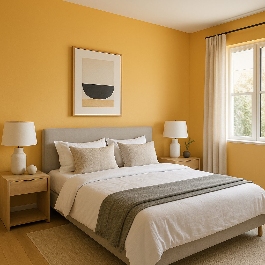
The soft, soothing quality of Happily makes it a popular choice for bedrooms and nurseries. Its calming presence promotes relaxation, making it ideal for creating a peaceful retreat. Pair it with white linens, natural wood furniture, and soft lighting for a dreamy ambiance.
Happily’s fresh and clean appearance is perfect for bathrooms. Its light blue tone evokes the tranquility of water, making it a natural fit. Use it alongside white tiles and chrome or brushed nickel fixtures for a spa-like atmosphere.
For living rooms, Happily provides a serene backdrop that allows furniture and artwork to take center stage. Pair it with neutral grays and pops of warm colors like mustard yellow or terracotta for a contemporary, inviting space.
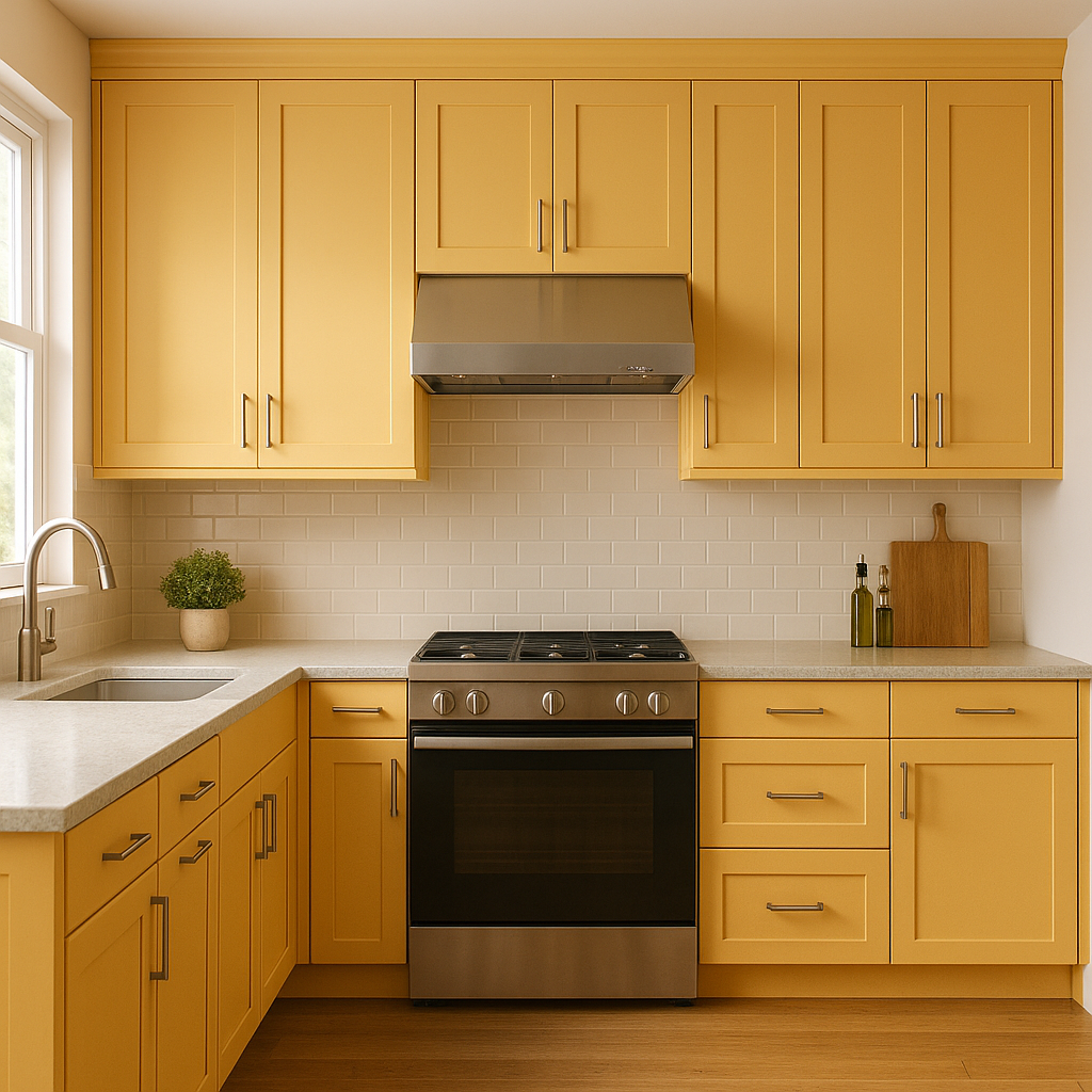
This shade of blue works wonderfully in kitchens, especially when combined with white cabinetry and marble or quartz countertops. The slight green undertone adds a hint of vibrancy, making the space feel fresh and lively.
If you’re not ready to commit to an entire room, Happily makes a beautiful accent wall color. Use it behind a bed’s headboard, a fireplace mantle, or in a reading nook to add a touch of charm and sophistication.
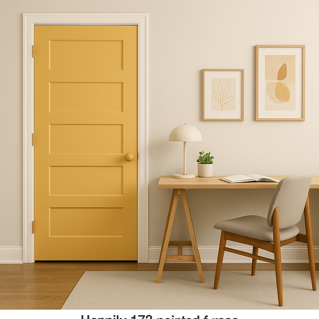
Happily also shines in outdoor applications, such as on shutters, doors, or porch ceilings. Its light and airy quality harmonizes beautifully with natural surroundings and creates an inviting curb appeal.
Happily (173) is more than just a paint color—it’s a mood enhancer. Its cheerful and calming qualities bring life to interiors while maintaining a sense of balance and sophistication. Whether you’re looking to create a serene retreat or an uplifting, light-filled space, Happily adapts effortlessly to your vision.
With its subtle undertones, versatile coordinating options, and wide range of uses, Happily (173) is a timeless and stylish choice for any home.
View Colors Only by Brand (No Imagery):
Sherwin-Williams
|
Benjamin-Moore
|
Behr
|
Valspar
Live on the Eastern Slope of Colorado and looking for a local painting professional, check out all our painting services and reach out for a free estimate.
Copyright © 2026 : Wild Fox Painting Inc. : 12435 Mead Way, Littleton, CO 80125


