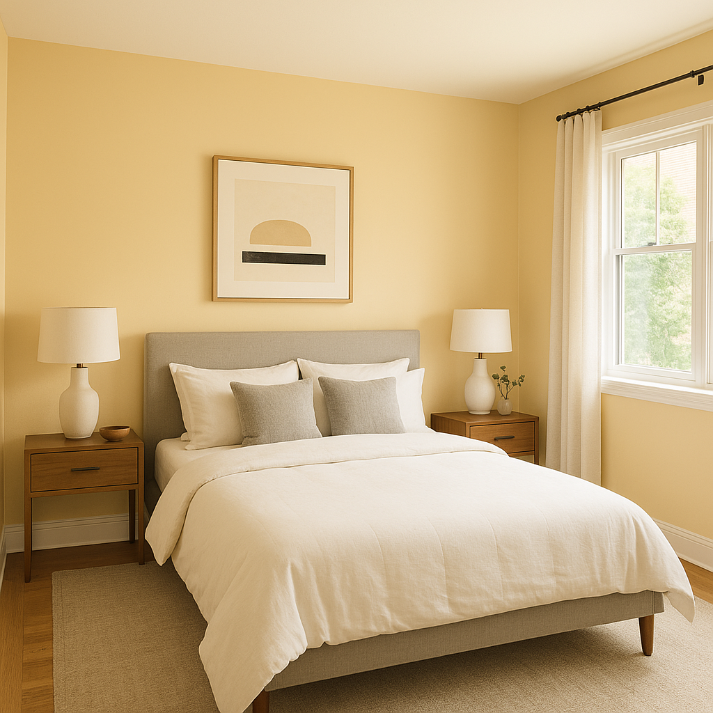
Benjamin Moore Goldtone (176) is a rich, golden-yellow hue that strikes the perfect balance between sophistication and warmth. Its subtle yet impactful presence adds depth to any space, making it a versatile choice for both traditional and modern interiors. Whether you’re crafting a cozy living room or looking to brighten up a hallway, Goldtone delivers an inviting and timeless aesthetic.
Goldtone exudes a natural warmth with undertones of ochre and muted amber. These earthy influences give the color a grounded and approachable quality, while its slight golden shimmer ensures it remains uplifting and refined. Depending on your lighting, you may notice hints of honey or sunlit mustard, which can shift the mood of the room throughout the day.
Goldtone pairs beautifully with a variety of complementary shades, allowing you to tailor its impact to your desired style.
For a classic and subdued palette, pair Goldtone with soft neutrals like Benjamin Moore White Dove (OC-17) or Cloud Cover (OC-25). These lighter tones balance Goldtone’s warmth and create an effortlessly elegant space.
To enhance its golden richness, consider pairing it with deep, moody shades like Benjamin Moore Hale Navy (HC-154) or Black Forest Green (PM-12). These darker hues provide striking contrast, ideal for creating bold and dramatic interiors.
For a more natural and grounded look, partner Goldtone with earthy greens and browns, such as Benjamin Moore Tate Olive (HC-112) or Rustic Taupe (2166-50). These combinations evoke a sense of connection to nature and are perfect for rustic or farmhouse-inspired designs.
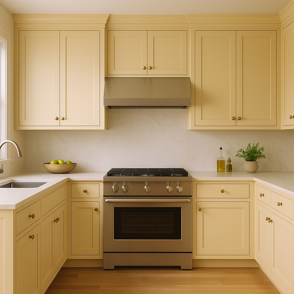
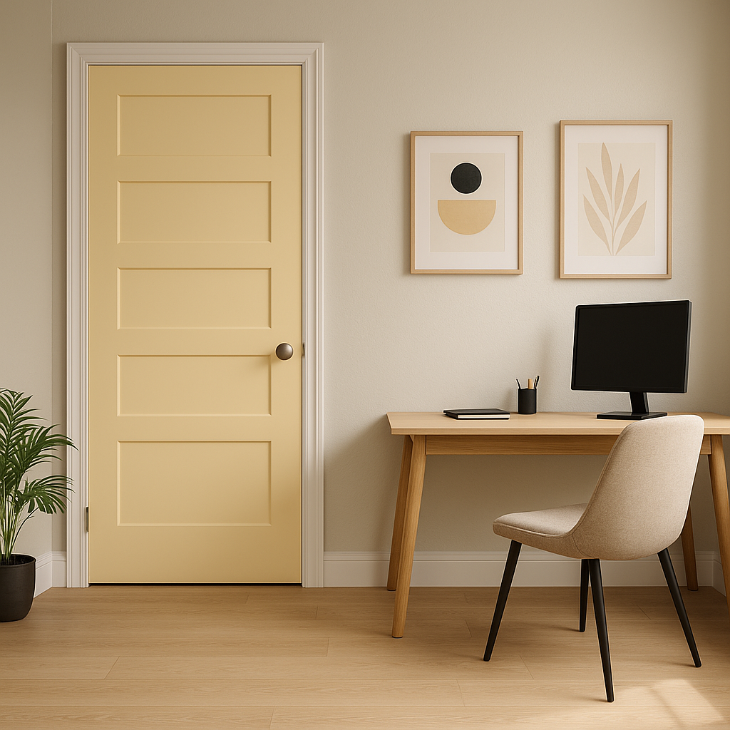
Goldtone’s versatility allows it to shine in a variety of applications and room types:
Goldtone’s undertones and vibrancy can shift depending on the lighting in your space. In natural daylight, it will appear brighter and more golden, while under warm artificial lighting, its amber undertones become more pronounced. Consider testing the color in different lighting conditions to ensure it achieves your desired effect.
Benjamin Moore Goldtone (176) is more than just a paint color—it’s a design element that brings warmth, depth, and character to any room. Its versatility and rich undertones make it a winning choice for homeowners and designers alike. Whether you’re seeking a golden accent for a modern interior or a cozy backdrop for a traditional space, Goldtone invites you to transform your home into a haven of timeless beauty.
View Colors Only by Brand (No Imagery):
Sherwin-Williams
|
Benjamin-Moore
|
Behr
|
Valspar
Live on the Eastern Slope of Colorado and looking for a local painting professional, check out all our painting services and reach out for a free estimate.
Copyright © 2026 : Wild Fox Painting Inc. : 12435 Mead Way, Littleton, CO 80125


