Benjamin Moore Goldfinch (187) is a radiant and uplifting shade that encapsulates the warmth and vitality of golden sunlight. Bold yet refined, this color exudes energy and happiness, making it a versatile choice for both modern and classic interior designs. Its striking personality can transform spaces into cheerful sanctuaries, effortlessly bridging the gap between sophistication and playfulness.
Goldfinch is a rich, golden yellow with warm undertones that lean slightly toward an earthy amber hue. These subtle undertones prevent it from feeling overly bright or fluorescent, giving the color depth and character. The warmth in Goldfinch makes it feel inviting and cozy, perfect for spaces where you want to evoke positivity and comfort.
Pairing Goldfinch with complementary or contrasting colors can create a stunning, balanced aesthetic. Here are some suggestions for coordinating colors:
Goldfinch is a versatile color that works well in a variety of applications, depending on the mood and style you want to achieve. Here’s how you can incorporate this vibrant hue into your home:
Goldfinch is the perfect color for living rooms designed to be warm and welcoming. Use it as an accent wall to create an energetic focal point, or pair it with neutral furnishings and décor to allow the color to shine without overwhelming the space.
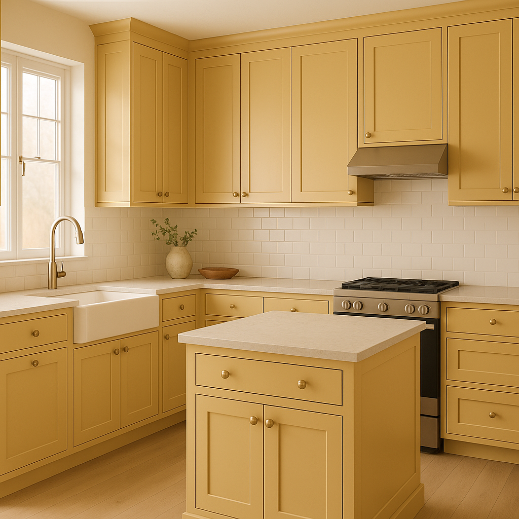
The golden tones of Goldfinch bring a sense of cheer and vitality to kitchens and dining rooms. Consider using it for cabinetry, a backsplash, or even the ceiling to create a sunlit ambiance that feels fresh and invigorating.
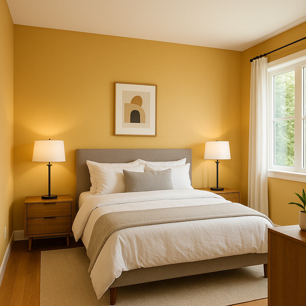
While Goldfinch is bold, its warm undertones make it suitable for bedrooms when used thoughtfully. Pair it with soft whites and muted grays to create a balanced, cozy retreat.
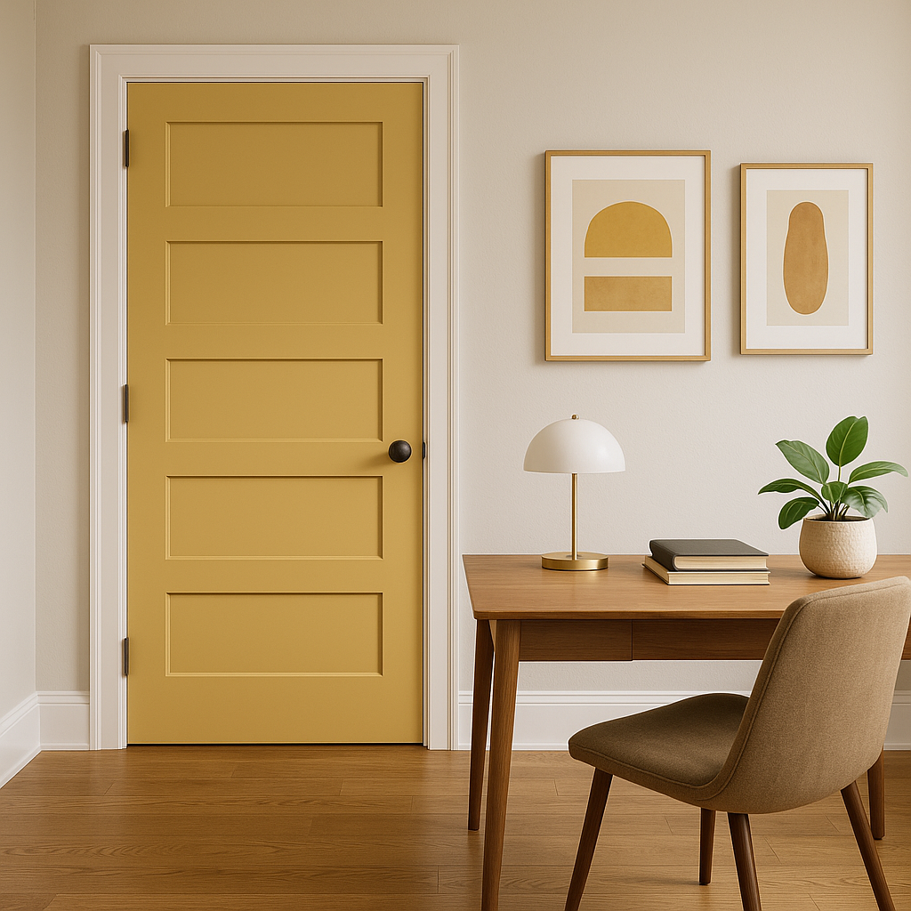
Stimulate creativity and productivity by incorporating Goldfinch into your home office. Use it for an accent wall or furnishings to energize the space and keep the atmosphere lively.
Welcoming and vibrant, Goldfinch is an excellent choice for entryways and hallways. It sets a cheerful tone as guests enter your home, leaving a lasting impression.
The playful nature of Goldfinch makes it ideal for children’s spaces. Pair it with playful blues, greens, or pinks to create a fun and imaginative environment.
Goldfinch’s appearance can shift dramatically depending on the lighting. In bright, natural light, the golden tones are more pronounced and vibrant, while in softer, artificial lighting, its earthy undertones become more apparent, lending it a more subdued and cozy feel. Test Goldfinch in your space before committing to ensure it complements your lighting conditions.
Benjamin Moore Goldfinch (187) is a delightful color choice for those looking to bring sunshine and positivity into their homes. Whether you use it sparingly as an accent or embrace it fully in larger applications, this golden hue is sure to elevate the mood and aesthetic of any space.
View Colors Only by Brand (No Imagery):
Sherwin-Williams
|
Benjamin-Moore
|
Behr
|
Valspar
Live on the Eastern Slope of Colorado and looking for a local painting professional, check out all our painting services and reach out for a free estimate.
Copyright © 2026 : Wild Fox Painting Inc. : 12435 Mead Way, Littleton, CO 80125


