Benjamin Moore Pearly 190 is a sophisticated and versatile off-white paint color that exudes understated elegance. This soft, creamy hue is celebrated for its ability to seamlessly adapt to a variety of design styles, creating a harmonious and inviting atmosphere in any room. Whether you're designing a modern, minimalist space or a cozy, traditional retreat, Pearly 190 offers a timeless backdrop that enhances both natural and artificial light.
One of the most captivating aspects of Pearly 190 is its warm undertones. This shade leans slightly toward the beige spectrum, with subtle hints of yellow and creamy ivory that keep it from feeling stark or cold. These delicate undertones give the color a soft glow, making it a fantastic choice for spaces where warmth and comfort are desired. Additionally, its neutral foundation ensures that it will not clash with other colors or overpower a room’s design elements.
Benjamin Moore Pearly 190 pairs beautifully with a variety of coordinating colors, allowing you to create a cohesive and balanced color palette for your interiors. Here are some suggestions to inspire your design:
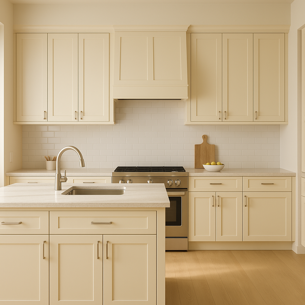
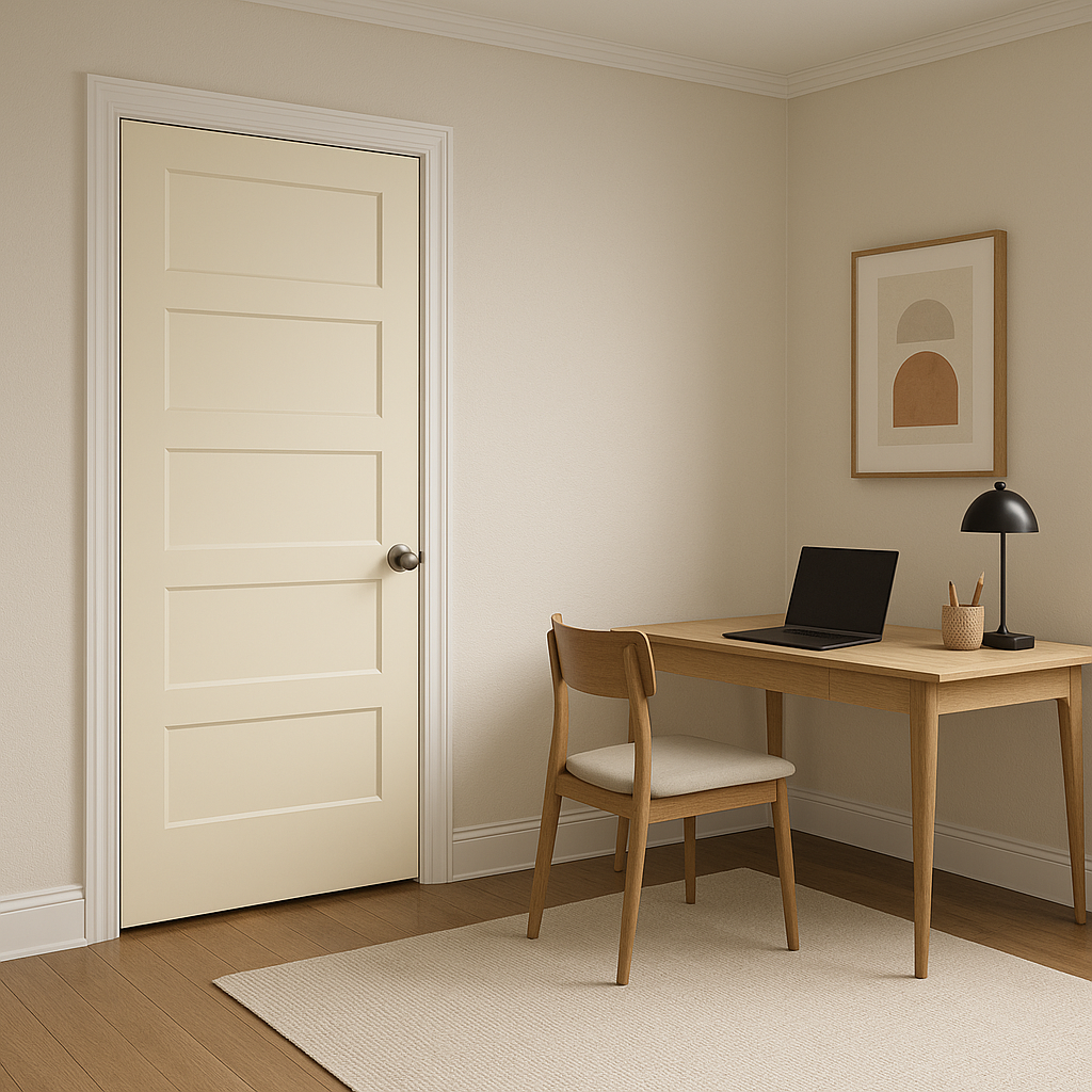
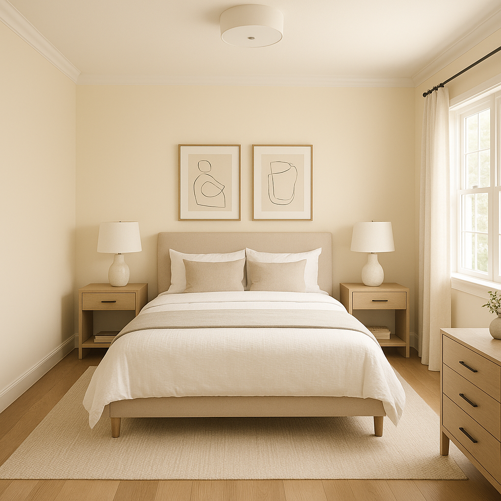
The versatility of Benjamin Moore Pearly 190 makes it a go-to choice for a wide range of applications throughout your home. Here are a few ideas for incorporating this timeless hue into your interior design:
Benjamin Moore Pearly 190 is more than just a paint color—it’s a design element that brings warmth, refinement, and balance to any room. Its neutral yet rich undertones make it a versatile choice that complements a variety of design aesthetics, from contemporary to classic. Whether used as the main wall color or as a supporting hue, Pearly 190 is sure to elevate your interiors with its timeless charm and effortless elegance.
View Colors Only by Brand (No Imagery):
Sherwin-Williams
|
Benjamin-Moore
|
Behr
|
Valspar
Live on the Eastern Slope of Colorado and looking for a local painting professional, check out all our painting services and reach out for a free estimate.
Copyright © 2026 : Wild Fox Painting Inc. : 12435 Mead Way, Littleton, CO 80125


