Benjamin Moore Barley (199) is a timeless, versatile paint color that exudes warmth and comfort. This soft, creamy yellow strikes the perfect balance between brightness and subtlety, making it an excellent choice for creating a welcoming atmosphere in any room. Whether you’re revitalizing a traditional interior or adding a touch of warmth to a contemporary design, Barley offers a serene charm that pairs beautifully with various styles and palettes.
Barley is characterized by its golden undertones that lean towards a soft, buttery yellow. These warm undertones give the color a subtle glow without overwhelming the space, making it feel sunny yet understated. Unlike harsher yellows, Barley has a muted quality that keeps it sophisticated and grounded. Depending on the lighting, it may reveal hints of cream or a pale amber hue, offering a dynamic yet soothing effect throughout the day.
Barley’s versatility allows it to pair effortlessly with a wide range of complementary and accent colors. Whether you prefer soft, tonal combinations or bold contrasts, this shade integrates seamlessly into varied palettes.
Barley’s adaptable nature makes it suitable for a variety of applications across your home. Its soft, inviting tone adds character without overwhelming the space, making it equally at home in traditional, transitional, and modern designs.
Barley is an excellent choice for living rooms, where its warm undertones create a cozy, inviting environment. Pair it with neutral furniture and natural textures like wood or woven fabrics for a relaxed, timeless look.
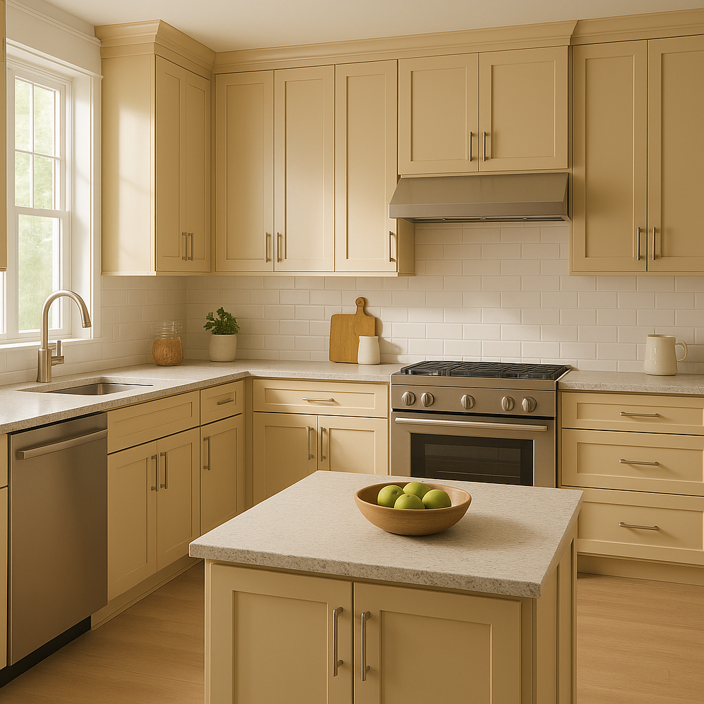
The cheerful yet subtle nature of Barley makes it ideal for kitchens and dining areas. It pairs beautifully with white cabinetry and natural stone countertops, creating a fresh, light-filled space perfect for gathering with family and friends.
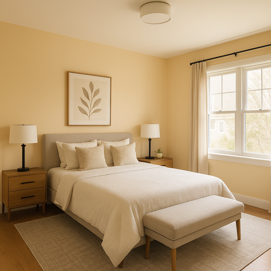
In bedrooms, Barley promotes a serene and restful atmosphere. Pair it with crisp white linens and soft gray accents for a calming retreat, or incorporate warm woods and muted greens for an earthy, grounded feel.
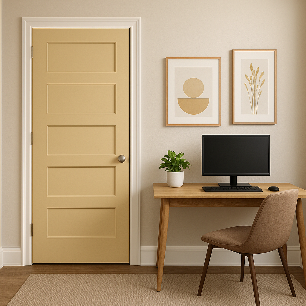
Barley’s warm glow is perfect for hallways and entryways, where it sets a welcoming tone for the rest of the home. Its ability to reflect light makes these often-overlooked spaces feel brighter and more open.
The soft, buttery quality of Barley makes it a wonderful choice for nurseries and children’s rooms. It provides a cheerful yet calming backdrop that can grow with the child over time.
Benjamin Moore Barley (199) is a versatile, classic choice that works well across a variety of spaces and design styles. Its warm, golden undertones create a welcoming and uplifting ambiance, while its muted quality ensures a sophisticated and timeless appeal. Pair it with crisp whites, earthy tones, or bold accents to customize its effect and make it uniquely yours. Whether you’re designing a cozy living room, a cheerful kitchen, or a serene bedroom, Barley is a reliable and beautiful option that will stand the test of time.
View Colors Only by Brand (No Imagery):
Sherwin-Williams
|
Benjamin-Moore
|
Behr
|
Valspar
Live on the Eastern Slope of Colorado and looking for a local painting professional, check out all our painting services and reach out for a free estimate.
Copyright © 2026 : Wild Fox Painting Inc. : 12435 Mead Way, Littleton, CO 80125


