
Benjamin Moore Spring 2001-30 is a soft, muted green that evokes the rejuvenating energy of nature and the promise of new beginnings. This versatile shade brings a sense of balance, tranquility, and understated elegance to any space. Whether you're designing a serene retreat or adding a subtle pop of color, Spring 2001-30 offers a refreshing yet timeless aesthetic.
Spring 2001-30 is a delicate green with warm undertones, making it a highly adaptable choice for a variety of design styles. Unlike cooler greens that can feel stark or overly vibrant, this shade leans slightly toward a more earthy and subdued tone. Its warm undertones make it feel approachable and inviting, blending beautifully with both classic and contemporary interiors.
The undertones in Spring 2001-30 include hints of yellow and beige, giving it a grounded, natural look. These undertones prevent the color from feeling overly bright or artificial, creating a hue that feels like it was plucked straight from a spring meadow. Depending on the lighting, Spring 2001-30 can appear softer and more muted in shaded areas or take on a brighter, sunnier quality in well-lit spaces.
Spring 2001-30 pairs seamlessly with a variety of hues, making it an excellent choice for creating cohesive color palettes. Here are some suggestions for coordinating colors to enhance its natural charm:
Neutrals: Pair Spring 2001-30 with warm, creamy whites like Benjamin Moore's Simply White (OC-117) or Swiss Coffee (OC-45) for a clean and airy look. Soft beige tones like Manchester Tan (HC-81) also complement the warmth of this green beautifully.
Earth Tones: For a harmonious, nature-inspired palette, consider pairing it with earthy browns like Kendall Charcoal (HC-166) or Sparrow (AF-720). These tones enhance the organic feel of Spring 2001-30.
Blues: Soft blues like Palladian Blue (HC-144) or Wythe Blue (HC-143) create a serene and calming effect when used alongside Spring 2001-30. The combination evokes the soothing essence of a spring sky and lush greenery.
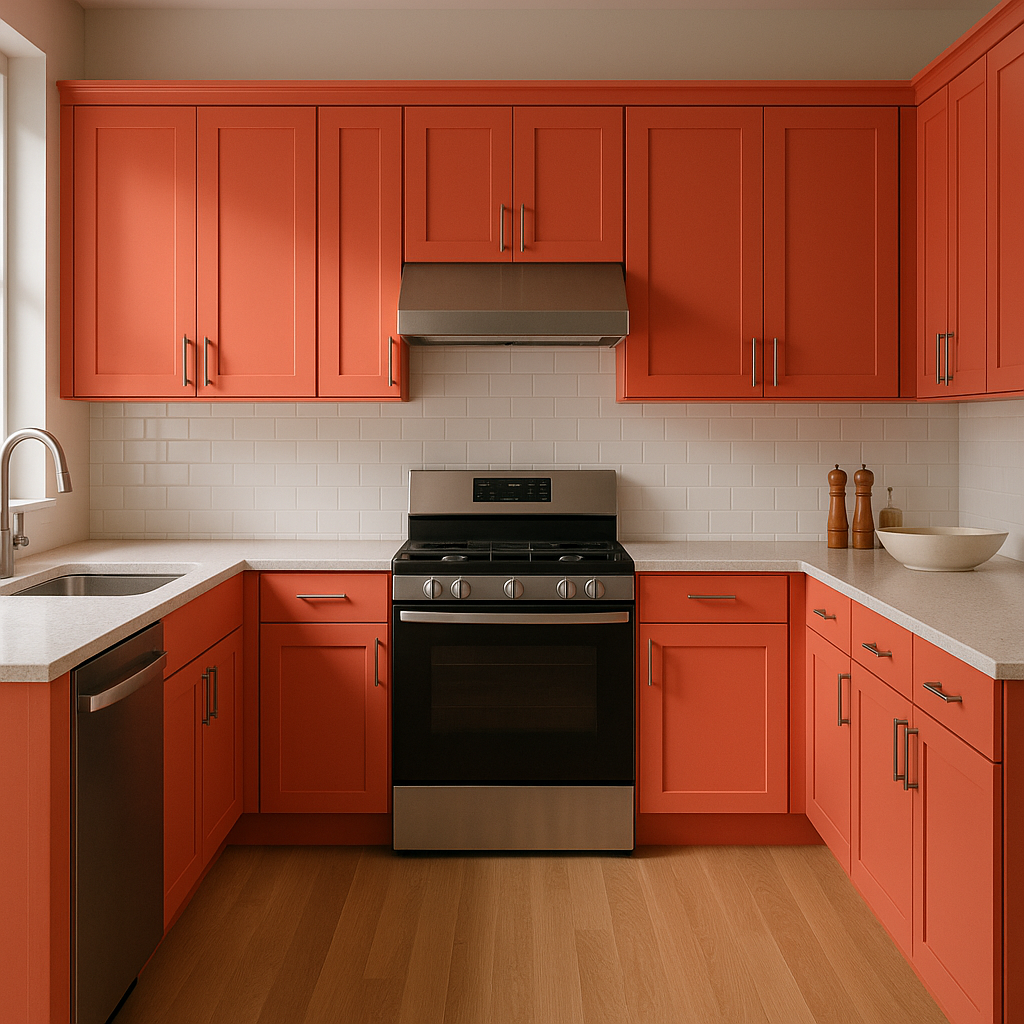
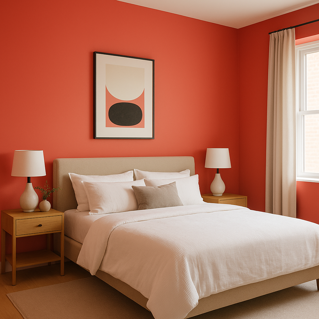
Pops of Color: Add a touch of vibrancy with accents in coral or peach, such as Coral Gables (2010-40). This playful contrast gives the space energy while maintaining balance.
Spring 2001-30 is incredibly versatile and can be used in various settings to create a welcoming and peaceful ambiance. Here are some ideas for incorporating it into your home:
Living Rooms: Use Spring 2001-30 on the walls of your living room to create a cozy and inviting atmosphere. Pair it with light furniture and natural textures like wood or rattan for a casual, relaxed vibe.
Bedrooms: This soothing green is perfect for bedrooms, where its calming effect can promote relaxation and restful sleep. Pair it with soft textiles in neutral tones or subtle floral patterns for a romantic, cottage-inspired look.
Kitchens and Dining Areas: Spring 2001-30 works beautifully in kitchens and dining spaces, especially when paired with white cabinetry or open shelving. Its warm undertones make it a great choice for spaces where you gather and entertain.
Bathrooms: Create a spa-like retreat in your bathroom by using Spring 2001-30 on the walls or cabinetry. Complement it with brushed nickel or matte black fixtures for a modern touch.
Exterior Spaces: This versatile color isn't limited to interiors. Use Spring 2001-30 for exterior siding, shutters, or front doors to give your home a fresh and welcoming curb appeal. Pair it with crisp whites and dark gray accents for a timeless, polished look.
View Colors Only by Brand (No Imagery):
Sherwin-Williams
|
Benjamin-Moore
|
Behr
|
Valspar
Live on the Eastern Slope of Colorado and looking for a local painting professional, check out all our painting services and reach out for a free estimate.
Copyright © 2026 : Wild Fox Painting Inc. : 12435 Mead Way, Littleton, CO 80125


