Benjamin Moore Pink (2006-70) is a delicate, soft shade of pink that exudes charm and sophistication. This pastel hue has an inherently versatile quality, making it suitable for a wide range of interior design styles, from classic and traditional to modern and whimsical. Its subtle nature allows it to serve both as a prominent feature color and as a gentle backdrop that complements other elements within your space.
One of the defining characteristics of Benjamin Moore Pink (2006-70) is its warm undertones. These peachy and slightly beige undertones give the color depth and prevent it from feeling overly saccharine or juvenile. The warmth adds a subtle sophistication, making it an excellent choice for rooms where comfort and tranquility are priorities.
These undertones also make this pink more adaptable to varied lighting conditions. In spaces with natural light, Benjamin Moore Pink appears luminous and fresh, while in dimmer artificial light, its warmth creates a cozy, inviting atmosphere.
Pairing Benjamin Moore Pink with complementary and coordinating shades can elevate your design while ensuring balance and harmony within your space. Here are a few color suggestions:
These coordinating colors can be incorporated through furniture, accent walls, decor pieces, or textiles, allowing you to style the space cohesively.
Benjamin Moore Pink is exceptionally versatile and can be used in a variety of spaces to achieve different aesthetic goals. Here are a few ideas to inspire its use:
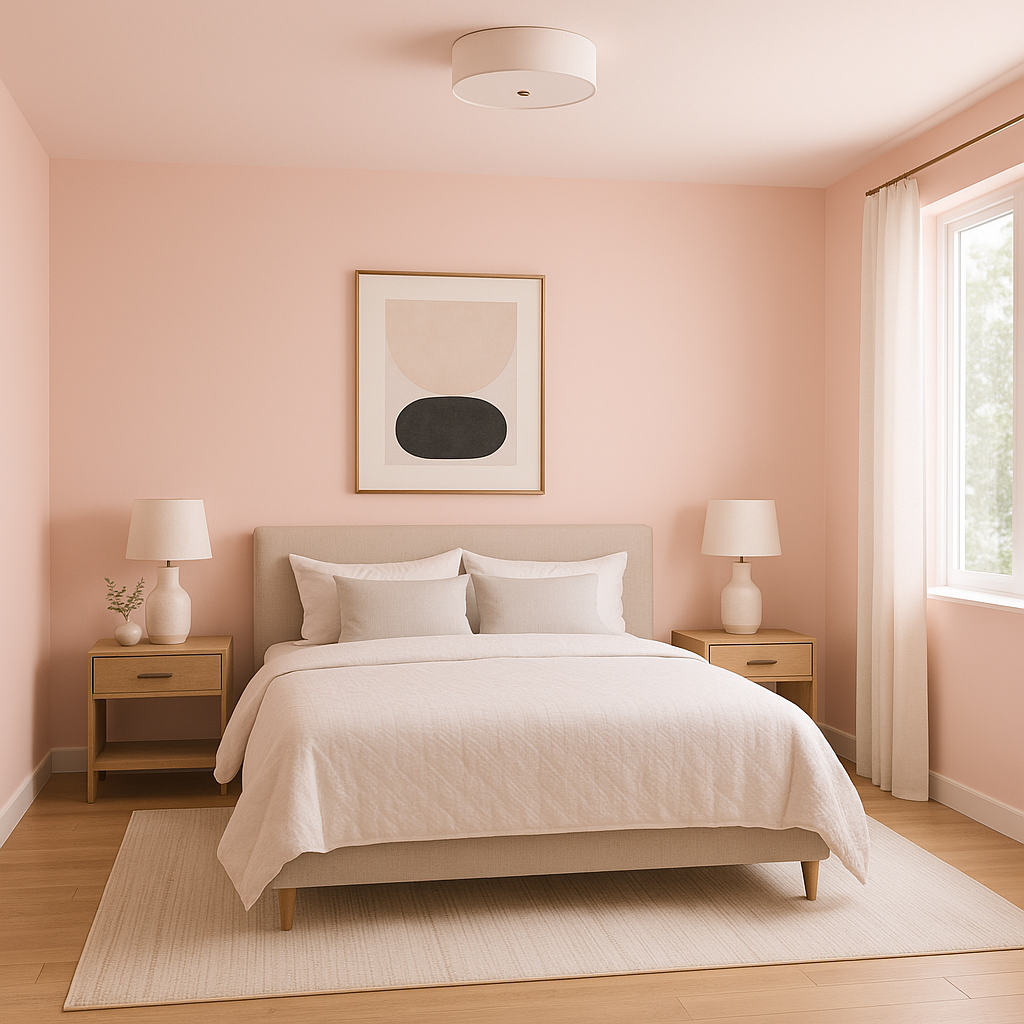
Its soft, calming appearance makes Benjamin Moore Pink an ideal choice for bedrooms. Pair it with plush textures, neutral bedding, and warm lighting fixtures to create a serene retreat. For a more romantic or feminine vibe, incorporate floral patterns and gold accents.
Benjamin Moore Pink works beautifully in nurseries or children’s bedrooms, especially when paired with playful patterns and whimsical decor. Its subtle tone ensures the room remains calming rather than overly stimulating.
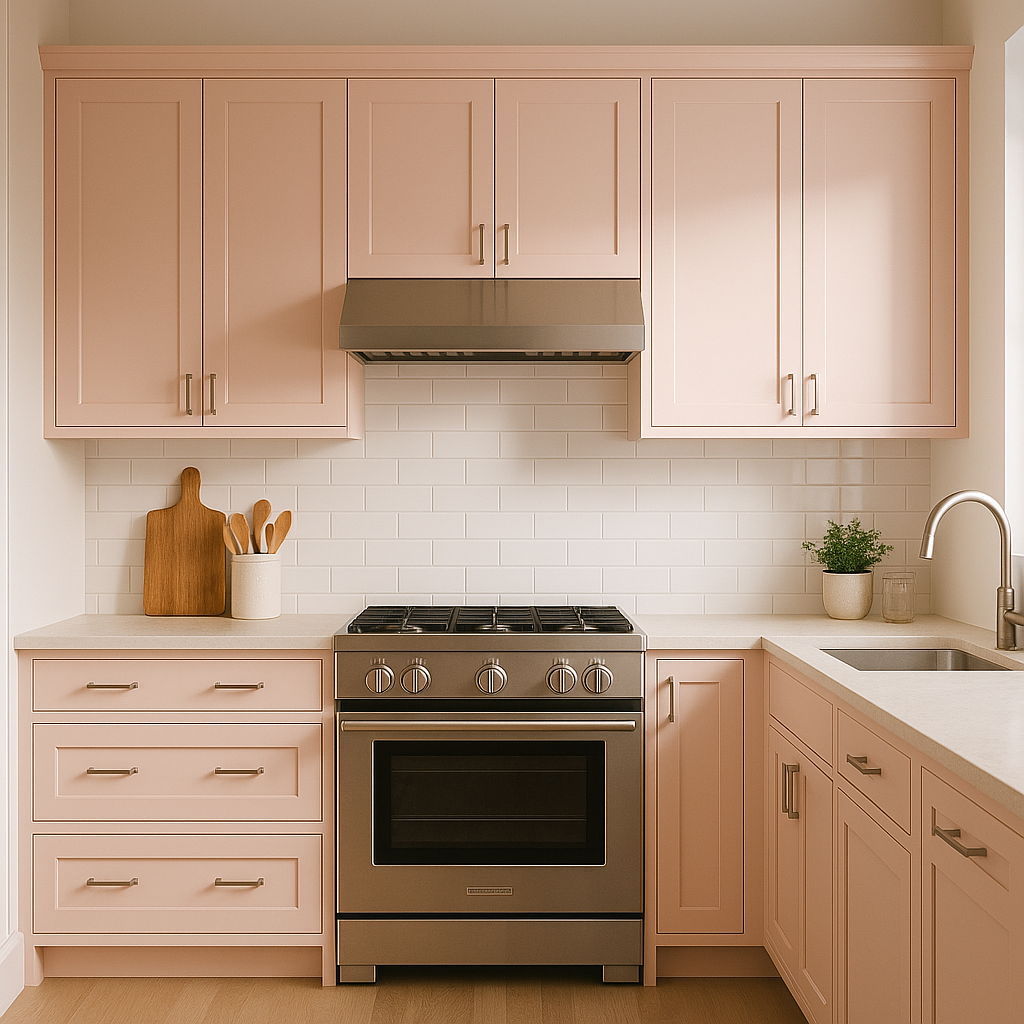
In living rooms, this shade of pink can be used to add a touch of warmth and personality. Consider using it as an accent wall, or pair it with neutral furniture and vibrant artwork for a balanced look.
Create a spa-like escape by using Benjamin Moore Pink in bathrooms. Pair it with white subway tiles, brass fixtures, and natural textures like wood or stone for a modern yet cozy feel.
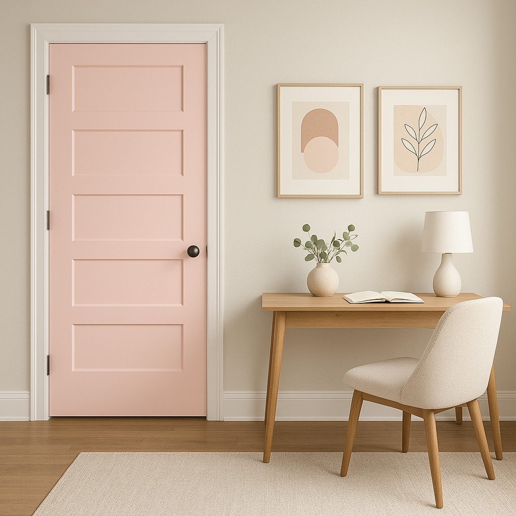
Benjamin Moore Pink is perfect for accent walls in spaces like dining rooms, hallways, or entryways. Its gentle hue makes a statement without overwhelming the design. Add bold artwork or textured finishes to enhance the focal point.
Benjamin Moore Pink (2006-70) is a timeless color that brings warmth, elegance, and versatility to any space. Its ability to adapt to different styles, lighting, and coordinating colors ensures it remains a favorite among interior designers and homeowners alike.
View Colors Only by Brand (No Imagery):
Sherwin-Williams
|
Benjamin-Moore
|
Behr
|
Valspar
Live on the Eastern Slope of Colorado and looking for a local painting professional, check out all our painting services and reach out for a free estimate.
Copyright © 2026 : Wild Fox Painting Inc. : 12435 Mead Way, Littleton, CO 80125


