Benjamin Moore Touch (2008-70) is a timeless, versatile paint color that brings a sense of understated elegance to any space. This soft neutral is a pale beige with a gentle infusion of warmth, making it an ideal choice for those seeking a subtle yet impactful backdrop that complements both traditional and modern aesthetics. Its refined hue makes it a perfect canvas for layering textures, patterns, and accents without overwhelming the design.
One of the most appealing aspects of Touch is its delicate undertones. It carries a warm peachy-beige base with hints of cream, providing just enough warmth to keep the color from feeling stark or overly cool. These undertones make it an approachable neutral that pairs beautifully with a wide range of colors and design styles. Touch straddles the line between beige and off-white, making it an adaptable choice for spaces that require a soft, understated palette.
Thanks to its warm undertones, Touch harmonizes well with both muted and vibrant shades. Here are some suggestions for coordinating colors:
These coordinating colors provide endless design possibilities, whether you’re aiming for a monochromatic look or creating high-impact contrasts.
Touch’s versatility makes it suitable for a wide range of applications throughout your home. Here are some ideas to inspire:
Touch serves as a perfect neutral backdrop in living rooms, especially when paired with warm wood tones or soft textiles. It creates a welcoming and cozy atmosphere while allowing furniture and décor to take center stage.
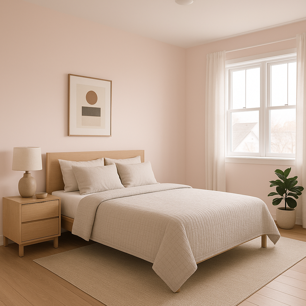
For bedrooms, Touch offers a calming and serene vibe that promotes relaxation. Consider pairing it with crisp white linens and muted accent colors for a tranquil retreat.
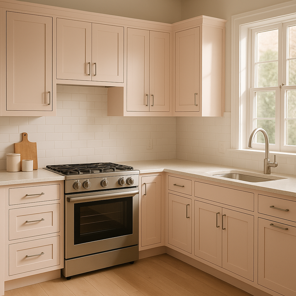
This warm neutral works beautifully in kitchens, especially when combined with white cabinetry and brushed brass hardware. Its understated elegance lends itself well to traditional or transitional kitchen designs.
Touch is an excellent choice for hallways and entryways due to its ability to brighten spaces with limited natural light. Its warm undertones ensure the space feels inviting and open.
Introduce Touch to your bathroom for a spa-like ambiance. Pair it with marble countertops, soft gray tiles, and polished chrome fixtures to create a timeless and luxurious look.
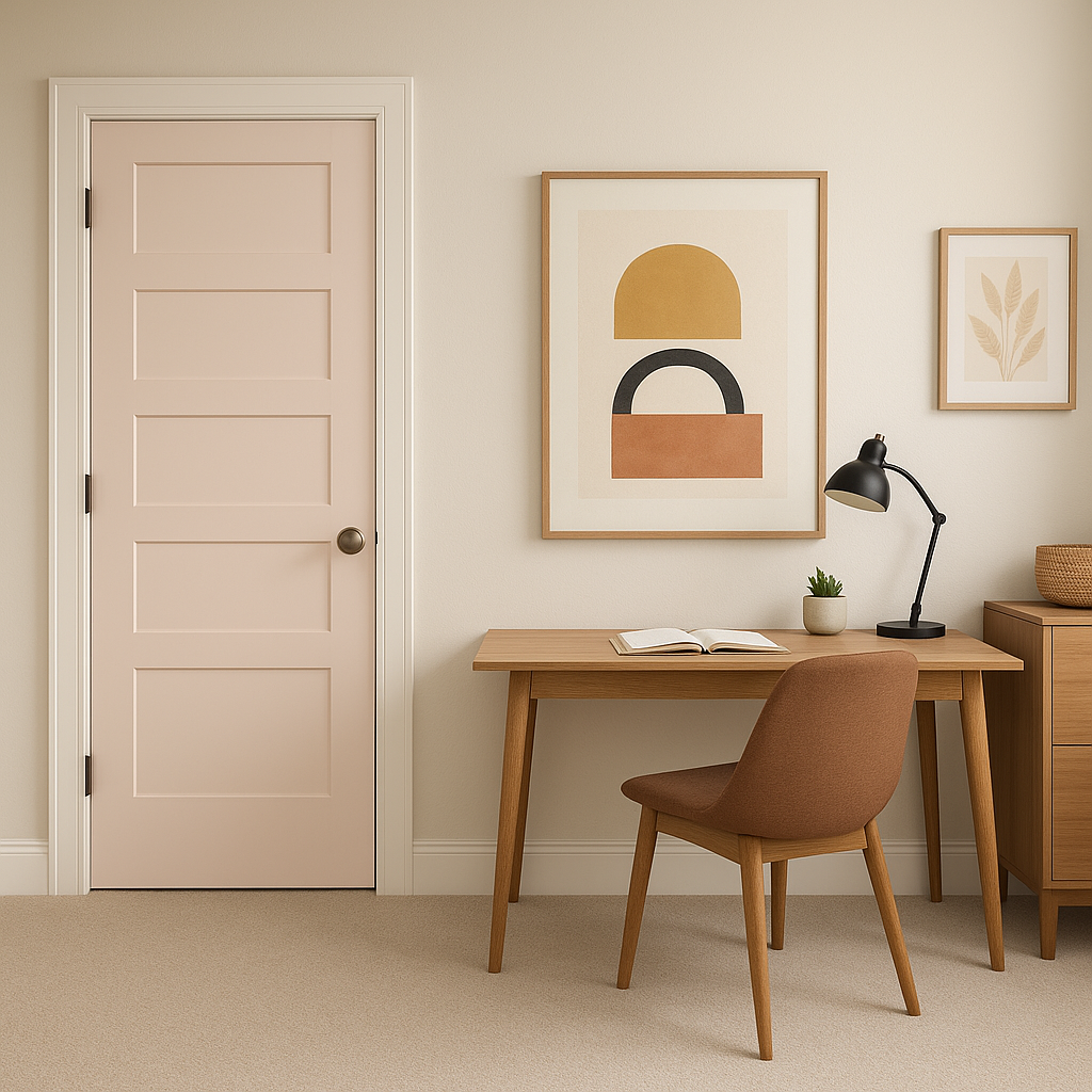
While neutral colors like Touch are often used on all walls, it can also work as an accent wall when paired with slightly darker or bolder tones to create visual interest.
Benjamin Moore Touch (2008-70) strikes the perfect balance between subtle sophistication and versatility. Its warm undertones and adaptability make it an excellent choice for anyone looking to create a harmonious, inviting space. Whether you’re styling a modern minimalist interior or a cozy traditional home, Touch offers a nuanced hue that enhances your design vision without overpowering the room.
With coordinating options ranging from crisp whites to deep blues and muted greens, Touch allows you to craft a palette that reflects your style and personality. Its ability to transform any room into a serene and elegant sanctuary makes it a standout choice for homeowners and designers alike.
View Colors Only by Brand (No Imagery):
Sherwin-Williams
|
Benjamin-Moore
|
Behr
|
Valspar
Live on the Eastern Slope of Colorado and looking for a local painting professional, check out all our painting services and reach out for a free estimate.
Copyright © 2026 : Wild Fox Painting Inc. : 12435 Mead Way, Littleton, CO 80125


