Benjamin Moore Powder (2009-70) is a soft and airy pastel blue that evokes a sense of tranquility and lightness. This delicate color offers a refreshing balance of cool tones, making it an excellent choice for creating soothing environments. Powder is versatile, bringing sophistication and calmness to any space without overpowering the decor. Its understated nature makes it a favorite among both modern and traditional design enthusiasts.
Powder (2009-70) carries subtle gray undertones, which lend the color a muted and refined quality. Unlike vibrant blues, its softness allows it to adapt beautifully to varying light conditions. In natural daylight, Powder reveals its gentle blue essence, while in artificial lighting, the gray undertones become more pronounced, giving the room a cozy and inviting feel.
Benjamin Moore Powder pairs beautifully with a range of complementary and contrasting colors, offering versatility in design. Here are some coordinating color recommendations:
Powder is a versatile shade that can be used in various rooms and design styles. Its gentle, relaxing nature makes it ideal for spaces where calmness and serenity are desired.
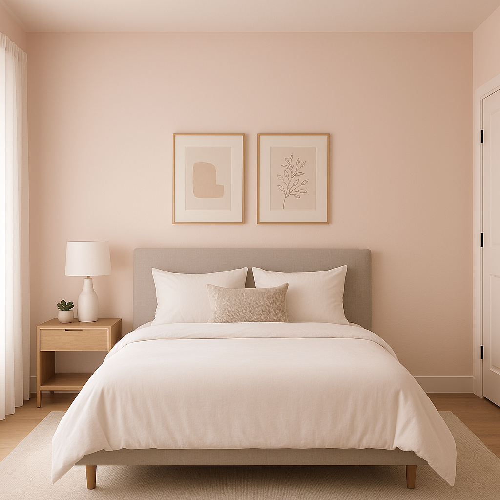
Powder is a perfect choice for bedrooms, offering a calming retreat to unwind after a long day. Pair it with soft white bedding, natural wood accents, and metallic fixtures for a dreamy, tranquil look.
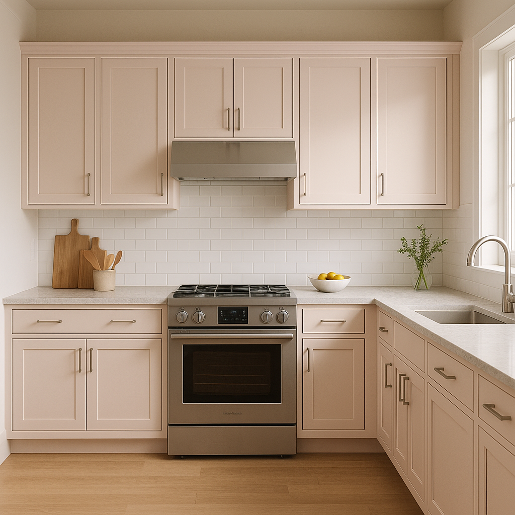
The fresh and clean feel of Powder works beautifully in bathrooms. Use it on walls alongside crisp white tiles, marble countertops, and silver hardware for a spa-like atmosphere.
This pastel blue creates a soft and nurturing environment, ideal for nurseries and children's rooms. Pair it with pale yellows, whites, or gentle greens for a playful yet serene setting.
Powder can bring a breath of fresh air to living rooms. It works well with coastal or cottage-inspired interiors, especially when paired with white or beige furniture and natural textures like rattan or linen.
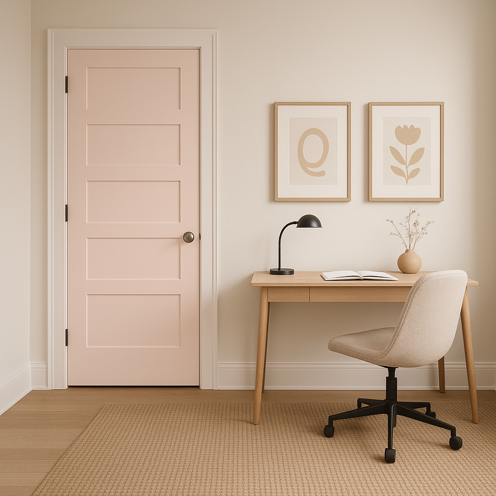
For a productive yet peaceful workspace, Powder offers a refreshing alternative to stark neutrals. Combine it with light wood furniture and brass accents to create a balanced and inspiring environment.
To amplify the elegance of Benjamin Moore Powder, consider pairing it with matte or eggshell finishes for walls, as these finishes enhance the soft, subdued nature of the color. Use glossy or semi-gloss finishes on trim or cabinetry to create subtle contrast and visual interest. Incorporating textures such as woven fabrics, brushed metals, or natural wood can help elevate the room’s design while maintaining the serene ambiance.
Benjamin Moore Powder responds beautifully to different lighting conditions. In spaces with abundant natural light, the soft blue tones shine through, creating a light and airy feel. However, in rooms with indirect or artificial lighting, the gray undertones become more visible, adding a cozy, grounded atmosphere. Always test the color in your space to see how it interacts with lighting throughout the day.
Benjamin Moore Powder (2009-70) is more than just a color—it’s an invitation to create spaces that feel calm, fresh, and effortlessly elegant. Whether you’re aiming for a coastal-inspired interior or a serene modern retreat, Powder is a timeless choice that adapts beautifully to your vision.
View Colors Only by Brand (No Imagery):
Sherwin-Williams
|
Benjamin-Moore
|
Behr
|
Valspar
Live on the Eastern Slope of Colorado and looking for a local painting professional, check out all our painting services and reach out for a free estimate.
Copyright © 2026 : Wild Fox Painting Inc. : 12435 Mead Way, Littleton, CO 80125


