Benjamin Moore Tomato (2010-10) is a vivid and fiery red that commands attention and brings a lively energy to any space. This color is ideal for homeowners and designers looking to make a bold statement or add a touch of drama to their interiors. With its undeniable richness and warmth, Tomato offers a timeless yet contemporary aesthetic that can transform both residential and commercial spaces.
Tomato is a pure red with subtle orange undertones, giving it a sun-kissed vibrancy that feels inviting rather than overpowering. These undertones lend the color a slightly warm disposition, making it versatile for a variety of looks. Unlike cooler reds with blue hints, Tomato leans toward the warm side of the spectrum, making it perfect for spaces that need a cozy, energetic vibe. Its orange undertones create depth and prevent the color from becoming flat or overly brash.
Pairing Benjamin Moore Tomato with complementary and coordinating colors can enhance its dynamic presence while creating balance in your design. Here are a few suggestions:
Benjamin Moore Tomato is a versatile color that can be used in a variety of design applications, whether as a primary hue or a strong accent. Below are some creative ways to incorporate Tomato into your interiors:
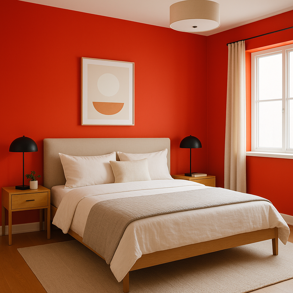
Make a bold statement with a Tomato-painted feature wall in a living room, dining room, or bedroom. This energetic red creates a focal point that instantly draws the eye and adds personality to the space.
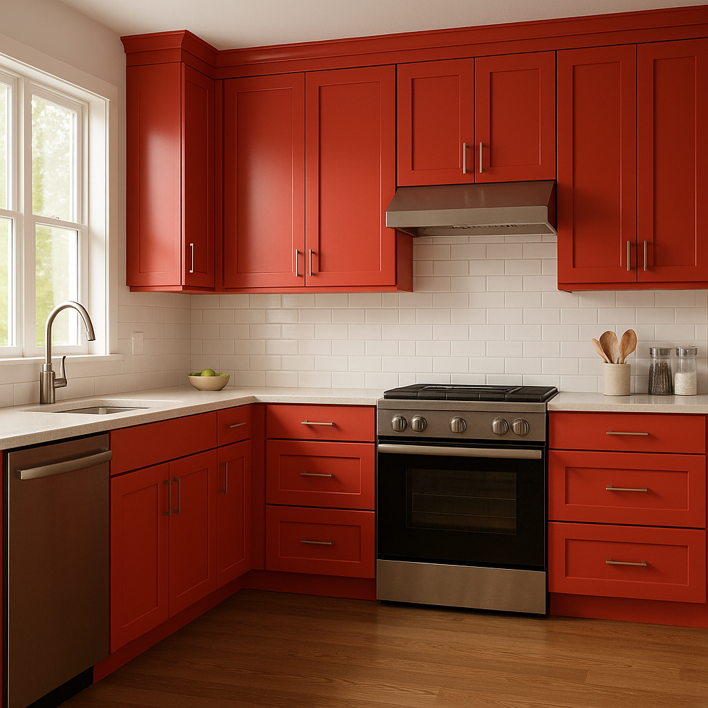
Tomato is a fantastic choice for kitchens and dining areas, as its warm undertones stimulate appetite and encourage lively conversation. Consider using it on cabinetry, an island base, or even as a backdrop wall paired with crisp white trim for a classic yet modern vibe.
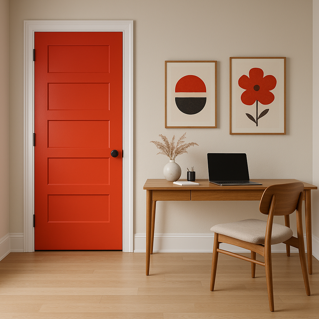
Create a welcoming and memorable impression by using Tomato in an entryway or foyer. Its boldness sets the tone for the rest of the home and exudes confidence and style.
If you’re hesitant to commit to an entire wall or room in Tomato, consider incorporating it through accents like furniture, artwork, or textiles. A Tomato-painted console table or a set of chairs can add just the right pop of color without overwhelming the space.
Tomato’s vibrant energy makes it a great choice for commercial spaces such as restaurants, retail stores, or creative studios. It fosters an atmosphere of enthusiasm and vitality, perfect for spaces where engagement and creativity are key.
Benjamin Moore Tomato (2010-10) is more than a paint color—it’s a design statement. Its warm undertones, compatibility with a wide range of coordinating colors, and ability to elevate both residential and commercial spaces make it a go-to choice for designers and homeowners alike. Whether you’re looking to energize a room, create a cozy vibe, or make a memorable impression, Tomato delivers bold style with timeless appeal.
View Colors Only by Brand (No Imagery):
Sherwin-Williams
|
Benjamin-Moore
|
Behr
|
Valspar
Live on the Eastern Slope of Colorado and looking for a local painting professional, check out all our painting services and reach out for a free estimate.
Copyright © 2026 : Wild Fox Painting Inc. : 12435 Mead Way, Littleton, CO 80125


