Benjamin Moore Frosty (2010-70) is a sophisticated, soft white that radiates a sense of calm and serenity. Its gentle appearance makes it a versatile choice for a variety of interior design styles, whether you're curating a minimalist sanctuary, a cozy cottage aesthetic, or a contemporary haven. This color strikes a perfect balance between being bright enough to amplify natural light while having subtle undertones that add depth and warmth to your space.
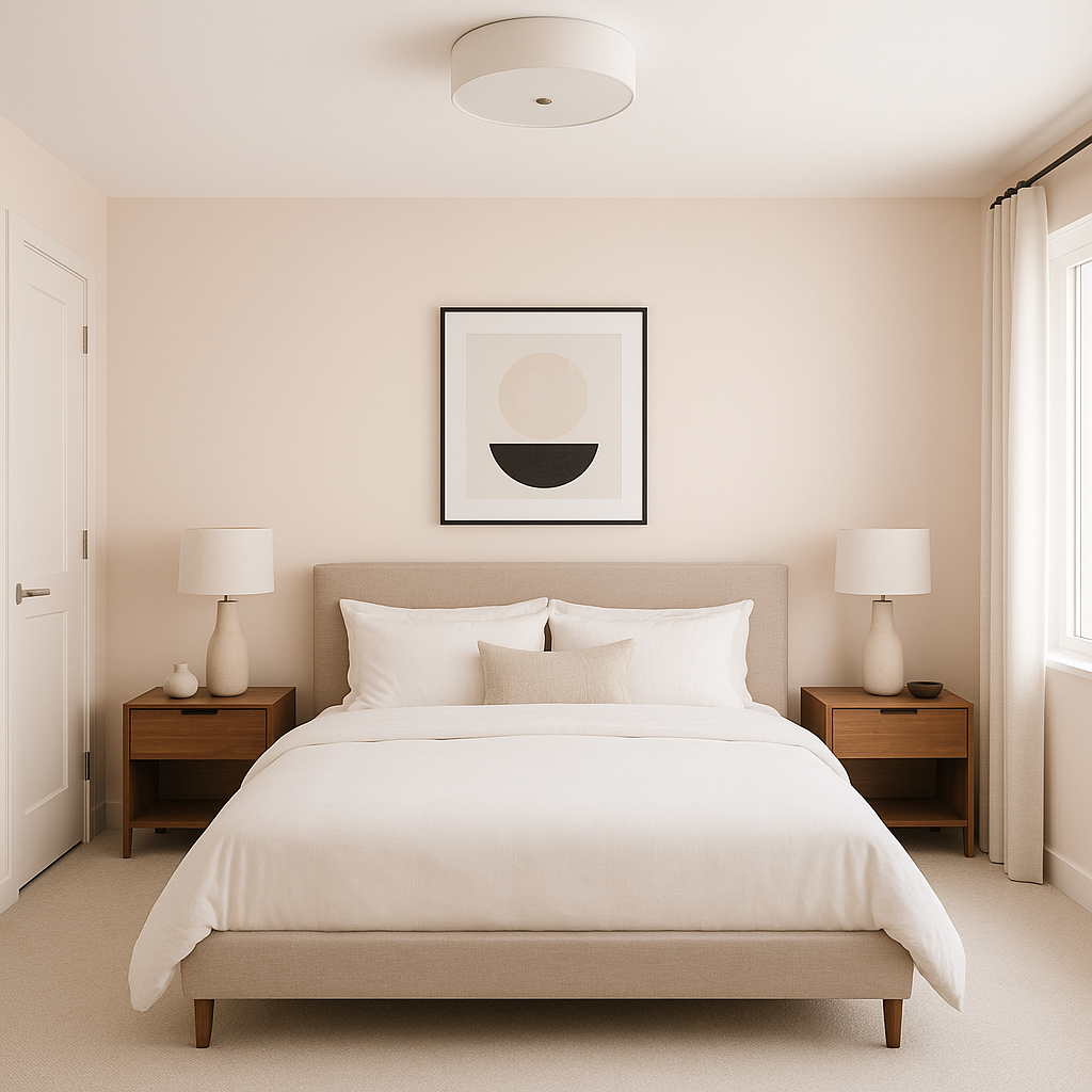
Frosty is not a stark, clinical white; instead, it carries subtle cool undertones that lean slightly toward gray. These undertones give the color a delicate softness, making it a refreshing yet approachable white. This cool base makes Frosty a fantastic option for spaces where you want to evoke tranquility and clarity, such as bedrooms, bathrooms, and home offices. It is particularly effective in rooms with ample natural light, where its cool undertones can balance out warmer sunlight, creating a luminous and inviting atmosphere.
The versatility of Frosty shines when paired with complementary colors. Whether you're looking to create a monochromatic palette or add contrast, this hue has endless possibilities:
Soft Neutrals: Pair Frosty with warm beige tones like Benjamin Moore’s Revere Pewter (HC-172) or Edgecomb Gray (HC-173) for a balanced, elegant look. These soft neutrals create a harmonious and cohesive feel.
Cool Grays: Enhance the cool undertones of Frosty with shades like Stonington Gray (HC-170) or Gray Owl (OC-52) for a modern, sophisticated aesthetic.
Blues and Greens: For a pop of color, combine Frosty with serene blues like Breath of Fresh Air (806) or muted greens such as Hollingsworth Green (HC-141). These shades bring out Frosty’s calming nature and create a tranquil, spa-like ambiance.
Bold Accents: If you're looking to add contrast, consider pairing Frosty with deep, dramatic hues such as Hale Navy (HC-154) or Black Ink (2127-20) for a striking, high-impact design.
Frosty’s adaptable and timeless quality makes it an excellent choice for a wide range of applications in your home:
Walls: As a wall color, Frosty creates a clean, crisp backdrop that works beautifully with both modern and traditional furnishings. Its soft undertones prevent it from feeling cold or sterile.
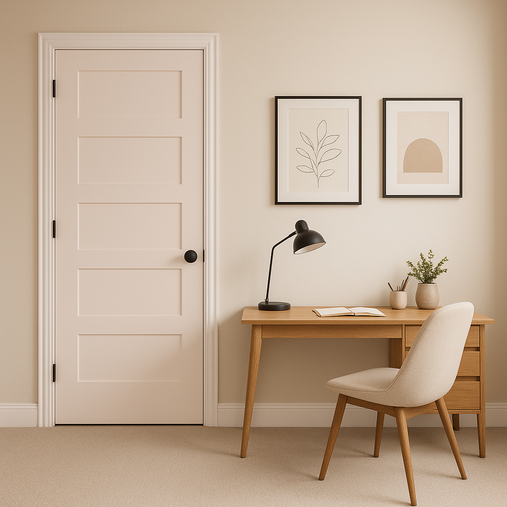
Trim and Molding: Use Frosty on trim, baseboards, and crown molding to add definition and refinement to your space. It pairs seamlessly with darker wall colors, creating a polished and balanced look.
Ceilings: Applying Frosty to ceilings can brighten your space and make the room feel larger and more open. Its subtle undertones prevent it from feeling overly bright or harsh.
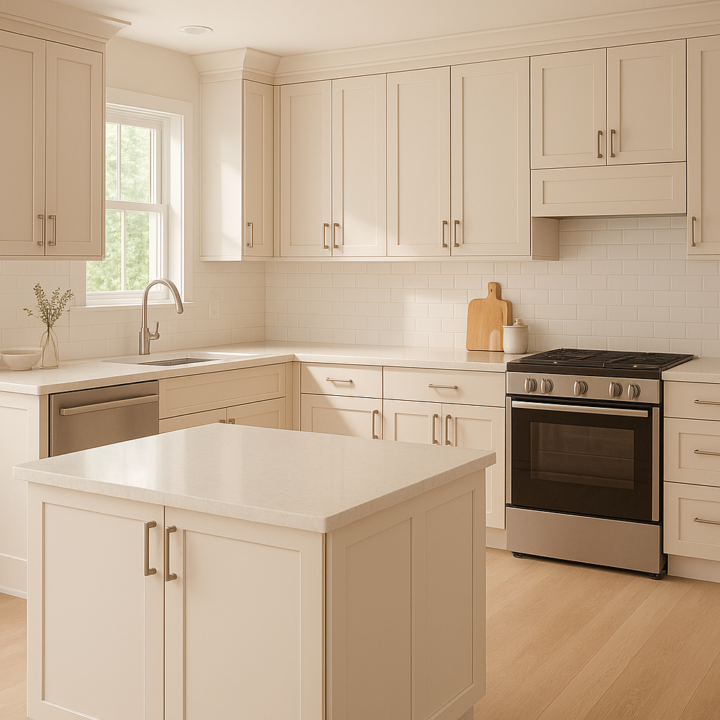
Kitchens and Bathrooms: The cool, crisp nature of Frosty makes it a favorite for kitchens and bathrooms. It pairs well with white cabinetry, marble countertops, and stainless steel finishes, creating a fresh and timeless aesthetic.
Exterior Use: Frosty is also an excellent choice for exterior trim or siding, offering a clean, classic appearance that complements a wide range of architectural styles.
Benjamin Moore Frosty (2010-70) is the epitome of understated elegance. Its soft, cool undertones and versatility make it a reliable choice for homeowners and designers alike. Whether you’re aiming to create a tranquil retreat, a bright and airy space, or a contemporary design with bold accents, Frosty offers the perfect foundation.
With its serene demeanor and ability to coordinate effortlessly with a wide variety of colors, Frosty is more than just a white paint—it’s a timeless canvas that elevates any room.
View Colors Only by Brand (No Imagery):
Sherwin-Williams
|
Benjamin-Moore
|
Behr
|
Valspar
Live on the Eastern Slope of Colorado and looking for a local painting professional, check out all our painting services and reach out for a free estimate.
Copyright © 2026 : Wild Fox Painting Inc. : 12435 Mead Way, Littleton, CO 80125


