Benjamin Moore Orange (2011-10) is a bold, energetic shade that radiates warmth and creativity. This striking orange hue is an excellent choice for anyone looking to inject personality and vibrancy into their space. Its rich saturation and dynamic presence make it a standout color that balances playfulness with sophistication.
Benjamin Moore Orange features a warm base with subtle red undertones, giving it a lively depth that feels inviting without being overpowering. The red undertones add a touch of richness, making this color more versatile than a standard orange. These undertones ensure that the hue leans toward a fiery, autumnal orange rather than a pastel or muted version, making it ideal for spaces that crave a sense of energy and movement.
To create a harmonious palette, pair Benjamin Moore Orange with complementary or contrasting colors that balance its intensity:
Neutral Pairings: Soft neutrals such as Benjamin Moore Simply White (OC-117) or Classic Gray (1548) allow the orange to shine as the focal point. These shades provide a calm and grounding effect, ensuring the vibrancy of the orange doesn't overwhelm the space.
Cool Contrasts: For a dynamic and modern look, pair this shade with cool blues or greens like Hale Navy (HC-154) or Seafoam Green (2039-60). These cooler tones provide contrast and create a balanced, eye-catching aesthetic.
Earthy Complements: For a cozy and layered look, combine Benjamin Moore Orange with earthy tones like Kendall Charcoal (HC-166) or Olive Branch (2143-30). These shades enhance the warmth of the orange while maintaining a sophisticated feel.
Bright Accents: If you're aiming for a bold, eclectic style, consider pairing this orange with other vibrant hues like Calypso Blue (727) or Sunlit Coral (2170-60). These combinations bring out the playful energy of the orange, creating a lively and unforgettable space.
Benjamin Moore Orange is a versatile color that can be used in a variety of settings, both residential and commercial. Here are some creative applications for this vibrant shade:
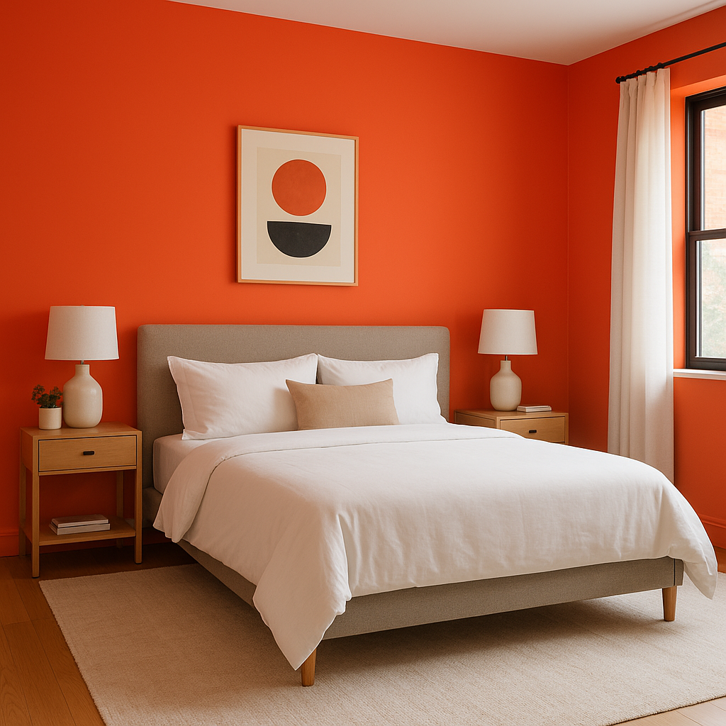
Accent Walls: This color works beautifully as an accent wall in living rooms, dining rooms, or bedrooms. It adds warmth and visual interest without overwhelming the entire space.
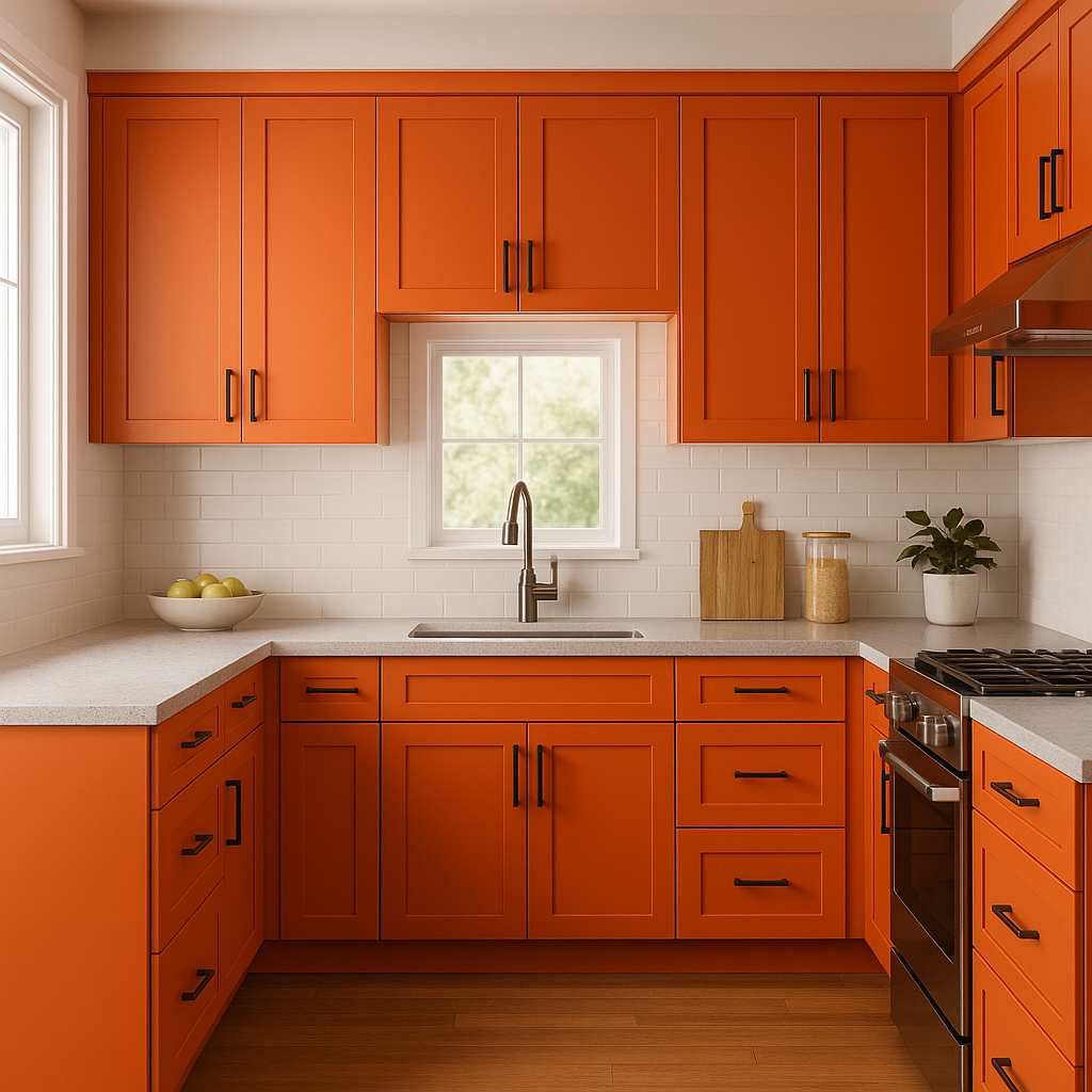
Kitchens and Dining Areas: Orange is often associated with energy and appetite, making it an excellent choice for kitchen cabinetry, a backsplash, or even a dining room wall. Pair it with white countertops or wooden furniture for a balanced look.
Creative Spaces: If you want to inspire creativity, use this hue in home offices, studios, or playrooms. Its vibrant energy fosters an atmosphere of innovation and enthusiasm.
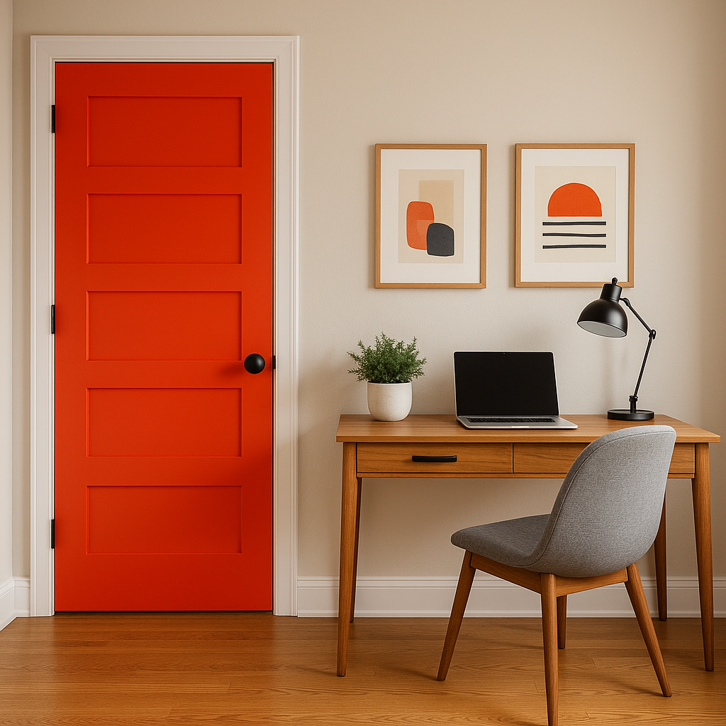
Front Doors and Exteriors: For curb appeal that turns heads, consider painting your front door in Benjamin Moore Orange. It’s a bold yet inviting choice that works well with neutral or earthy exterior siding.
Furniture and Décor: For a subtler approach, incorporate this shade into your space through furniture, throw pillows, rugs, or artwork. These touches can add pops of color without committing to painting walls.
As with any bold color, the appearance of Benjamin Moore Orange can vary depending on the lighting in your space. In natural daylight, its vibrancy shines, making the tone feel lively and invigorating. In artificial light, especially warm lighting, the red undertones may become more pronounced, creating a cozy and enveloping feel. Be sure to test this shade in your specific space to see how it interacts with your lighting conditions throughout the day.
Benjamin Moore Orange (2011-10) is a spirited and versatile choice for anyone seeking a warm, eye-catching color. Whether you use it as a bold accent or a primary feature, this shade is sure to transform your space into a lively and inviting environment.
View Colors Only by Brand (No Imagery):
Sherwin-Williams
|
Benjamin-Moore
|
Behr
|
Valspar
Live on the Eastern Slope of Colorado and looking for a local painting professional, check out all our painting services and reach out for a free estimate.
Copyright © 2026 : Wild Fox Painting Inc. : 12435 Mead Way, Littleton, CO 80125


