Benjamin Moore Springy (2011-60) is a soft, uplifting pastel green that exudes a sense of renewal, energy, and tranquility. Perfectly capturing the essence of springtime, this hue brings a fresh and airy quality to interiors, making it an excellent choice for creating inviting and serene spaces. Its subtle vibrancy makes it versatile enough to pair with a wide range of complementary colors, while its gentle tone ensures it remains soothing and approachable.
Springy (2011-60) is a light green with soft yellow undertones, giving the color a warm, cheerful character. These yellow undertones balance the coolness typically associated with greens, making Springy feel more welcoming and sunny than stark or clinical. The result is a hue that brightens up spaces while maintaining a soft, natural elegance.
This balance of warm and cool elements makes Springy particularly adaptable, allowing it to work beautifully in both traditional and modern design schemes.
Springy pairs effortlessly with a variety of colors, whether you want to create a serene monochromatic palette or introduce contrasting tones for added depth and interest. Here are some coordinating color suggestions to bring out the best in Springy:
Thanks to its light, luminous quality, Springy (2011-60) is a versatile paint color that works well in a variety of spaces. Its soothing nature makes it especially suited to areas where relaxation and comfort are key, but its cheerful energy also allows it to shine in livelier environments.
Springy is perfect for creating a bright and inviting living room. Use it as a wall color to establish a backdrop that feels vibrant yet calming, and pair it with natural textures like wood or wicker for an earthy, welcoming aesthetic.
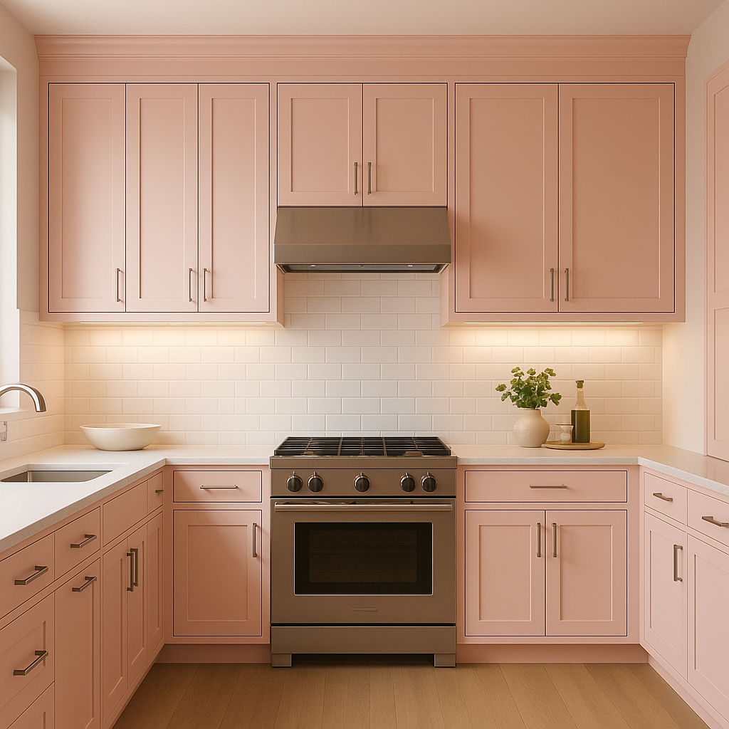
The fresh, clean appeal of Springy makes it an excellent choice for kitchens and dining spaces. Pair it with white cabinetry and polished chrome hardware for a crisp, modern look, or introduce warm wood tones for a more rustic feel.
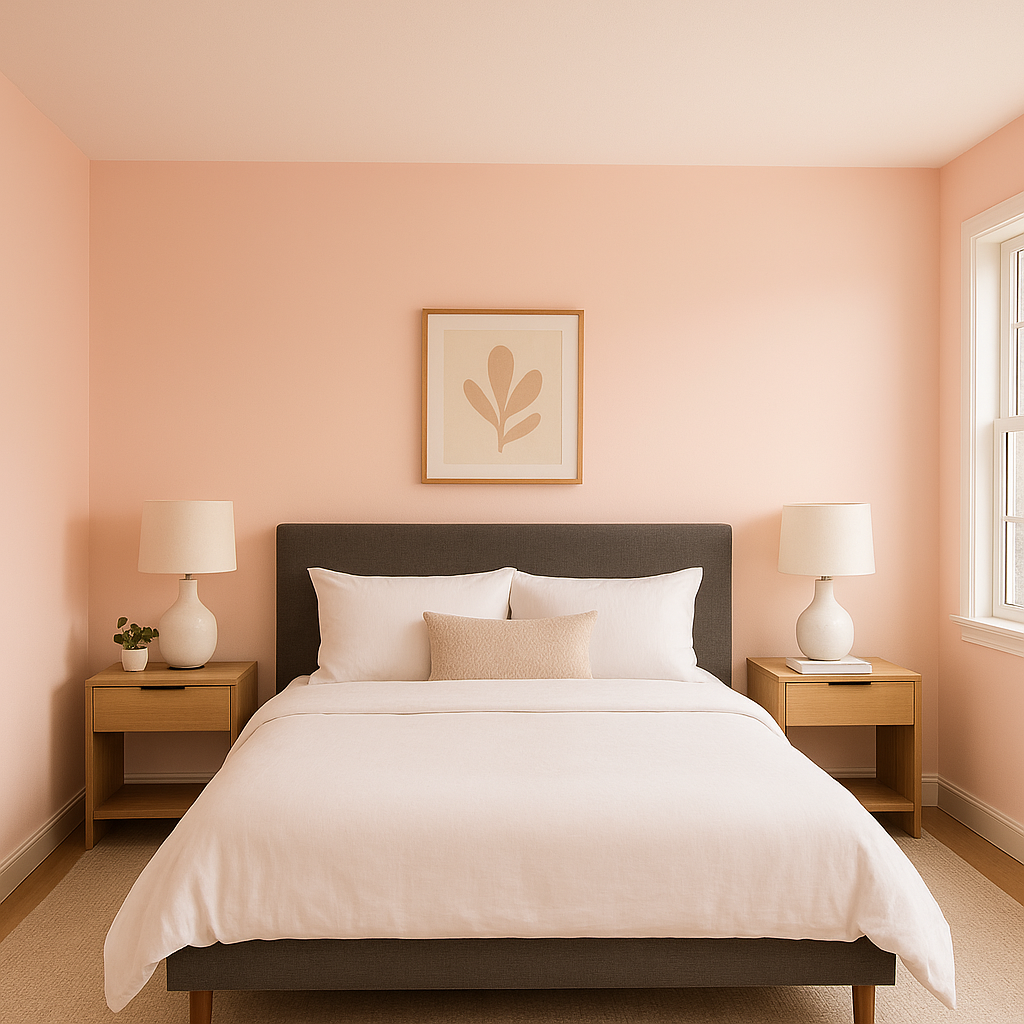
Transform your bedroom into a tranquil retreat with Springy on the walls. Its soft green hue promotes relaxation and pairs beautifully with neutral bedding and soft textiles. Add touches of gold or brass for a hint of sophistication.
Bring a spa-like atmosphere to your bathroom with Springy. The light green tone works beautifully with white tile and natural stone, creating a serene and rejuvenating space.
Springy’s cheerful yet soothing quality makes it a wonderful option for nurseries or children’s spaces. Its pastel nature gives the room a playful vibe without being overwhelming. Pair it with fun patterns or colorful accents for an added sense of whimsy.
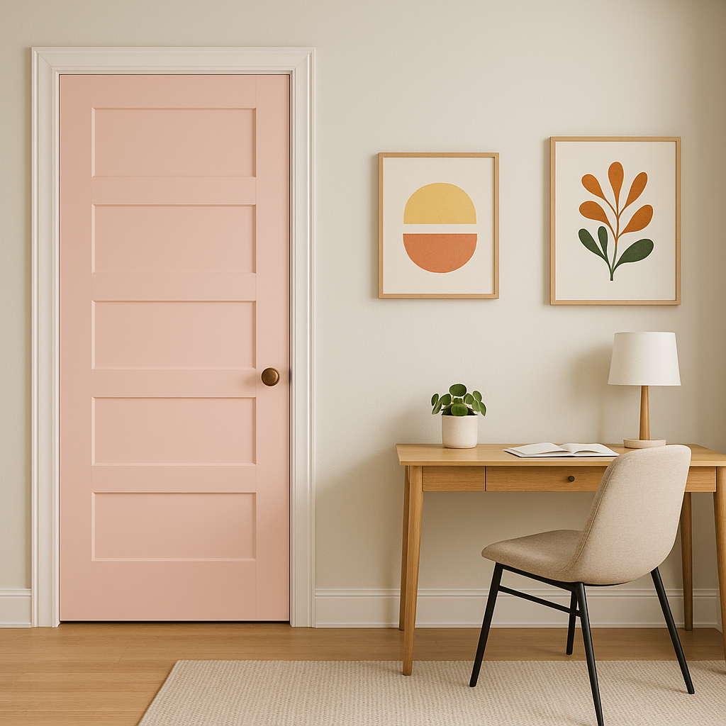
If you’re not ready to commit to Springy as an all-over wall color, consider using it as an accent. Paint a feature wall, a piece of furniture, or even cabinetry to introduce a pop of fresh color in a more subtle way.
Benjamin Moore Springy (2011-60) is more than just a paint color—it’s a mood enhancer. Its refreshing, nature-inspired hue brings the outdoors in, filling your home with a sense of lightness and vitality. Whether you’re looking to create a serene retreat, a cheerful family space, or a stylish contemporary room, Springy’s versatile nature ensures it will elevate your design.
With its soft yellow undertones, wide range of coordinating colors, and suitability for various rooms, Springy is a timeless choice that works beautifully in any setting. Whether you're embarking on a full-scale renovation or simply looking to refresh a single room, this delightful green will breathe new life into your space.
View Colors Only by Brand (No Imagery):
Sherwin-Williams
|
Benjamin-Moore
|
Behr
|
Valspar
Live on the Eastern Slope of Colorado and looking for a local painting professional, check out all our painting services and reach out for a free estimate.
Copyright © 2026 : Wild Fox Painting Inc. : 12435 Mead Way, Littleton, CO 80125


