Benjamin Moore Tawny (2012-10) is a rich, warm neutral that exudes a sense of comfort and sophistication. This mid-tone earthy shade draws inspiration from sun-kissed clay and desert landscapes, making it a versatile and timeless choice for interiors. Tawny's unique blend of warmth and depth allows it to seamlessly adapt to various design styles, from modern rustic to classic traditional.
Tawny carries distinct warm undertones, primarily rooted in orange and red hues. These undertones give it a cozy, approachable character while maintaining a grounded, natural vibe. The red undertones add a soft vibrancy, ensuring the color feels lively yet balanced. Depending on the lighting, Tawny can appear slightly terracotta-like in brighter spaces or lean towards a muted, earthy brown in dimmer settings. This dynamic quality makes it an engaging and versatile paint color.
Benjamin Moore Tawny pairs beautifully with a range of colors, offering endless possibilities for coordination. Here are some curated suggestions:
Tawny’s versatility makes it an excellent choice for a variety of spaces and design applications. Here’s how you can use this color to elevate your interiors:
Tawny creates a warm, inviting atmosphere in living rooms, making it a wonderful choice for walls. Pair it with soft beige or cream-colored furniture for a classic look, or layer in bold accents like navy or emerald green for a modern twist.
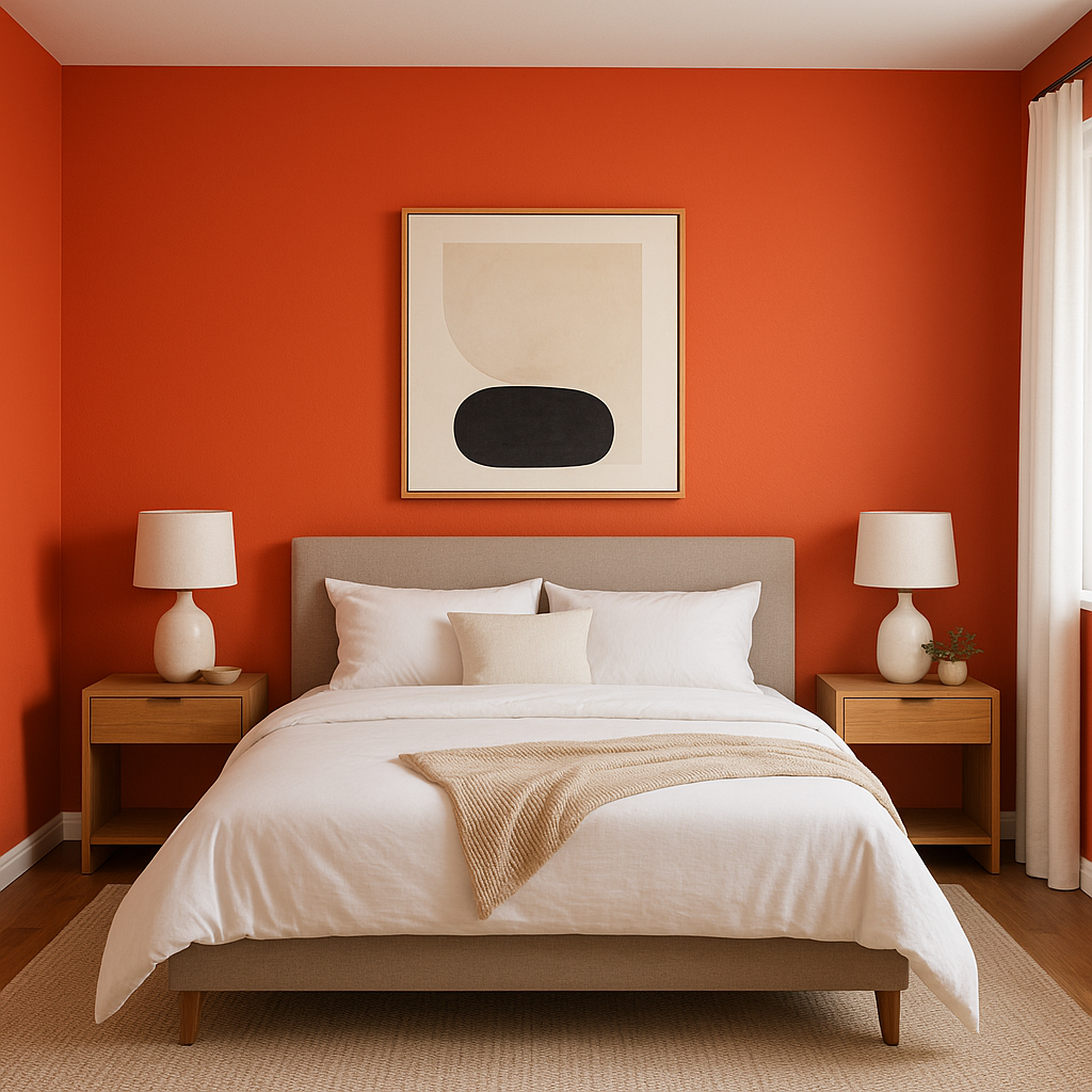
In bedrooms, Tawny’s cozy warmth fosters a sense of relaxation and comfort. Use it as a feature wall color behind the bed, complemented by crisp white linens and natural wood furniture for a soothing, earthy retreat.
Tawny’s rich, earthy tone adds depth and elegance to dining spaces. Highlight it with metallic accents like brushed gold or bronze in light fixtures and tableware to enhance the room’s sophistication.
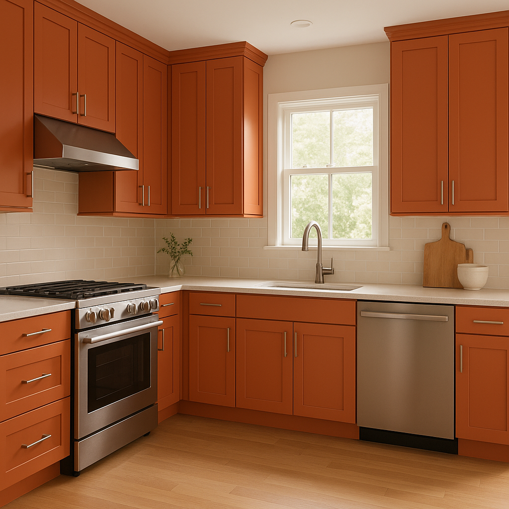
For kitchens, Tawny works beautifully on cabinetry or as an accent wall, especially when paired with white subway tiles and dark granite countertops. Its warm undertones create a welcoming environment that feels both stylish and functional.
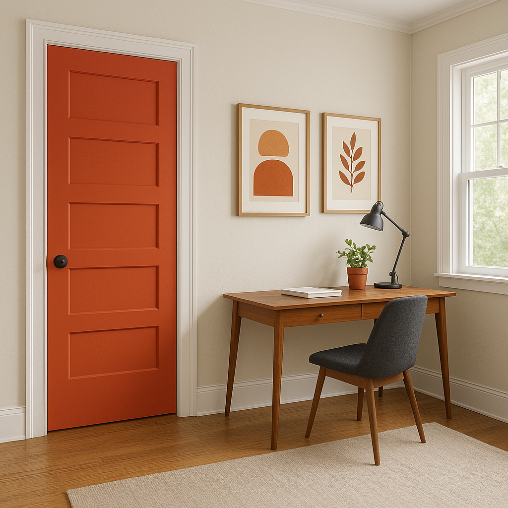
In transitional spaces like hallways and entryways, Tawny sets a welcoming tone for the home. Pair it with lighter, neutral trim colors to keep the space feeling open and inviting.
Lighting plays a significant role in how Benjamin Moore Tawny is perceived. In rooms with abundant natural light, Tawny’s orange and red undertones become more pronounced, radiating warmth and energy. In spaces with lower light levels or artificial lighting, it takes on a softer, more subdued appearance, emphasizing its earthy, grounded nature.
Benjamin Moore Tawny (2012-10) is an excellent choice for those seeking a warm, versatile color that adds character and coziness to any space. Its inviting undertones, ability to coordinate with a variety of shades, and adaptability to different lighting conditions make it a standout option for both residential and commercial interiors.
Whether you’re looking to create a relaxed, earthy ambiance or a sophisticated, layered design, Benjamin Moore Tawny is a color that delivers timeless appeal with a touch of warmth and personality.
View Colors Only by Brand (No Imagery):
Sherwin-Williams
|
Benjamin-Moore
|
Behr
|
Valspar
Live on the Eastern Slope of Colorado and looking for a local painting professional, check out all our painting services and reach out for a free estimate.
Copyright © 2026 : Wild Fox Painting Inc. : 12435 Mead Way, Littleton, CO 80125


