Benjamin Moore Creamy (2012-60) is an inviting, soft neutral that epitomizes warmth and versatility. Perfectly named, this shade exudes a creamy richness that feels both comforting and sophisticated. It is an ideal choice for homeowners and designers looking to create serene yet welcoming spaces. Its subtle elegance allows it to function as a foundational color or a complementary accent in various design schemes, making it a staple for modern, traditional, and transitional interiors alike.
The beauty of Benjamin Moore Creamy lies in its soft, warm undertones. This hue features a delicate balance of yellow and beige, giving it a creamy, buttery appearance without veering too heavily into golden or overly saturated territory. The yellow undertones lend a cheerful warmth to the color, while the beige influence keeps it grounded and neutral, making it easy to pair with a wide range of palettes.
Its understated warmth ensures it doesn’t feel stark or cold, unlike some cooler neutrals. It’s also a forgiving shade that adapts well to different lighting conditions, maintaining its inviting character whether in natural sunlight or artificial light.
Benjamin Moore Creamy offers exceptional versatility when it comes to coordinating colors. Its warm undertones make it an excellent companion to both cool and warm palettes, allowing you to design spaces that feel harmonious and well-balanced.
If you’re looking to inject vibrancy into the space, consider pairing Creamy with rich jewel tones like Benjamin Moore Hale Navy (HC-154) or Caliente (AF-290). These bold choices create a dynamic contrast, allowing Creamy to act as a soothing backdrop.
Creamy is a fantastic choice for living rooms, providing a warm and inviting atmosphere that feels effortlessly elegant. Pair it with soft beige or taupe furnishings for a classic look, or mix it with bold accent pieces for a modern twist.
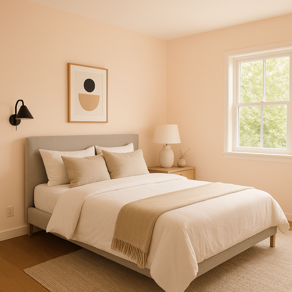
For bedrooms, Creamy creates a tranquil retreat. Its soothing undertones lend themselves well to cozy textiles like linen or soft wool. Coordinate with muted pastels or earth tones for a calm and restful environment.
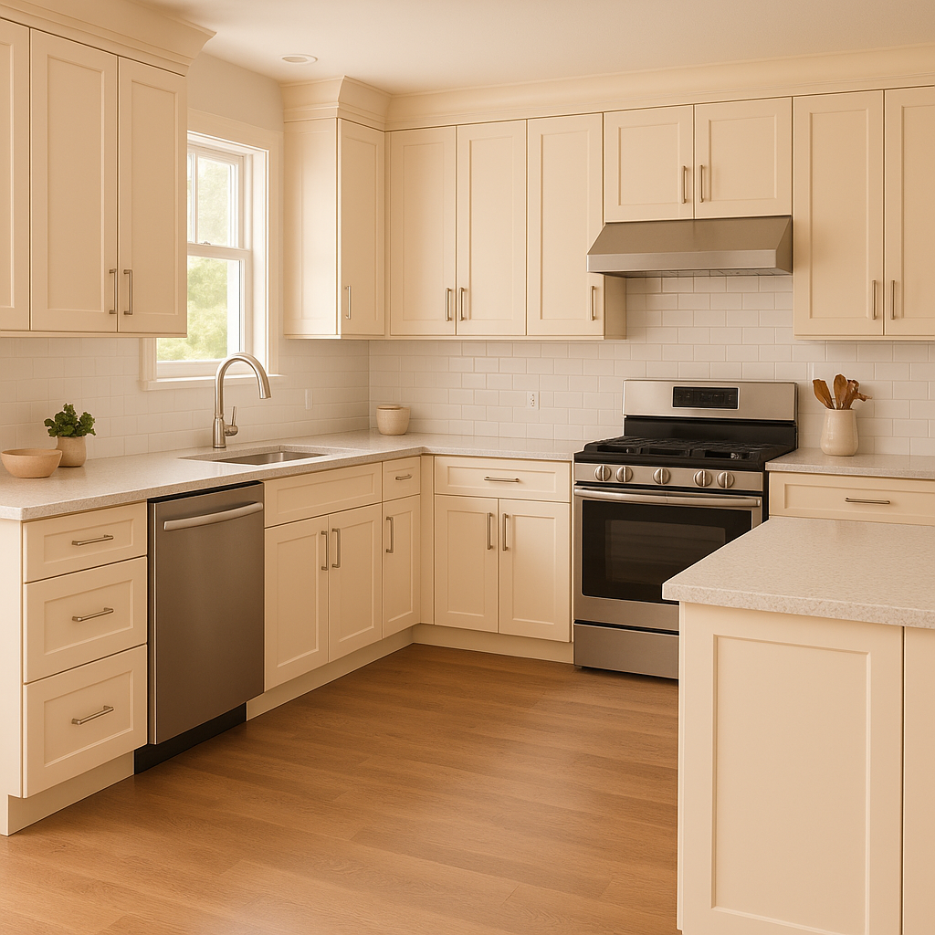
Creamy is a popular option for kitchens due to its timeless appeal. Use it on walls, cabinetry, or even backsplashes to create a bright yet grounded space. Pair it with subway tiles and brushed nickel hardware for a classic aesthetic or with bronze accents for a rustic charm.
In bathrooms, Creamy’s warm undertones help create a spa-like feel, especially when paired with crisp whites or soft grays. Add natural materials like marble or wood to enhance the serene ambiance.
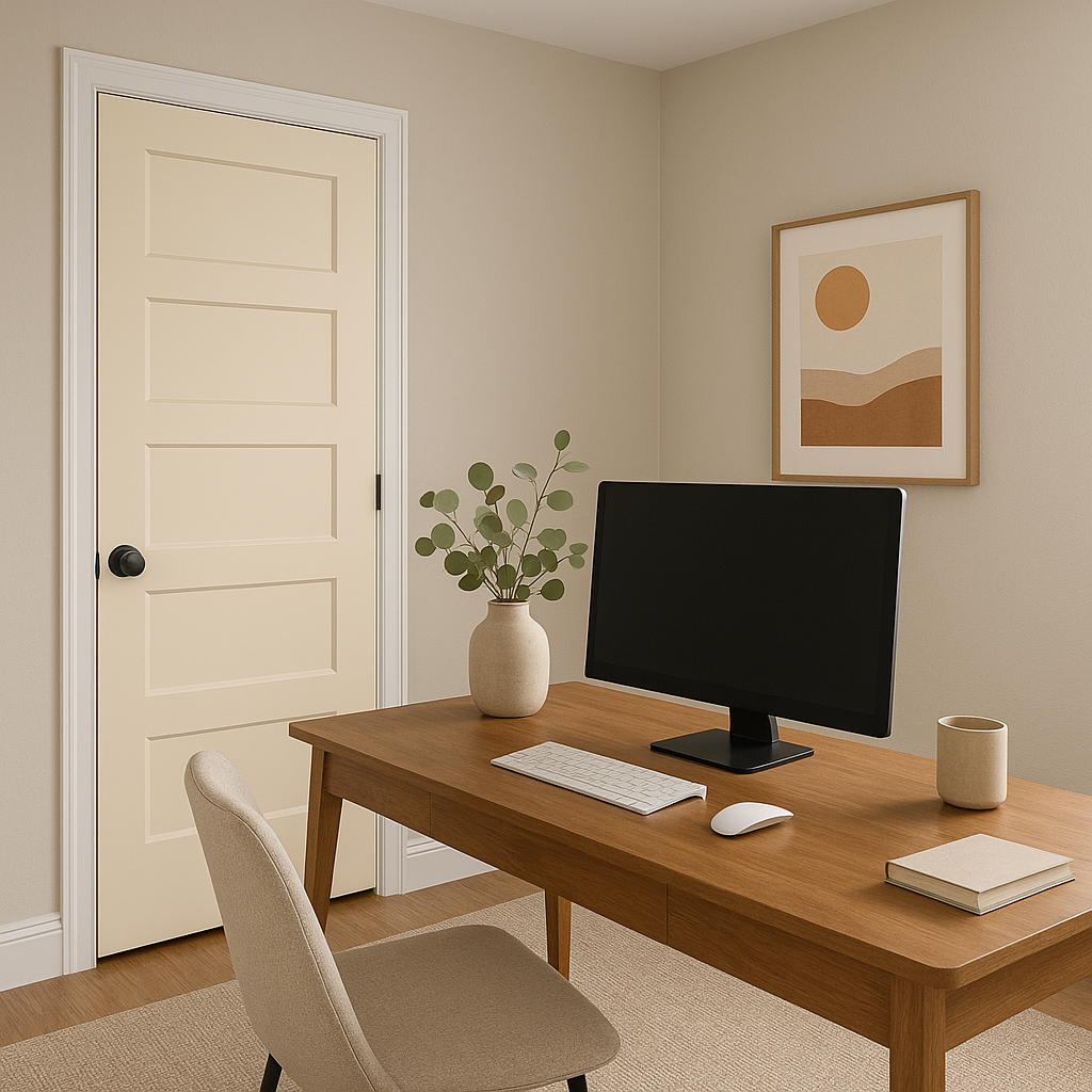
Transform transitional spaces like hallways and entryways into bright, welcoming areas with Creamy. Its adaptable nature ensures it complements adjoining rooms easily, creating a cohesive flow throughout your home.
Don’t overlook Creamy for exterior projects! Its warm, neutral tone works beautifully on siding, trim, or shutters, offering an understated elegance that stands out in various lighting conditions.
Benjamin Moore Creamy (2012-60) is more than just a paint color—it's a design solution that brings warmth, sophistication, and adaptability to any space. Whether you’re creating a cozy retreat or a polished entertaining area, this shade provides the perfect balance of softness and richness. With its versatile undertones and ability to coordinate with a wide range of colors, Creamy is a timeless choice that elevates interiors and exteriors alike.
View Colors Only by Brand (No Imagery):
Sherwin-Williams
|
Benjamin-Moore
|
Behr
|
Valspar
Live on the Eastern Slope of Colorado and looking for a local painting professional, check out all our painting services and reach out for a free estimate.
Copyright © 2026 : Wild Fox Painting Inc. : 12435 Mead Way, Littleton, CO 80125


