Benjamin Moore Dusk (2013-40) is a deeply captivating color that evokes a sense of timeless sophistication and serene mystery. This unique hue is part of Benjamin Moore’s Color Preview collection, designed to inspire creativity and allow for bold yet harmonious designs. Perfectly balanced between warm and cool tones, Dusk is an exquisite choice for anyone seeking a color with depth, versatility, and refined charm.
The magic of Dusk lies in its complex undertones. This shade is a muted purple-gray, with soft plum and lavender influences that give it both a romantic and contemporary edge. The gray undertones help anchor the color, lending it a subtle neutrality that makes it adaptable to a variety of palettes. However, the faint purple essence brings warmth and personality, ensuring that Dusk never feels cold or sterile.
Depending on the lighting, Dusk can shift its character:
Benjamin Moore Dusk is a versatile shade that pairs beautifully with a wide range of complementary and contrasting colors. Whether you want to create a serene monochromatic look or add pops of vibrancy for contrast, here are some excellent coordinating options:
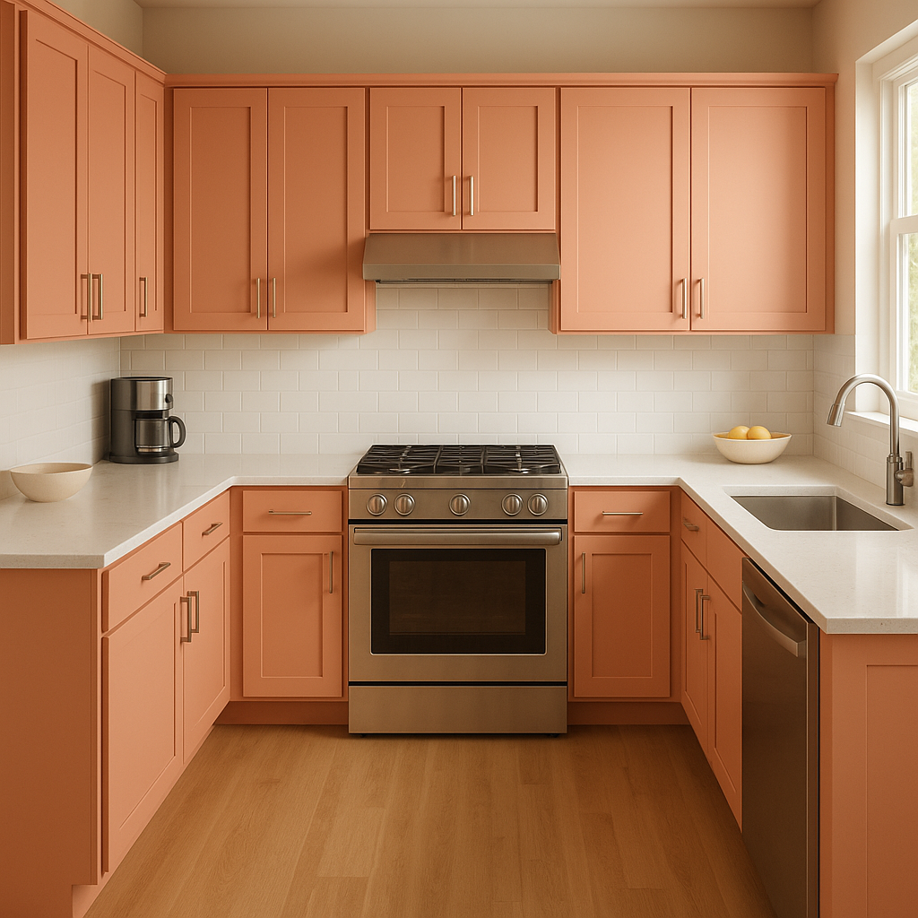
Dusk is incredibly versatile and can be used in a variety of settings, from cozy residential spaces to chic commercial interiors. Its balance of drama and softness makes it suitable for both modern and classic designs.
Create a cozy, inviting atmosphere by using Dusk on the walls of your living room. Pair it with plush textiles in gray and lavender tones, and accentuate the space with metallic finishes, such as brushed gold or silver.
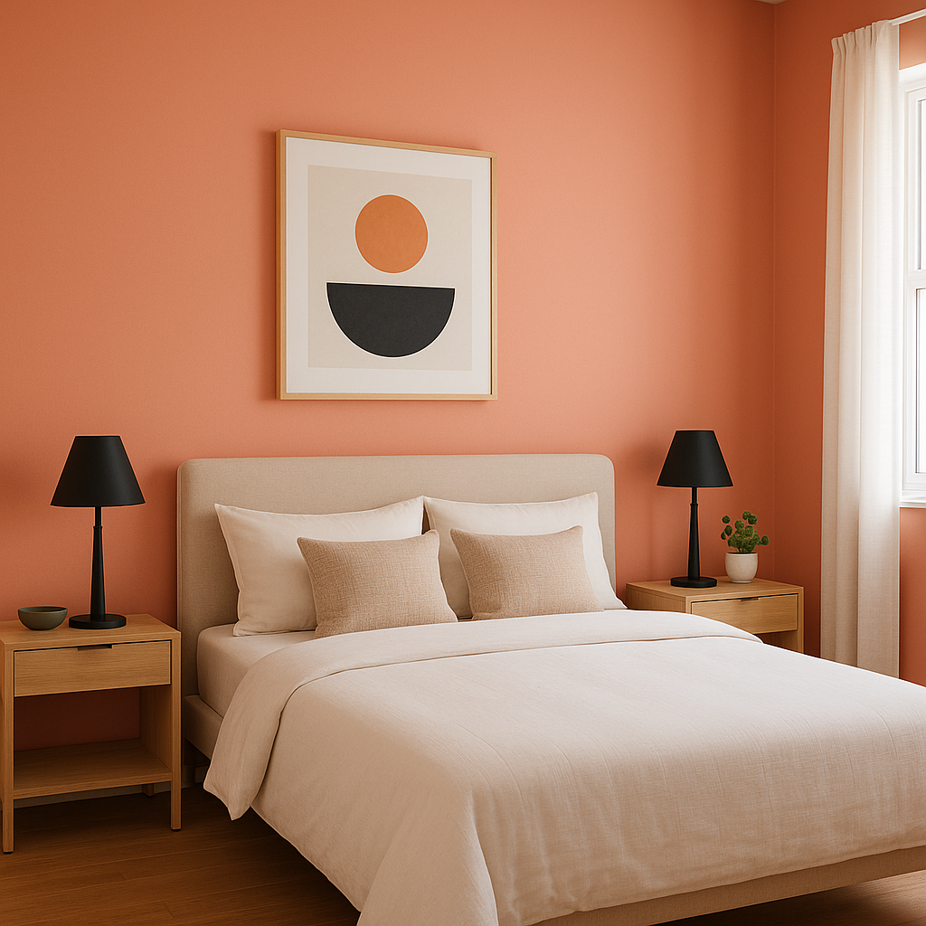
Dusk is an ideal choice for bedrooms, where its calming purple-gray undertones promote relaxation and tranquility. Layer it with soft whites, creams, or even deeper charcoals for a luxurious and restful retreat.
For a spa-like bathroom, use Dusk on the walls and pair it with white subway tiles, marble countertops, and polished chrome fixtures. The muted purple undertones will add a touch of sophistication without overwhelming the space.
Dusk’s moody elegance makes it perfect for dining rooms, where you want to create an intimate and upscale environment. Pair it with rich wood tones and dramatic lighting to enhance the ambiance.
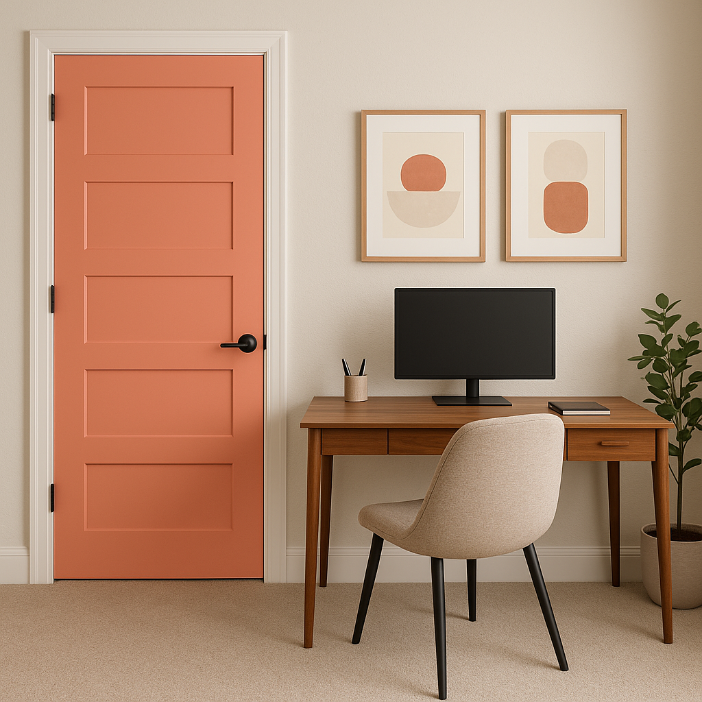
If you’re not ready to commit to Dusk for an entire room, use it as an accent wall to add depth and character. It pairs beautifully with light neutral walls or even brighter colors for a striking focal point.
The way Benjamin Moore Dusk appears depends heavily on the lighting in your space. To ensure you achieve your desired look, test the color in different lighting conditions before committing to it. For darker spaces, consider pairing Dusk with lighter, reflective shades to prevent the room from feeling too heavy. In brighter spaces, allow the natural light to showcase Dusk’s subtle complexity.
Benjamin Moore Dusk (2013-40) is a color that exudes elegance, versatility, and depth. With its rich undertones and ability to coordinate seamlessly with a range of palettes, it’s a perfect choice for homeowners and designers seeking to create sophisticated and inviting spaces. Whether used as a main wall color, an accent shade, or even in furnishings, Dusk will elevate your interiors with its timeless charm.
View Colors Only by Brand (No Imagery):
Sherwin-Williams
|
Benjamin-Moore
|
Behr
|
Valspar
Live on the Eastern Slope of Colorado and looking for a local painting professional, check out all our painting services and reach out for a free estimate.
Copyright © 2026 : Wild Fox Painting Inc. : 12435 Mead Way, Littleton, CO 80125


