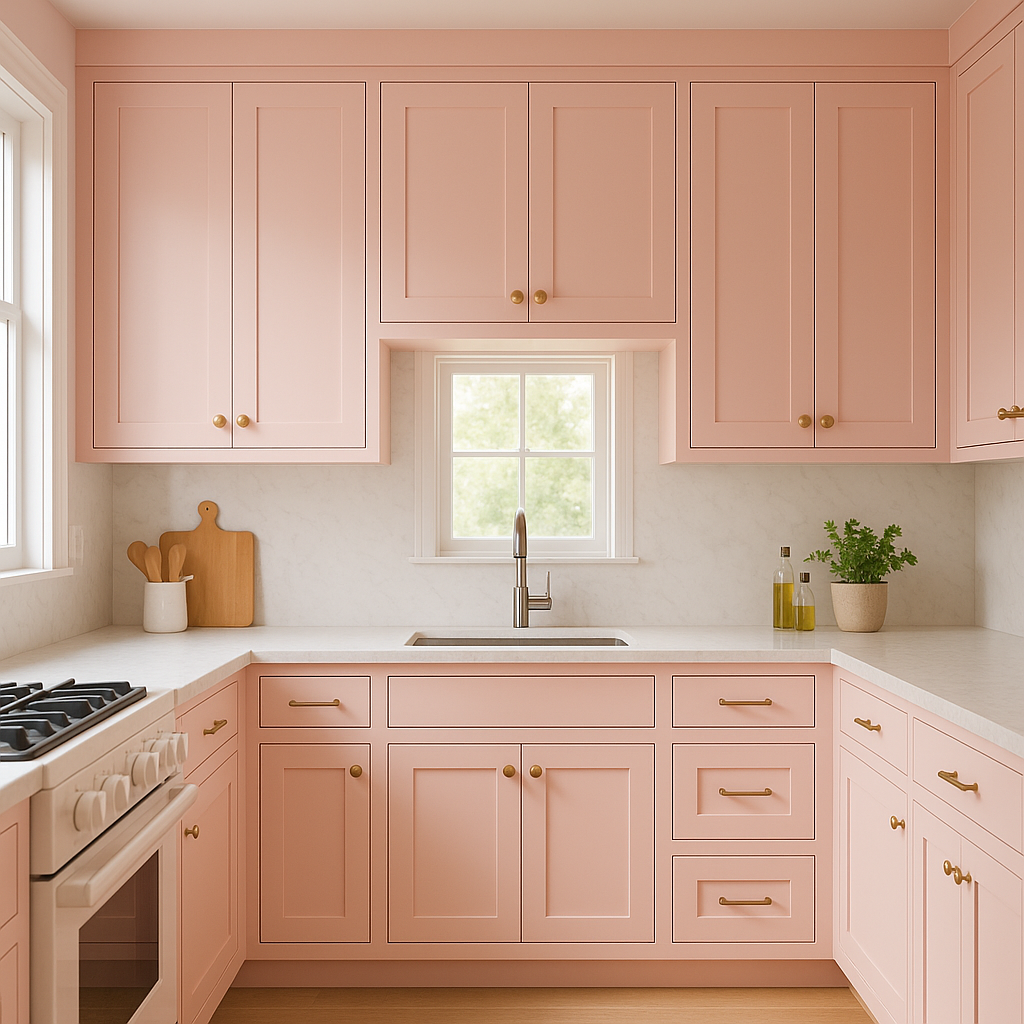
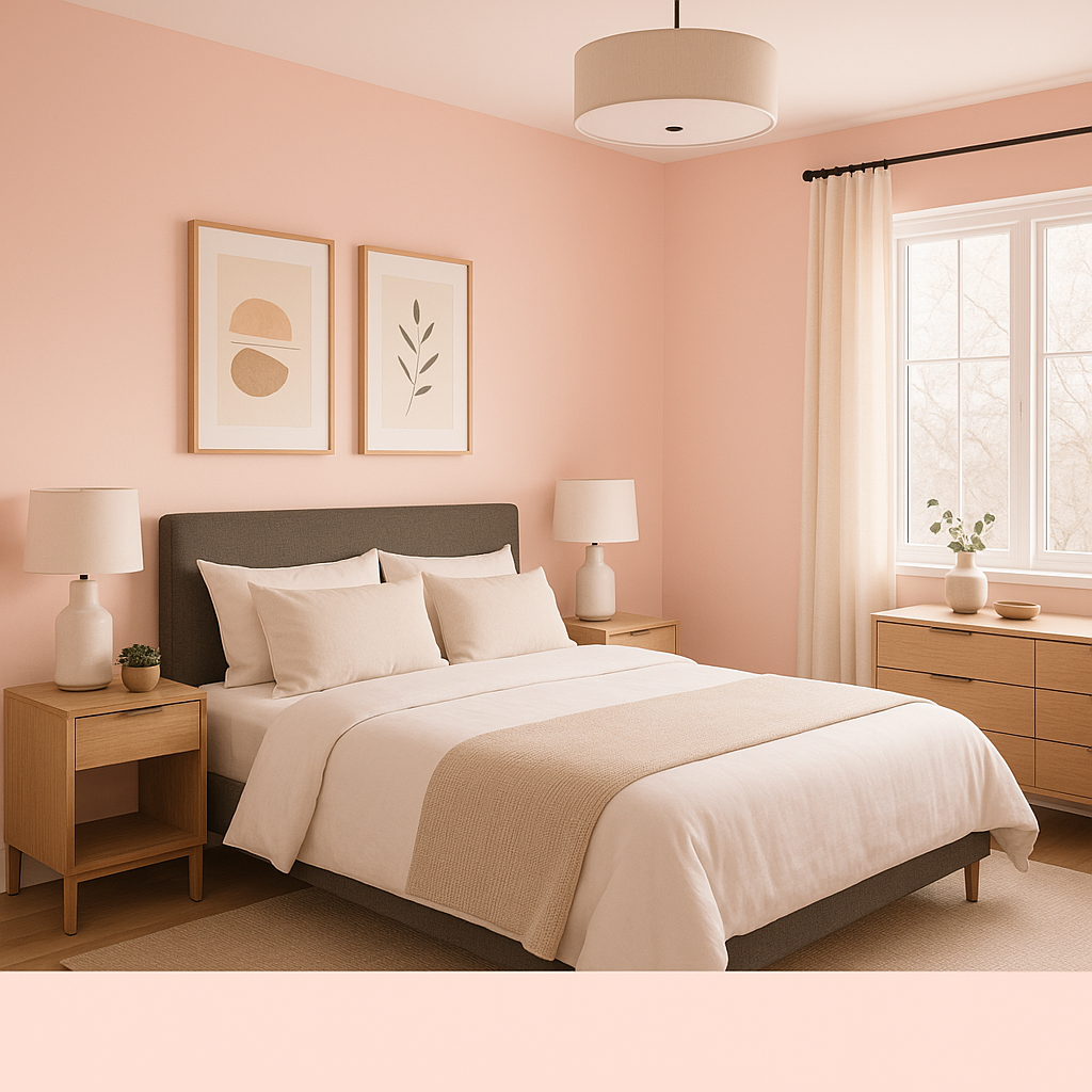
Benjamin Moore Pink (2013-60) is a soft, delicate pink that exudes a sense of timeless charm and sophistication. Its subtle, powdery quality makes it a versatile color choice for a variety of design styles, from modern minimalism to vintage-inspired interiors. Whether you're creating a romantic bedroom retreat, a cheerful nursery, or an inviting living space, this gentle hue offers a perfect balance of warmth and elegance without feeling overwhelming.
What sets Benjamin Moore Pink apart is its refined undertones. This shade leans towards a cooler pink with subtle beige and lavender undertones, which keeps it from feeling overly saccharine or juvenile. The beige undertone grounds the color, lending it a sophisticated and mature quality, while the faint lavender influence imparts a serene, calming effect. These nuanced undertones make Benjamin Moore Pink suitable for spaces that demand a soft, romantic ambiance with a contemporary edge.
Benjamin Moore Pink (2013-60) pairs beautifully with an array of complementary and contrasting colors, allowing for flexible design possibilities. Here are some recommendations for coordinating hues:
Benjamin Moore Pink's versatility makes it suitable for a wide range of applications, whether you're designing a single room or an entire home. Here are some ideas to inspire your next project:
This soft pink is a natural choice for bedrooms, where its calming undertones create a peaceful, soothing environment. Pair it with crisp white bedding and metallic accents for a romantic, luxurious feel, or layer it with muted grays for a more modern aesthetic.
The gentle tone of Benjamin Moore Pink makes it an excellent option for nurseries. Its warm yet muted quality provides a nurturing and serene backdrop for your little one. Add pops of pastel blue or mint green for a fresh, playful touch.
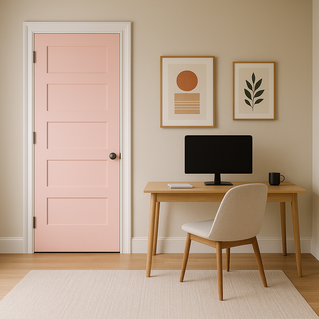
Add a hint of understated elegance to your living room with this versatile pink. Use it as an accent wall to add warmth and softness to the space, complementing it with neutral furniture and metallic decor for a chic, modern look.
Benjamin Moore Pink can transform a bathroom into a spa-like retreat. Its soft, powdery quality pairs beautifully with white or marble finishes, creating a clean yet cozy atmosphere. Consider adding brushed gold or matte black fixtures for a touch of glamour.
For a unique and inviting dining room, use Benjamin Moore Pink as a backdrop for darker furniture and bold accents. The color adds warmth to the space while maintaining a sophisticated ambiance perfect for entertaining.
Benjamin Moore Pink (2013-60) is more than just a color—it's a statement of subtle elegance and refined taste. Its balanced undertones, adaptability, and ability to pair with a variety of other hues make it a standout choice for both residential and commercial spaces. Whether you're creating a cozy, traditional look or a sleek, contemporary design, this versatile pink is sure to elevate your interiors with its effortless charm.
View Colors Only by Brand (No Imagery):
Sherwin-Williams
|
Benjamin-Moore
|
Behr
|
Valspar
Live on the Eastern Slope of Colorado and looking for a local painting professional, check out all our painting services and reach out for a free estimate.
Copyright © 2026 : Wild Fox Painting Inc. : 12435 Mead Way, Littleton, CO 80125


