Benjamin Moore Whispering (2014-60) is a soft, understated shade that exudes tranquility and sophistication. Perfectly suited for creating serene spaces, this delicate hue is ideal for homeowners seeking a refined yet calming atmosphere. Its versatility and gentle presence make it a favorite among interior designers for a wide variety of aesthetics, from minimalist modern to coastal-inspired interiors.
Whispering is a light, muted beige with warm undertones that lean toward cream. This subtle warmth ensures that the shade feels inviting and cozy without being overly yellow or stark. It strikes the perfect balance between neutral and warm, making it highly adaptable to different lighting conditions.
The undertones in Whispering include hints of soft taupe and a touch of peachy warmth, which give it depth and dimension. In spaces with ample natural light, Whispering reflects a soft glow, enhancing its airy quality. Under artificial lighting or in darker spaces, the peachy undertones become slightly more noticeable, adding a gentle warmth that prevents the color from feeling cold or flat.
Benjamin Moore Whispering pairs beautifully with an array of complementary and coordinating shades, allowing it to harmonize effortlessly in any design scheme.
Neutral Pairings:
Accent Colors:
Bold Contrast:
For a more dramatic look, pair Whispering with darker tones like Black Beauty (2128-10) or Iron Mountain (2134-30). These deep shades create striking contrast and emphasize Whispering's light, airy quality.
Whispering is remarkably versatile, making it a go-to choice for a variety of settings and purposes:
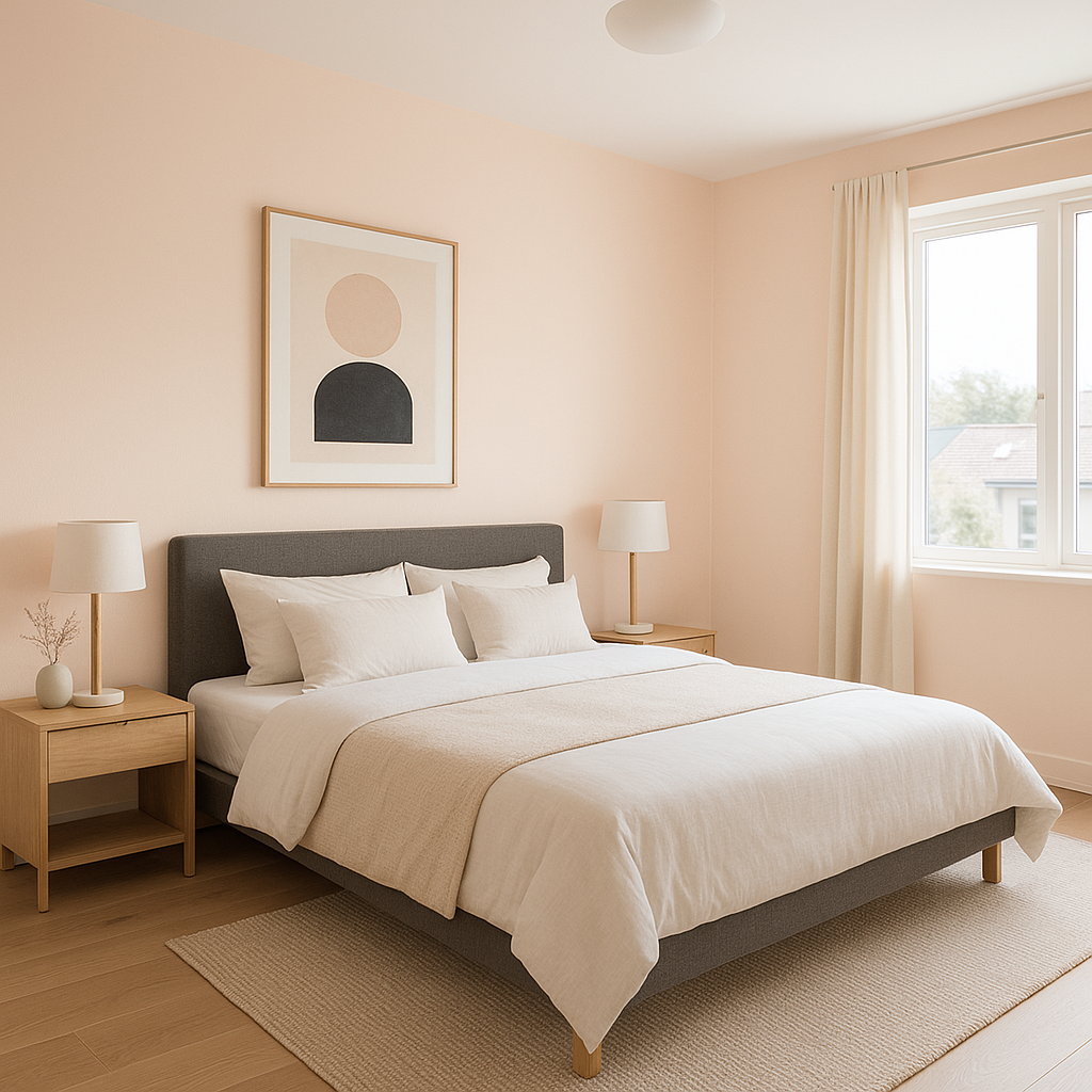
Living Rooms and Bedrooms:
The soft beige tone of Whispering is perfect for spaces where relaxation is key. It creates a soothing backdrop for upholstered furniture, layered textiles, and warm wood tones. Pair it with natural materials like linen, jute, and oak for an effortlessly chic look.
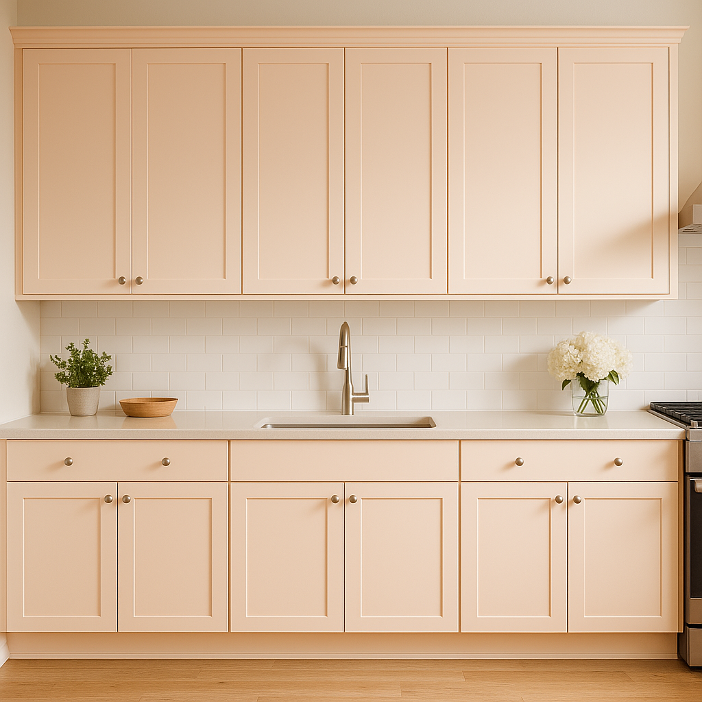
Kitchens and Dining Areas:
Whispering’s understated warmth works beautifully in kitchens and dining spaces, especially when paired with white cabinetry or countertops. It offers a clean, welcoming vibe that complements both traditional and modern designs.
Bathrooms:
For bathrooms, Whispering provides a serene, spa-like feel, especially when paired with pale blues, greens, or crisp whites. Add chrome or brushed nickel fixtures for a polished finish.
Hallways and Entryways:
Whispering is an excellent choice for transitional spaces like hallways and entryways. Its neutral tone creates a cohesive flow between rooms, making it a versatile connector color in open-concept homes.
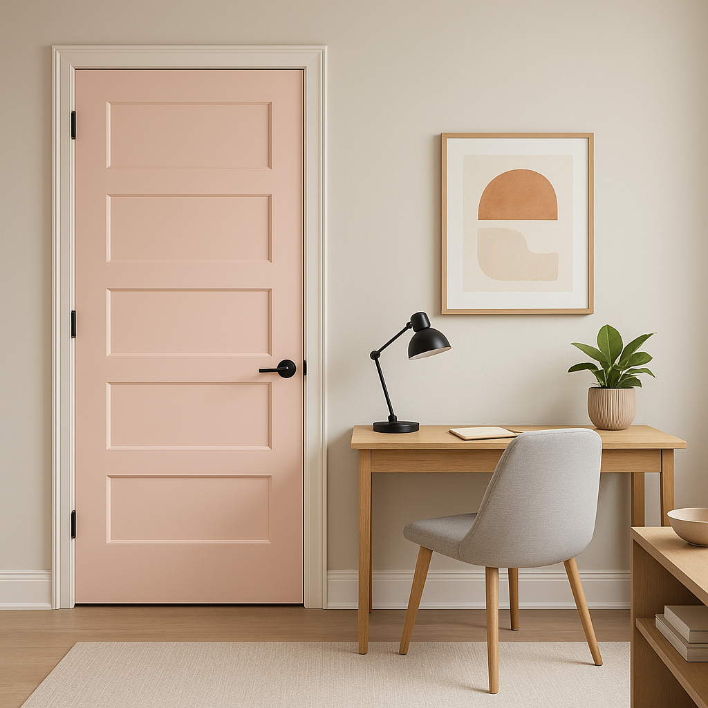
Offices and Workspaces:
The calm, neutral nature of Whispering fosters focus and productivity, making it an ideal choice for home offices or creative studios. Pair it with warm woods and pops of greenery for a grounded yet inspiring environment.
Benjamin Moore Whispering (2014-60) changes subtly depending on the lighting in your space. In bright, naturally lit areas, it feels airy and almost creamy, while in dimmer settings, its taupe undertones add a cozy, intimate vibe. To ensure the color works well in your room, test it in different lighting conditions throughout the day to observe its nuances.
Benjamin Moore Whispering is a timeless shade that offers a soft, neutral backdrop for any interior design style. Its adaptability, soothing undertones, and compatibility with a wide range of colors make it a versatile and elegant choice for both residential and commercial spaces. Whether you’re crafting a warm and welcoming home or a polished professional environment, Whispering delivers understated sophistication that stands the test of time.
View Colors Only by Brand (No Imagery):
Sherwin-Williams
|
Benjamin-Moore
|
Behr
|
Valspar
Live on the Eastern Slope of Colorado and looking for a local painting professional, check out all our painting services and reach out for a free estimate.
Copyright © 2026 : Wild Fox Painting Inc. : 12435 Mead Way, Littleton, CO 80125


