Benjamin Moore Gerbera (2015-60) is a strikingly vivid coral hue that radiates energy and warmth, making it an excellent choice for adding personality to your interiors. This lively shade balances a playful vibrancy with a refined sophistication, making it versatile enough for a variety of design styles. Whether you're looking to energize a space or create a cheerful focal point, Gerbera is a color that delivers an unforgettable impact.
Gerbera features bold pink and orange undertones, creating a luscious mix of coral that feels tropical yet grounded. The pink undertones lend a touch of softness, while the orange adds a sunny radiance. This blend ensures Gerbera offers an uplifting presence without feeling overly sweet or juvenile. Its undertones allow it to pair seamlessly with both warm and cool palettes, making it a dynamic choice for your design scheme.
Gerbera’s versatility makes it easy to incorporate into various color palettes. To achieve a harmonious look, consider pairing it with these coordinating shades:
Neutral Complements:
Bold Contrasts:
Playful Pairings:
Gerbera is perfect for spaces where you want to evoke energy, creativity, and positivity. Here are some ideas for incorporating this exuberant hue into your home or workspace:
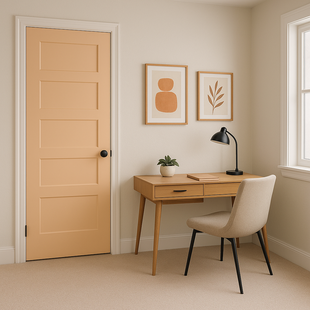
Accent Walls: Transform a plain room into a statement space with Gerbera as an accent wall. It works especially well in living rooms or art studios where a boost of energy is welcome.
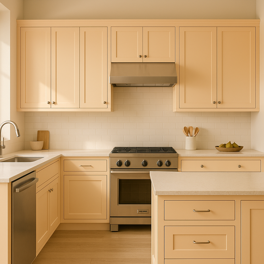
Furniture and Décor: Use Gerbera on furniture pieces like bookshelves, dressers, or even cabinetry to create a unique focal point that stands out. Pair it with metallic hardware for a touch of glam.
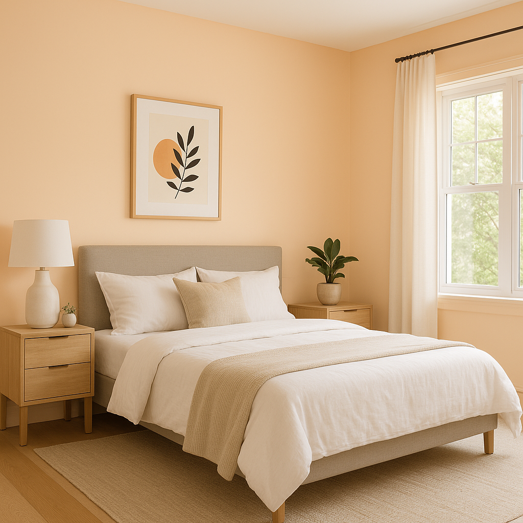
Children’s and Teen Bedrooms: Gerbera’s playful yet polished vibe makes it a fantastic choice for kids' rooms or teen hangouts. Pair it with softer pastel hues for a whimsical look, or bold contrasting colors for a more dramatic aesthetic.
Bathrooms: Brighten up a small or dark bathroom space with Gerbera on walls or cabinetry. Pair it with crisp whites and polished metals for a fresh, modern look.
Creative Spaces: Perfect for home offices, craft rooms, or art studios, Gerbera’s lively energy fosters creativity and inspiration.
As with any bold color, lighting plays a crucial role in how Gerbera appears. In well-lit areas, its coral vibrancy shines with full intensity, while in dimmer spaces, the pink undertones become more pronounced, giving it a softer appearance. Test Gerbera in your space beforehand to see how the light interacts with its dynamic undertones.
Benjamin Moore Gerbera is a color for those who aren’t afraid to make a bold statement. Its energizing mix of pink and orange undertones creates a sense of joy and optimism while remaining sophisticated enough for modern interiors. By pairing it with complementary or contrasting colors, you can tailor this hue to fit a range of design aesthetics, from playful and eclectic to polished and contemporary. Gerbera is more than just a paint color; it’s an invitation to embrace vibrancy and creativity in your home or workspace.
View Colors Only by Brand (No Imagery):
Sherwin-Williams
|
Benjamin-Moore
|
Behr
|
Valspar
Live on the Eastern Slope of Colorado and looking for a local painting professional, check out all our painting services and reach out for a free estimate.
Copyright © 2026 : Wild Fox Painting Inc. : 12435 Mead Way, Littleton, CO 80125


