Benjamin Moore Apricot 2015-70 is a delightful and versatile shade that blends soft warmth with a touch of understated elegance. This creamy, peachy hue radiates a welcoming charm, making it an ideal choice for creating inviting and cozy interiors. Its delicate yet uplifting tone makes it perfect for a wide variety of spaces, from living rooms to nurseries, and even kitchens or dining areas.
Apricot 2015-70 is a light, pastel orange with subtle pink and yellow undertones. These undertones give the color its signature warmth, adding a sense of cheerfulness and comfort to any room. The soft pink undertones bring a hint of sweetness, while the yellow undertones add brightness and vitality. Together, they create a balanced and harmonious shade that feels fresh, sunny, and soothing.
This color has a gentle presence that avoids being overpowering, making it an excellent choice for spaces where you want to evoke warmth without overwhelming the senses. Its lightness also reflects natural light beautifully, making smaller rooms feel more open and airy.
To create a cohesive and well-balanced design, consider pairing Benjamin Moore Apricot 2015-70 with complementary and coordinating colors:
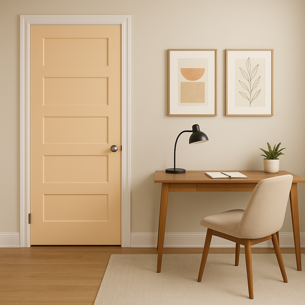
The versatility of Apricot 2015-70 makes it a great option for a variety of design applications and room styles. Here are some creative ways to incorporate this color into your home:
As a wall color, Benjamin Moore Apricot 2015-70 creates a warm and welcoming backdrop for living spaces. Pair it with plush cream-colored furniture and natural wood accents to enhance its cozy appeal. Incorporate metallic finishes, like gold or brass, for a touch of sophistication.
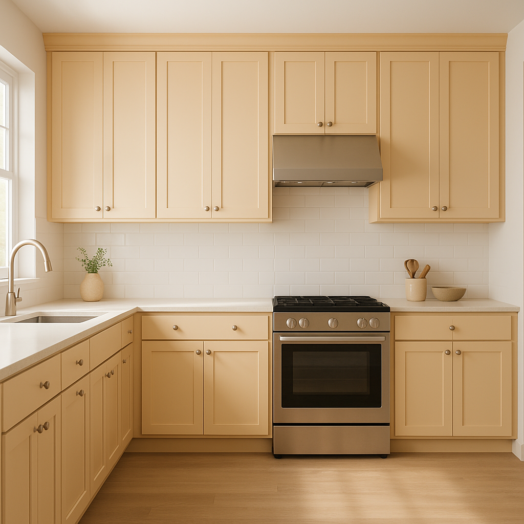
This cheerful hue is a fantastic choice for kitchens and dining rooms, where its sunny undertones can stimulate conversation and appetite. Use it on walls or as an accent color on cabinets. Pair it with white subway tiles or light marble countertops for a clean, modern look.
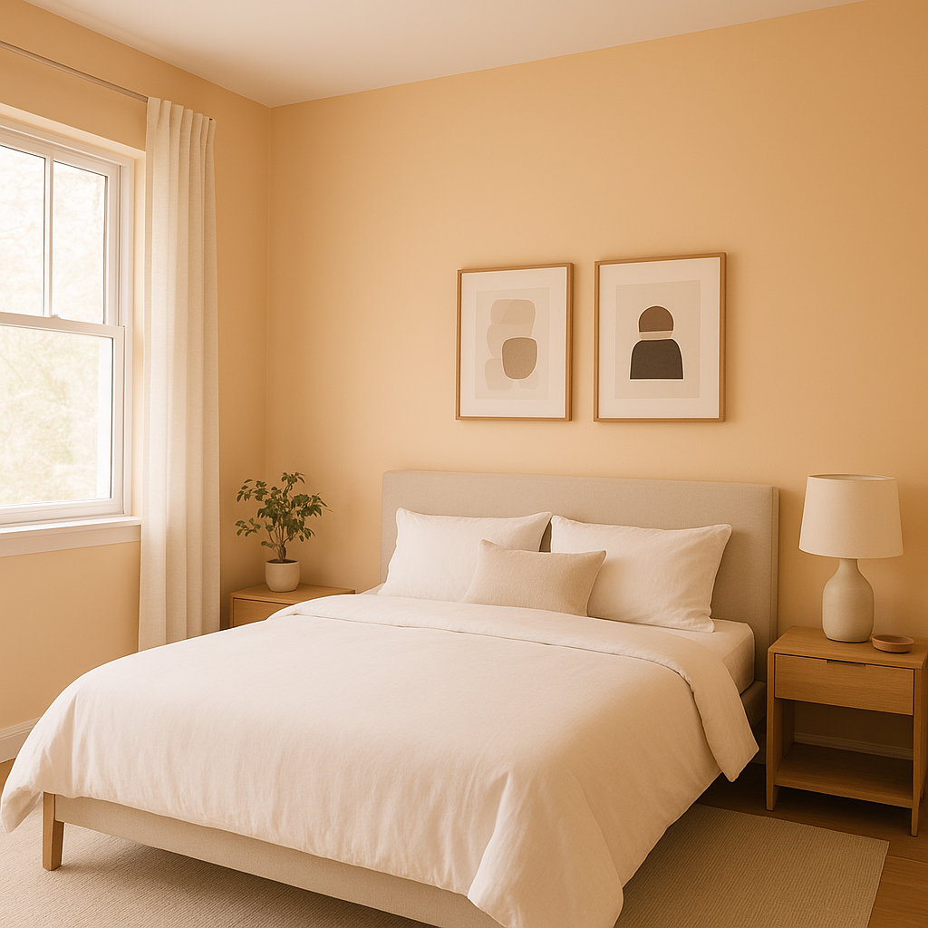
Create a soft, romantic retreat by using Apricot 2015-70 in bedrooms. Accent it with blush pinks, soft grays, or muted lavenders for a serene and dreamy palette. Add layers of texture through linens and throw pillows to enhance the room’s coziness.
The sweet and gentle vibe of Apricot 2015-70 makes it a wonderful choice for a nursery or child’s room. Combine it with whimsical patterns and complementary pastel shades to create a nurturing and cheerful space.
View Colors Only by Brand (No Imagery):
Sherwin-Williams
|
Benjamin-Moore
|
Behr
|
Valspar
Live on the Eastern Slope of Colorado and looking for a local painting professional, check out all our painting services and reach out for a free estimate.
Copyright © 2026 : Wild Fox Painting Inc. : 12435 Mead Way, Littleton, CO 80125


