Benjamin Moore Carrot (2016-30) is a bold and invigorating shade that radiates warmth, energy, and optimism. This vivid orange hue is perfect for creating dynamic spaces that exude confidence and creativity. Whether you're looking to make a statement or infuse a space with cheerful energy, Carrot is a compelling choice that commands attention while retaining a lively sophistication.
Carrot (2016-30) has rich, golden undertones that lend it depth and versatility. These warm undertones soften the vibrancy of the orange, making it more approachable and adaptable to various design aesthetics. The subtle hints of yellow within its composition give it a sunny disposition, while the slightest suggestion of red ensures the color remains grounded and inviting rather than overly intense.
Pairing Benjamin Moore Carrot with complementary shades is key to creating a harmonious and balanced space. Here are some ideas for coordinating colors:
Benjamin Moore Carrot is not for the faint of heart—it’s a color that makes a statement and adds undeniable personality to any room. Here are some creative ways to incorporate this energetic hue into your home or workspace:
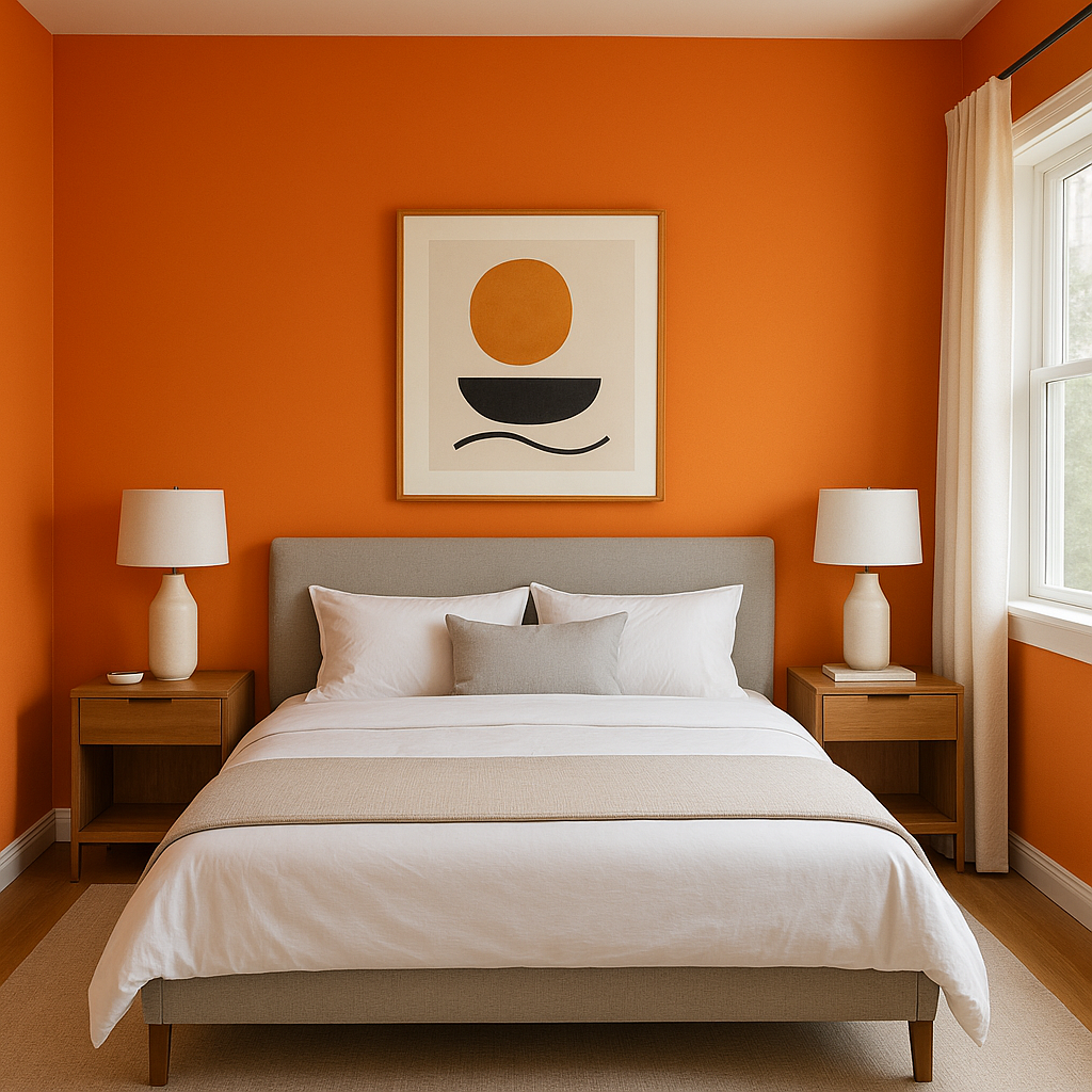
Carrot is a fantastic choice for an accent wall, especially in spaces where you want to spark creativity and conversation. It works well in home offices, art studios, or even dining rooms where you wish to encourage vibrant energy.
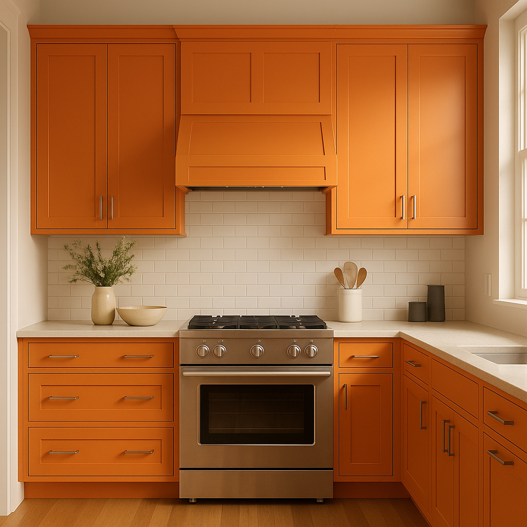
Orange hues are known to stimulate appetite and conversation, making Carrot a perfect candidate for kitchens or dining rooms. Pair it with crisp white cabinetry or natural wood tones for a welcoming yet modern aesthetic.
Infuse youthful spaces with Carrot's playful energy. This hue can inspire creativity and joy, making it ideal for a child’s bedroom or playroom. Pair it with complementary bright colors like teal or lime green for a fun, whimsical vibe.
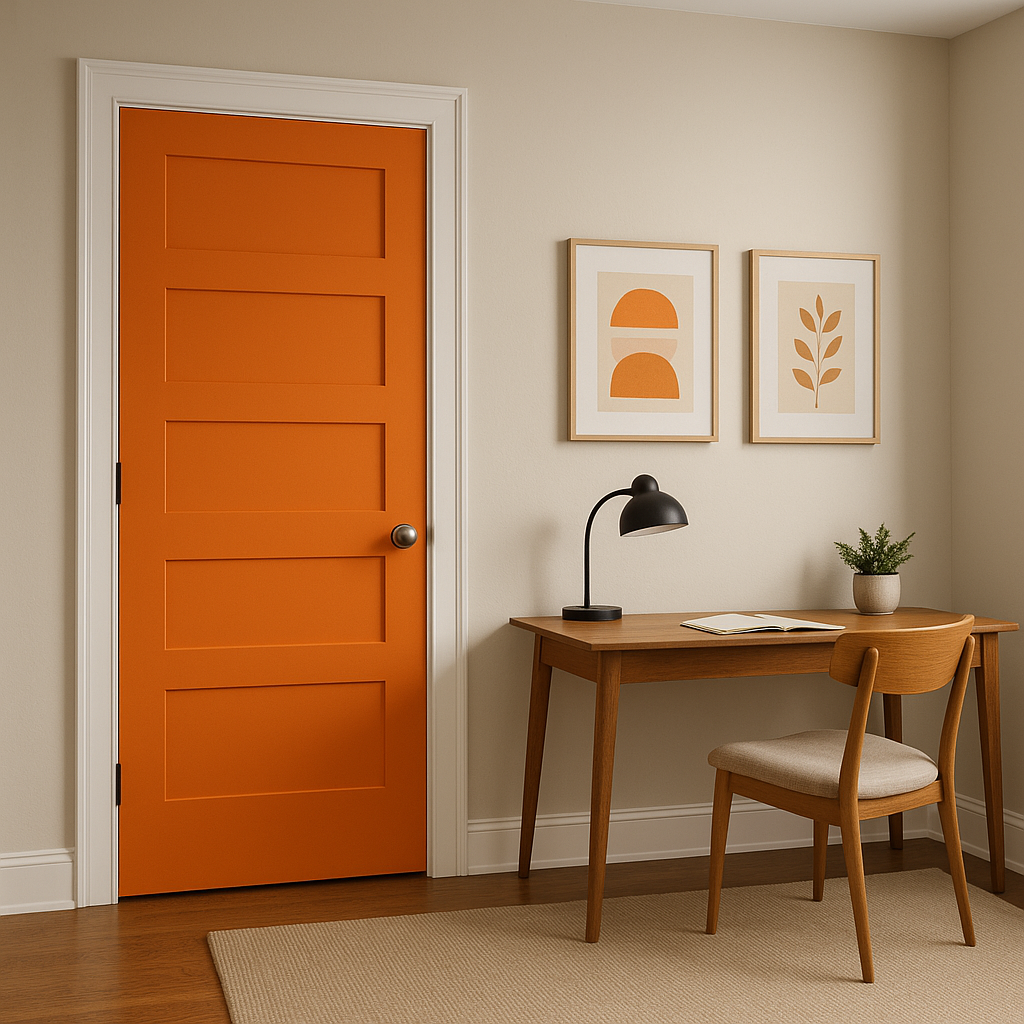
Make a bold first impression by using Carrot in an entryway or foyer. It creates a warm, inviting atmosphere that greets guests with a sense of excitement and positivity.
If you’re hesitant to commit to an entire wall, consider using Carrot as an accent color for furniture or accessories. A painted console table, upholstered chair, or even throw pillows in this shade can elevate the overall look of a room without overwhelming it.
The perception of Carrot changes depending on the lighting in your space. In rooms with ample natural light, Carrot feels bright, sunny, and revitalizing. In darker spaces or under artificial lighting, it takes on a more intimate and cozy vibe. To ensure the best results, test the color in your specific lighting conditions before committing.
Benjamin Moore Carrot (2016-30) is a fearless and invigorating hue that can transform any space into a lively, charismatic environment. Its versatility lies in its ability to work both as a standout statement color and as a complementary accent. With the right pairings and thoughtful placement, Carrot can bring warmth, energy, and a touch of bold sophistication to your interior design projects. Whether you’re seeking to energize a workspace, brighten a living area, or add whimsy to a child’s room, this dynamic orange shade is sure to deliver a memorable impact.
View Colors Only by Brand (No Imagery):
Sherwin-Williams
|
Benjamin-Moore
|
Behr
|
Valspar
Live on the Eastern Slope of Colorado and looking for a local painting professional, check out all our painting services and reach out for a free estimate.
Copyright © 2026 : Wild Fox Painting Inc. : 12435 Mead Way, Littleton, CO 80125


