Benjamin Moore Marmalade (2016-40) is a bold, cheerful color that radiates warmth and energy. This vivacious shade of orange stands out with its sunny disposition and inviting nature, making it an excellent choice for those seeking to infuse their spaces with a touch of vibrancy and personality. Whether you're designing a statement wall, refreshing a piece of furniture, or adding life to an accent area, Marmalade is a color that commands attention while still feeling approachable.
Marmalade boasts rich undertones of golden yellow and a subtle hint of red, giving it its signature warmth and depth. These undertones prevent the shade from feeling overly harsh or neon-like, instead creating a hue that is reminiscent of ripe citrus fruits or a glowing sunset. The golden undertones lend it a grounded, earthy quality, while the red provides a subtle sense of vibrance and vitality.
The balance of these undertones makes Marmalade especially versatile. It’s warm enough to feel cozy, but its brightness ensures it remains uplifting and full of life. This dynamic blend of warmth and cheer makes it a fantastic choice for spaces that need an extra dose of energy.
When pairing Benjamin Moore Marmalade with other colors, consider its bold nature and warm undertones. The right combination will allow this shade to shine while maintaining a harmonious balance in your space. Here are some coordinating color ideas:
Neutrals: Soft neutrals like Benjamin Moore Simply White (OC-117) or Ballet White (OC-9) create a crisp, clean contrast that allows Marmalade to take center stage. These shades help tone down the vibrancy of Marmalade while maintaining an airy and balanced feel.
Earthy Tones: Warm browns, terracottas, and taupes, such as Benjamin Moore Alexandria Beige (HC-77) or Caramel Apple (AF-135), complement Marmalade’s golden undertones beautifully. These colors create a nature-inspired palette that feels grounded and sophisticated.
Greens: Muted greens like Saybrook Sage (HC-114) or Guilford Green (HC-116) provide a refreshing contrast to Marmalade's warmth. The combination of green and orange mimics the look of lush gardens or natural landscapes, creating a serene yet lively atmosphere.
Blues and Grays: For a more dramatic and modern pairing, consider deep grays or muted blues like Kendall Charcoal (HC-166) or Boothbay Gray (HC-165). These cooler tones temper Marmalade’s warmth and create a balanced, contemporary look.
Accents: For a playful and eclectic vibe, pair Marmalade with pops of teal or aqua, such as Bermuda Turquoise (2049-50). These vibrant accents amplify its energy and create a lively, dynamic space.
Marmalade’s boldness makes it an excellent statement color, but its warmth ensures it can also feel inviting and cozy. Here are some ideas for incorporating Marmalade into your home or workspace:
Use Marmalade on an accent wall to create a warm and inviting focal point in your living or dining space. It pairs beautifully with wood furniture and natural textures, creating a space that feels vibrant and welcoming.
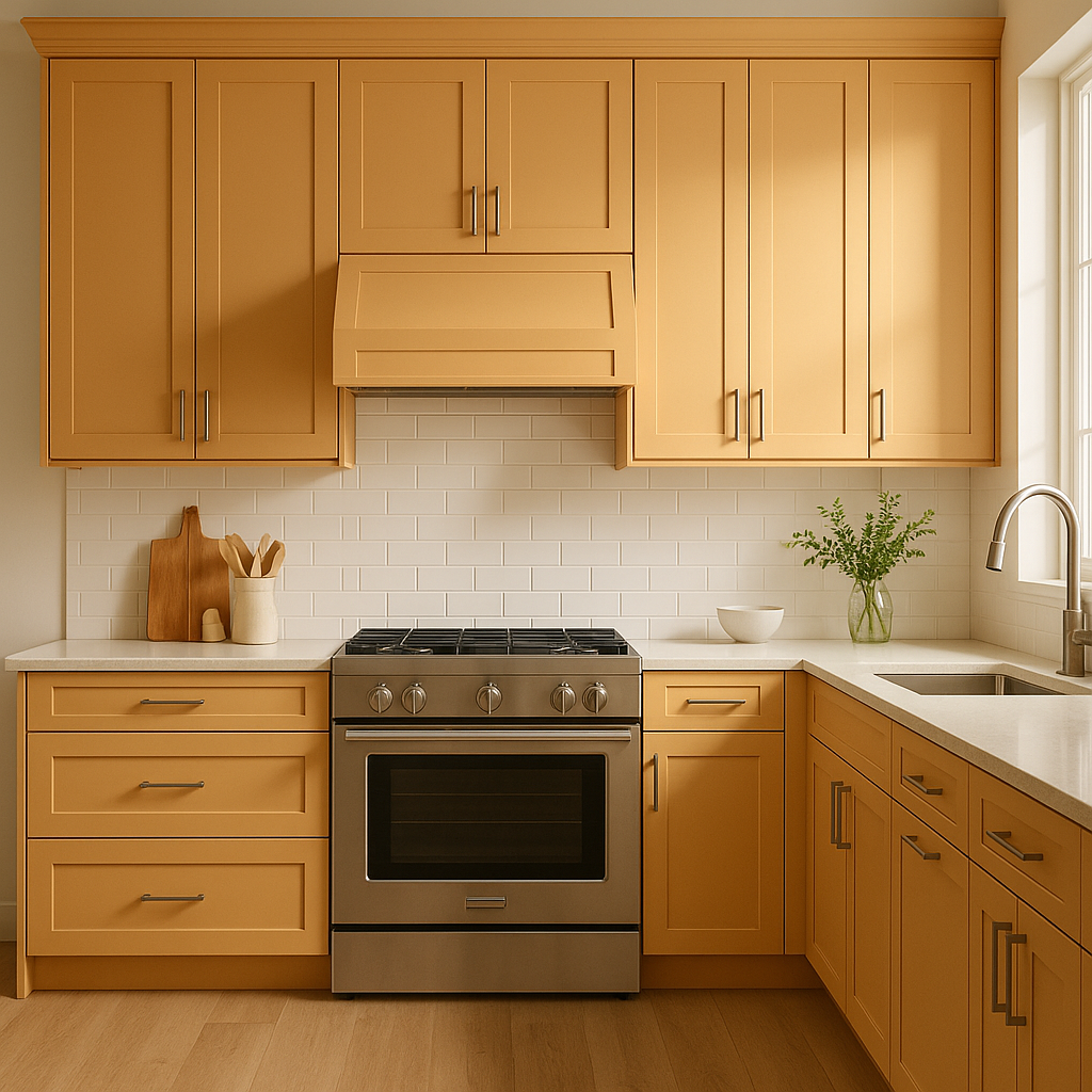
Marmalade is an excellent choice for kitchens, especially when paired with crisp white cabinets and natural wood finishes. Its sunny hue adds a sense of energy and joy to the heart of the home. Consider using it for a backsplash, island, or even a vintage-inspired pantry door.
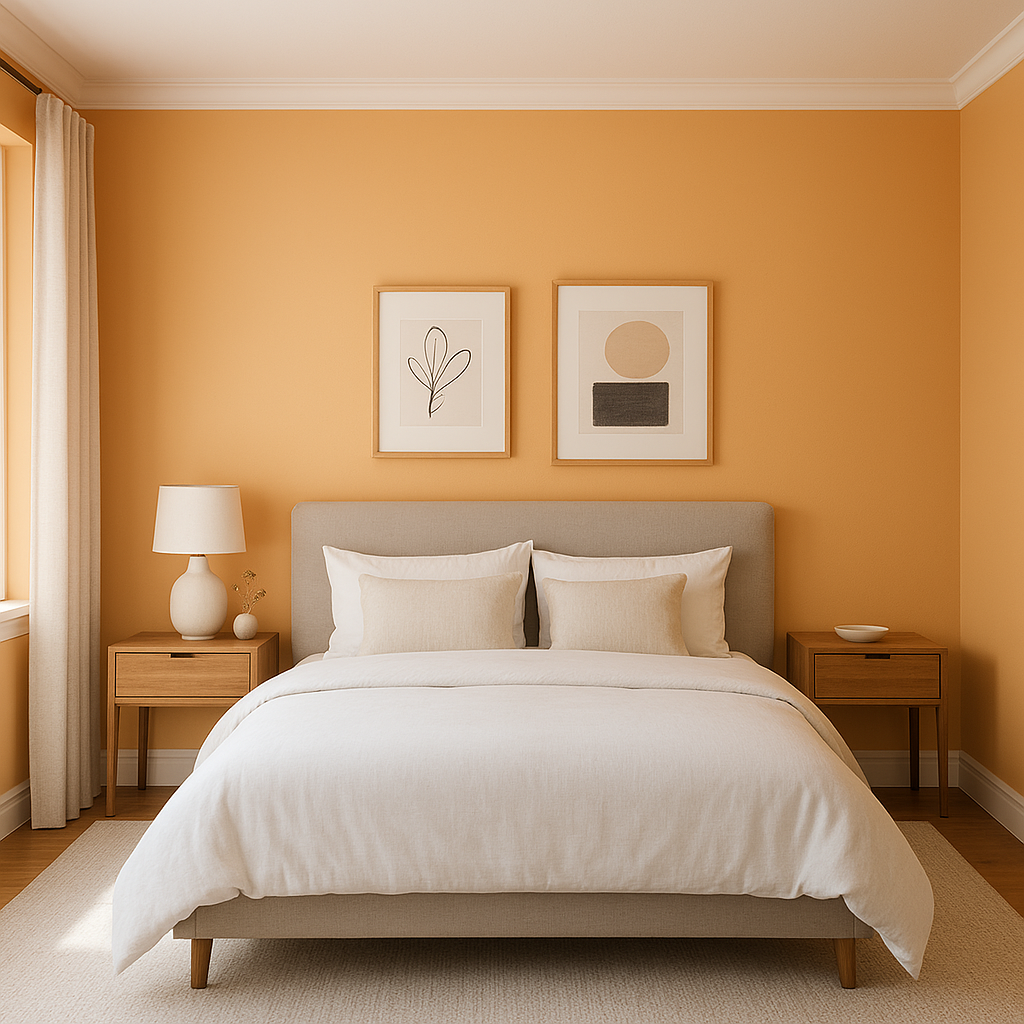
While bold, Marmalade can be softened with the right palette, making it suitable for bedrooms and nurseries. Pair it with soft creams, muted greens, or pale yellows to create a cozy and cheerful retreat.
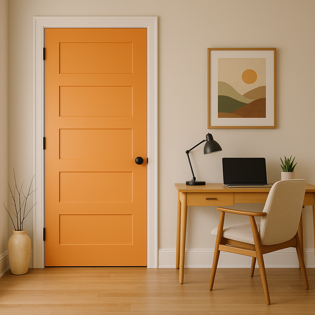
Bring a burst of personality to your home’s exterior by using Marmalade on your front door. Its warm, welcoming vibe is perfect for creating a memorable first impression. Pair it with a neutral house color for a striking and sophisticated look.
If you’re not ready to commit to Marmalade on your walls, consider incorporating it through accent pieces like furniture, throw pillows, or artwork. A Marmalade-painted bookcase or side table can add just the right pop of color to any room.
Benjamin Moore Marmalade is a perfect choice for those who love bold, confident colors with a touch of warmth and charm. Its golden undertones, versatility, and ability to pair seamlessly with a variety of coordinating colors make it a standout option for creating vibrant, personality-filled spaces. Whether you’re looking to energize your home or add a unique twist to a single room, Marmalade is a hue that delivers impact and style in equal measure.
View Colors Only by Brand (No Imagery):
Sherwin-Williams
|
Benjamin-Moore
|
Behr
|
Valspar
Live on the Eastern Slope of Colorado and looking for a local painting professional, check out all our painting services and reach out for a free estimate.
Copyright © 2026 : Wild Fox Painting Inc. : 12435 Mead Way, Littleton, CO 80125


