Benjamin Moore Creamy (2016-60) is a warm, inviting neutral that radiates sophistication, comfort, and versatility. This soft, understated hue strikes the perfect balance between beige and off-white, making it a popular choice for homeowners and designers alike. Creamy’s gentle warmth allows it to complement a wide range of design styles, from traditional to modern, while creating an ambiance that feels cozy yet refined.
The beauty of Creamy lies in its subtle undertones, which give the color its depth and dimension. This shade leans toward warm yellow undertones, though they are delicate enough to avoid overpowering the space. These undertones add a touch of brightness, making Creamy a fantastic choice for rooms that need a light-enhancing paint color without veering into stark white territory.
The yellow undertones also imbue Creamy with a welcoming and sunny disposition, making it perfect for spaces where you want to evoke warmth and comfort. While Creamy has a slightly warm base, it remains neutral enough to pair seamlessly with other colors in your palette.
Benjamin Moore Creamy (2016-60) is incredibly versatile and pairs beautifully with a wide range of coordinating colors, making it an excellent foundation for your interior design.
Benjamin Moore Creamy is a versatile color that works beautifully in a variety of spaces. Its timeless warmth and neutral quality make it an excellent choice for both walls and accents. Here are some of the ways you can incorporate Creamy into your home:
Creamy is a fantastic choice for living rooms where you want to create a welcoming and cozy atmosphere. Pair it with neutral furnishings and warm wood tones for a classic look, or add pops of color with vibrant throw pillows or artwork to brighten the space.
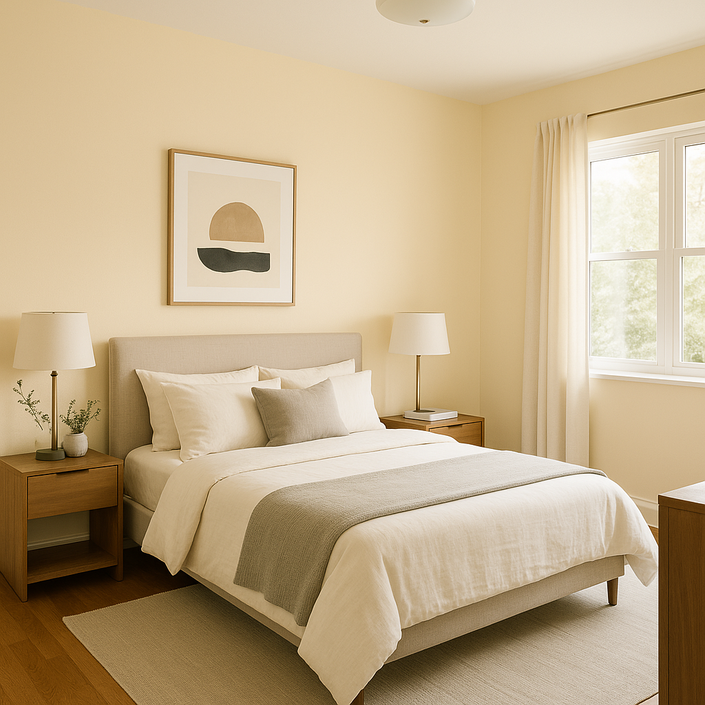
In bedrooms, Creamy serves as a calming backdrop that promotes relaxation. Pair it with soft linens, warm metallics like brass or gold, and natural textures such as wood or rattan for a peaceful retreat.
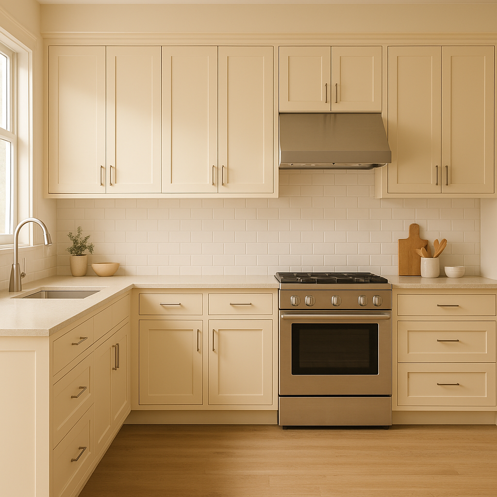
Creamy’s light-enhancing properties make it ideal for kitchens, especially those that lack abundant natural light. Use it for cabinets or walls and pair it with crisp whites, warm grays, or even bold navy accents for a timeless and fresh look.
For bathrooms, Creamy offers a spa-like feel when paired with soft whites and earthy tones. Add texture with marble countertops or subway tiles, and use brass fixtures to complement the warmth of the color.
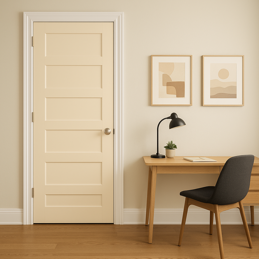
Creamy is perfect for hallways and entryways where you want to create a seamless transition between rooms. Its neutral character ensures it pairs beautifully with adjacent colors while brightening these often-overlooked spaces.
Benjamin Moore Creamy (2016-60) is more than just a paint color—it’s a design tool that allows you to shape the mood and personality of your space. Its warm undertones, versatility, and ability to coordinate with a variety of colors make it a go-to choice for homeowners and designers seeking a timeless neutral. Whether you’re refreshing a single room or designing an entire home, Creamy is a reliable option that brings warmth, elegance, and balance to any interior.
View Colors Only by Brand (No Imagery):
Sherwin-Williams
|
Benjamin-Moore
|
Behr
|
Valspar
Live on the Eastern Slope of Colorado and looking for a local painting professional, check out all our painting services and reach out for a free estimate.
Copyright © 2026 : Wild Fox Painting Inc. : 12435 Mead Way, Littleton, CO 80125


