Benjamin Moore Orange (2017-10) is a dynamic and invigorating shade that exudes warmth and vitality. This vibrant orange is rich and full-bodied, making it a bold choice for those looking to infuse their spaces with energy and personality. With its stunning depth and fiery undertones, it’s a color that commands attention while remaining versatile enough to complement a variety of design styles.
The undertones of Benjamin Moore Orange (2017-10) lean towards a warm, reddish hue, giving this color a rich and full-bodied character. It has just the right balance of brightness and depth, making it feel both lively and grounded. The subtle reddish undertones give this orange a sophisticated warmth, steering it away from overly neon or citrusy tones. This makes it a highly adaptable choice, whether you’re aiming for a retro-inspired vibe, a bohemian retreat, or a contemporary statement.
When pairing Benjamin Moore Orange with other colors, consider tones that complement its warmth and vibrancy. Here are some expert suggestions for coordinating hues:
By carefully selecting accompanying colors, you can either emphasize the boldness of Benjamin Moore Orange or temper its intensity for a more subdued look.
Benjamin Moore Orange (2017-10) is a versatile hue that can be used in a variety of ways to create different effects in your home or commercial space. Here are some ideas for incorporating this vibrant color:
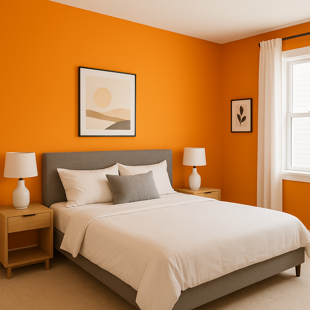
An accent wall in Benjamin Moore Orange can energize a room without overwhelming it. Use it in spaces like the living room, dining room, or even a home office to add a pop of color and create a focal point.
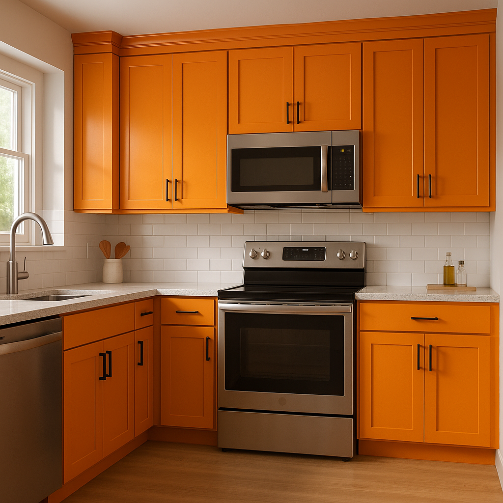
This shade works wonderfully in kitchens and dining spaces, as its warm undertones stimulate appetite and conversation. Pair it with white cabinetry and natural wood finishes for a cozy yet modern look.
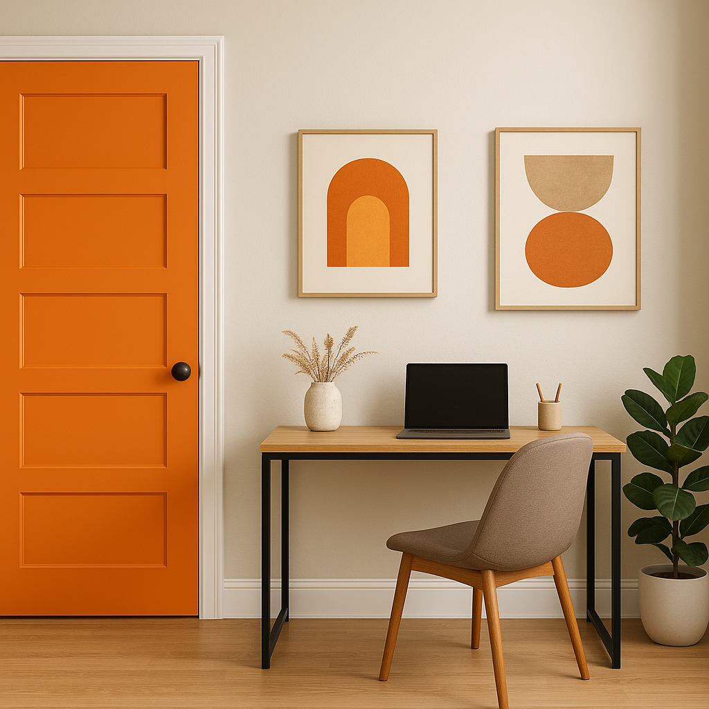
For a bold curb appeal statement, Benjamin Moore Orange is an excellent choice for front doors. Its vibrant energy adds a welcoming touch to your home’s exterior, especially when paired with cool grays or soft whites.
The cheerful and lively nature of this orange makes it a great choice for children’s spaces. Use it as an accent color alongside neutral or pastel walls to strike the perfect balance between fun and functionality.
In retail or hospitality settings, Benjamin Moore Orange (2017-10) can create an inviting, high-energy environment. Consider using it in cafes, restaurants, or boutique stores to evoke creativity, warmth, and excitement.
The appearance of Benjamin Moore Orange (2017-10) can shift depending on the lighting in your space. In natural daylight, its vibrancy shines through, making it feel bright and cheerful. Under warm, incandescent lighting, the reddish undertones become more pronounced, lending a cozy and intimate vibe. Be sure to test this color in your space with your specific lighting conditions to achieve the desired effect.
Benjamin Moore Orange (2017-10) is more than just a color—it’s a mood, a statement, and an invitation to embrace bold design choices. Whether you’re using it as a centerpiece or an accent, this hue brings life, energy, and warmth to any space. With its rich undertones and versatile coordinating colors, it’s a fantastic choice for those looking to make a statement while maintaining a sense of balance and sophistication.
View Colors Only by Brand (No Imagery):
Sherwin-Williams
|
Benjamin-Moore
|
Behr
|
Valspar
Live on the Eastern Slope of Colorado and looking for a local painting professional, check out all our painting services and reach out for a free estimate.
Copyright © 2026 : Wild Fox Painting Inc. : 12435 Mead Way, Littleton, CO 80125


