
Benjamin Moore Sharp (2017-20) is a standout color that makes a bold statement in any interior design project. This deep, sophisticated shade of blue has a commanding presence, exuding confidence and modernity. Whether used as an accent or dominating an entire room, Sharp brings a sense of drama and luxury to spaces, making it a favorite among designers looking to create memorable interiors.
Sharp (2017-20) is a richly saturated blue with cool undertones that lean toward indigo. It carries subtle hints of gray, giving it a grounded and versatile quality. These undertones make Sharp adaptable—while it’s unapologetically bold, it avoids feeling overly bright or garish. The slight gray influence softens the color, allowing it to work harmoniously in various design schemes.
The cool undertones also make Sharp feel tranquil and composed, ideal for spaces where you want to evoke a sense of calm sophistication. However, its richness ensures it retains an energetic and dynamic edge perfect for modern and eclectic designs.
To bring out the best in Sharp, pair it with complementary colors that enhance its depth and drama. Here are some coordinating options:
Benjamin Moore Sharp is a versatile color that can be used in multiple ways to elevate your interiors:
Sharp is perfect for creating a dramatic focal point in living rooms, dining rooms, or bedrooms. Its boldness draws the eye and sets the tone for the space, especially when paired with lighter walls or neutral furnishings.
Consider using Sharp on cabinetry, built-ins, or furniture pieces to inject personality into the room. Painted kitchen cabinets in Sharp look striking when paired with marble countertops and chrome hardware.
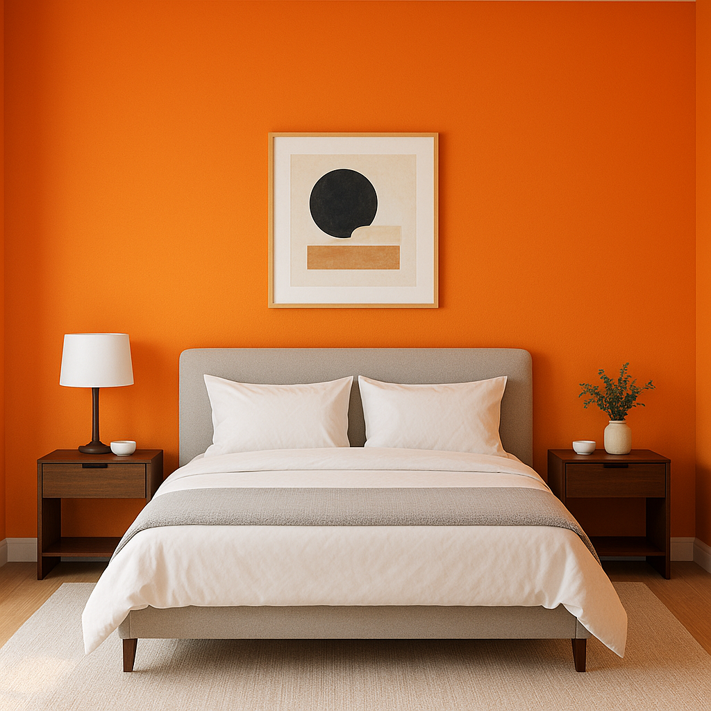
For a serene yet sophisticated retreat, Sharp works beautifully on walls or headboards. Pair it with soft white linens and silver accents for an effortlessly chic look.
Sharp’s commanding presence makes it an excellent choice for home offices or studies. It creates a sense of focus and authority while maintaining a refined aesthetic.
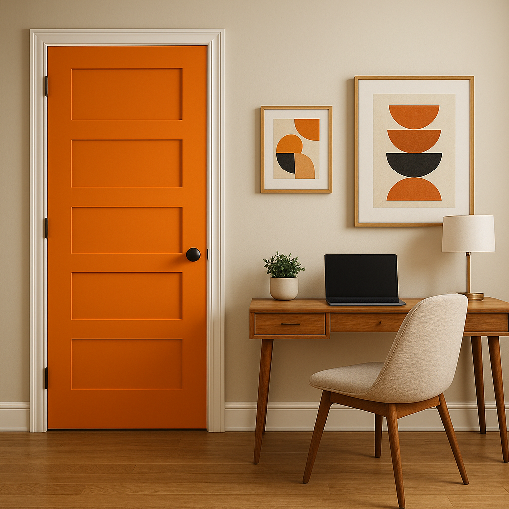
Make an unforgettable first impression by using Sharp on your entryway walls or even your front door. It conveys confidence and sets the tone for a stylish home.
Sharp is also a fantastic choice for commercial interiors, such as boutique shops, restaurants, or office reception areas. Its modern and luxurious vibe makes it suitable for high-end branding.
Benjamin Moore Sharp’s character can shift depending on the lighting in the space. In natural light, its blue tones shine brightest, creating a fresh and vibrant look. Under artificial lighting, particularly warm lights, its gray undertones become more pronounced, lending it a slightly moodier feel. Always test the color in your space with different lighting conditions to ensure it aligns with your vision.
Benjamin Moore Sharp (2017-20) is a color that stands out for its depth, sophistication, and versatility. Whether you're designing a bold statement wall, refreshing cabinetry, or creating a serene bedroom, Sharp is a modern hue that delivers impact while remaining timeless.
View Colors Only by Brand (No Imagery):
Sherwin-Williams
|
Benjamin-Moore
|
Behr
|
Valspar
Live on the Eastern Slope of Colorado and looking for a local painting professional, check out all our painting services and reach out for a free estimate.
Copyright © 2026 : Wild Fox Painting Inc. : 12435 Mead Way, Littleton, CO 80125


