Benjamin Moore Pale 2017-60 is a soft, understated neutral that radiates calmness and sophistication. With its delicate presence, this paint color effortlessly adds warmth and depth to spaces, making it a perfect choice for creating serene interiors. Its versatility allows it to adapt to various design styles, from modern minimalism to cozy traditional settings.
Pale 2017-60 is a warm off-white with subtle beige undertones. These gentle undertones give it a creamy appearance, making it neither too stark nor overly yellow. Its warmth ensures it feels inviting while maintaining a clean and airy aesthetic. Depending on the lighting, you might notice soft shifts in tone—appearing slightly cooler in northern light or warmer in areas with abundant natural sunlight.
The beauty of Benjamin Moore Pale 2017-60 lies in its ability to complement a wide range of shades. Here are some carefully chosen coordinating colors to enhance your design palette:
These combinations allow you to customize the mood of your space—whether it’s serene and subdued or bold and dynamic.
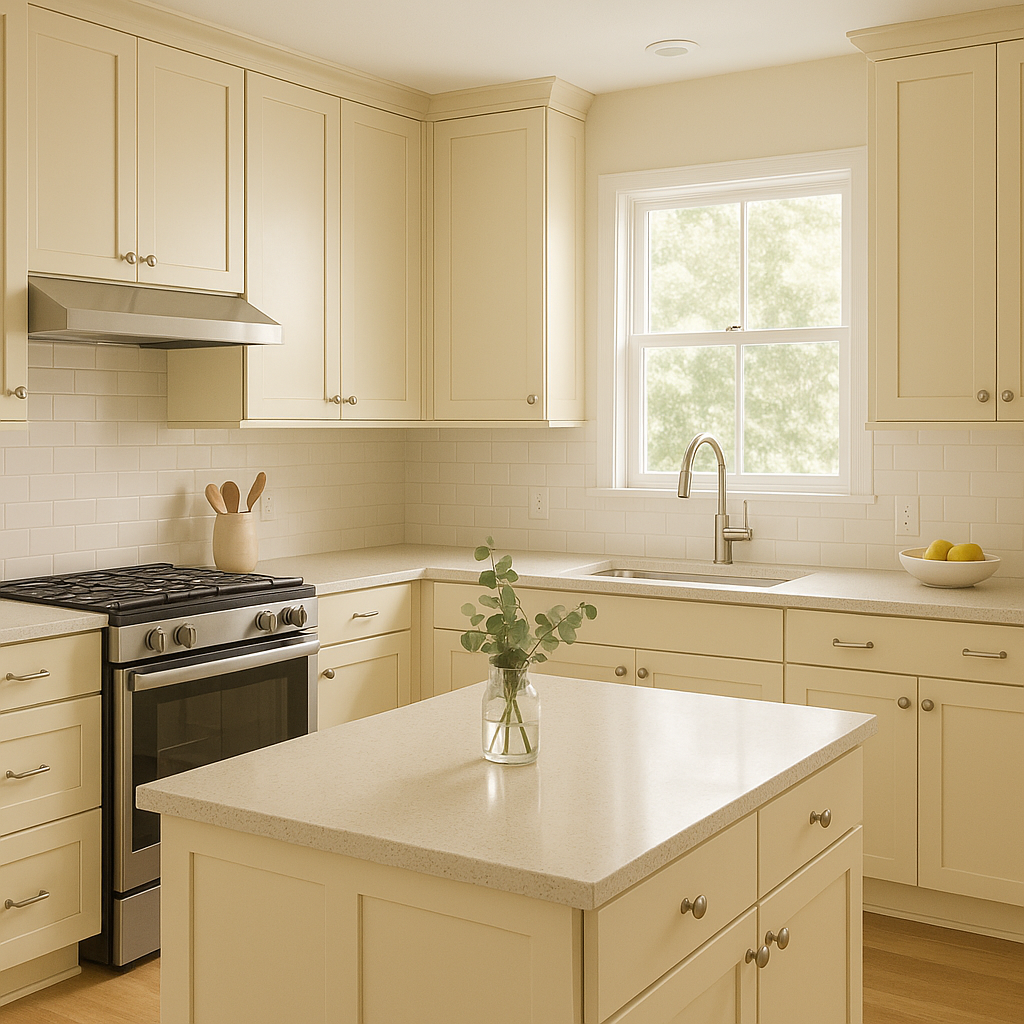
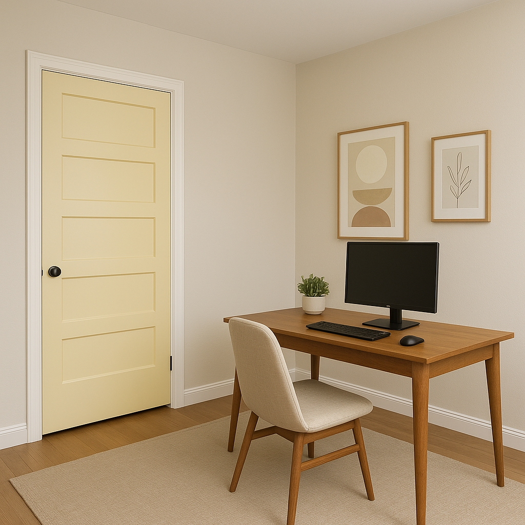
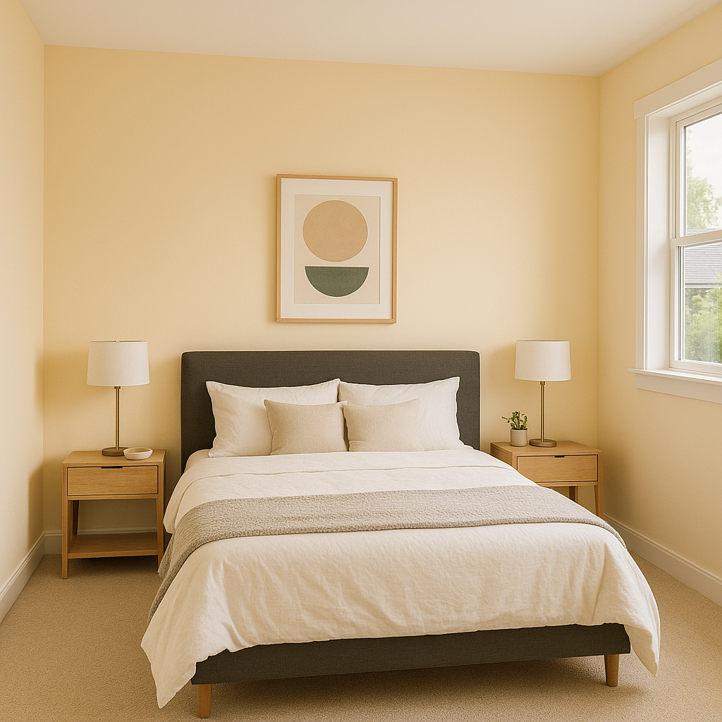
Pale 2017-60 is an incredibly versatile paint color that works beautifully across a variety of rooms and design purposes. Here’s how you can incorporate it into your interiors:
Lighting plays a significant role in how Pale 2017-60 will appear in your space. In brighter, sunlit areas, its creamy undertones become more pronounced, giving it a warm, soft glow. In dim or artificial lighting, it remains neutral and unobtrusive, making it a reliable choice for a variety of lighting conditions.
Benjamin Moore Pale 2017-60 is a timeless neutral that offers a perfect balance of warmth and versatility. Whether you’re refreshing a single room or tying together an entire home, its understated charm and adaptability make it an ideal choice for designers and homeowners alike.
View Colors Only by Brand (No Imagery):
Sherwin-Williams
|
Benjamin-Moore
|
Behr
|
Valspar
Live on the Eastern Slope of Colorado and looking for a local painting professional, check out all our painting services and reach out for a free estimate.
Copyright © 2026 : Wild Fox Painting Inc. : 12435 Mead Way, Littleton, CO 80125


