Benjamin Moore Yellowstone (202) is a radiant, golden yellow hue that brings warmth, vitality, and a touch of sophistication to any space. This color is an excellent choice for homeowners and designers who seek to brighten interiors while creating a welcoming and cheerful atmosphere. Whether used as an accent or the main feature, Yellowstone is a versatile yellow that can transform spaces with its sunny disposition.
Yellowstone carries subtle golden undertones that add depth and richness to the hue. Unlike overly saturated yellows, this shade has a refined quality, making it feel less overpowering and more grounded. Its golden undertones infuse a sense of warmth, evoking the look of sunlight streaming through a window or the glow of a summer day. These undertones make Yellowstone an ideal choice for rooms where you want to foster feelings of happiness, energy, and optimism.
Yellowstone pairs beautifully with a range of coordinating colors, allowing you to create a cohesive and balanced design. Here are some suggestions for complementary hues:
Soft Neutrals: Shades like Benjamin Moore White Dove (OC-17) or Simply White (OC-117) provide a clean and crisp backdrop for Yellowstone, allowing the golden hue to shine without distraction. These neutrals enhance the brightness of the space while maintaining a sense of calm.
Earthy Greens: Deep greens such as Benjamin Moore Forest Floor (AF-540) or Gloucester Sage (HC-100) create a harmonious and grounded pairing that evokes the beauty of nature. The yellow and green combination feels organic and timeless.
Warm Browns: Try Benjamin Moore Rustic Taupe (2167-50) or Alexandria Beige (HC-77) to bring out Yellowstone’s golden undertones and create a cozy, inviting atmosphere.
Soft Blues: Light blues like Palladian Blue (HC-144) or Beach Glass (1564) offer a serene contrast to Yellowstone’s warmth, creating a balanced and refreshing look.
Yellowstone is a versatile shade that can be used in a variety of interior design applications. Its cheerful yet refined nature makes it suitable for multiple spaces:
Infuse your living room with energy and warmth by incorporating Yellowstone on the walls or as an accent color. Pair it with neutral furniture and decor for a sophisticated yet lively environment.
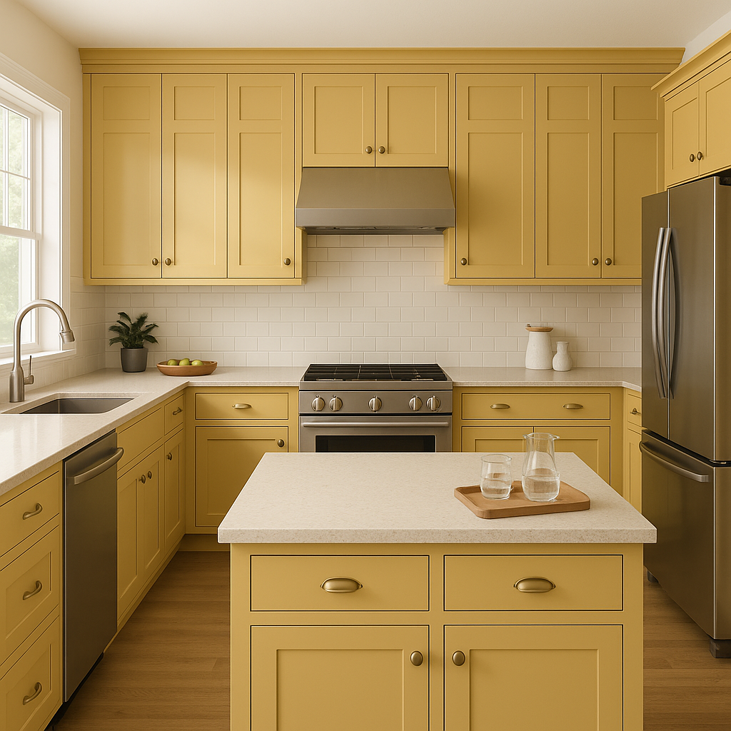
Yellowstone works beautifully in kitchens, especially when paired with white cabinetry and brass or gold hardware. It evokes a sunny, welcoming feel that’s perfect for spaces where family and friends gather.
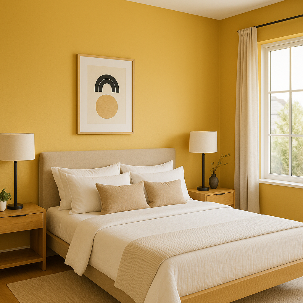
For a cozy and uplifting bedroom design, use Yellowstone as an accent wall or pair it with soft, muted tones like beige or sage green. Its golden undertones create a relaxing yet cheerful atmosphere.
Yellowstone’s playful and sunny personality makes it a great choice for nurseries or playrooms. It fosters creativity and joy, making it ideal for spaces where children spend time.
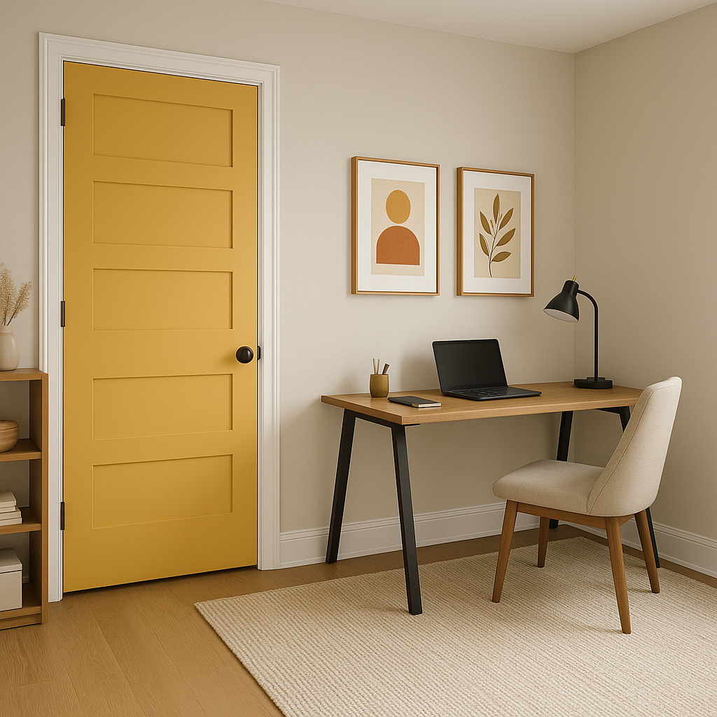
If you’re hesitant to commit to an entire room painted in Yellowstone, try using it on smaller features, such as doors, trim, or furniture. This allows you to add a pop of color without overwhelming the space.
Benjamin Moore Yellowstone (202) is a color that radiates positivity and warmth, making it an excellent choice for creating inviting spaces. Its golden undertones provide sophistication, while its versatility allows it to pair beautifully with a wide range of colors. Whether you’re designing a bright kitchen, a cozy bedroom, or a playful nursery, Yellowstone brings a timeless burst of sunshine to your home.
By using coordinating colors and thoughtful placements, you can make Yellowstone the centerpiece of your design or a supporting player in a harmonious palette. Let this sunny hue inspire your next interior design project and fill your space with light, energy, and style.
View Colors Only by Brand (No Imagery):
Sherwin-Williams
|
Benjamin-Moore
|
Behr
|
Valspar
Live on the Eastern Slope of Colorado and looking for a local painting professional, check out all our painting services and reach out for a free estimate.
Copyright © 2026 : Wild Fox Painting Inc. : 12435 Mead Way, Littleton, CO 80125


