Benjamin Moore Crème (2023-70) is a warm, creamy neutral that exudes sophistication and versatility. This soft, inviting hue is perfect for creating serene spaces with a touch of understated elegance. Whether used as a backdrop for bold accents or paired with other neutrals for a monochromatic look, Crème offers endless design possibilities for modern and traditional interiors alike.
Crème features subtle yellow and beige undertones that lend it a warm, sunny disposition without overwhelming the space. Its delicate balance ensures it doesn’t veer too golden or too cool, making it an ideal choice for homeowners seeking a neutral that feels cozy yet bright. The creamy undertones add depth, ensuring the color complements an array of lighting conditions, from natural sunlight to artificial lighting. While its warmth primarily shines through in south-facing rooms, Crème maintains a refined softness in cooler spaces as well.
Benjamin Moore Crème is exceptionally versatile and pairs beautifully with a range of coordinating colors. Here are some complementary shades that work well with Crème:
These coordinating colors allow you to tailor Crème to fit a variety of design styles, whether you’re aiming for a traditional, modern, or eclectic look.
The versatility of Benjamin Moore Crème makes it a fantastic choice for virtually any room in the house. Its warm and welcoming character brings comfort and style to spaces big and small. Below are some of the best ways to use this timeless shade in your home:
Crème creates a tranquil and inviting atmosphere, making it an excellent choice for living rooms. Pair it with natural wood furniture for a rustic vibe or with metallic accents for a more glamorous aesthetic. Add pops of color through throw pillows, rugs, or artwork to liven up the space.
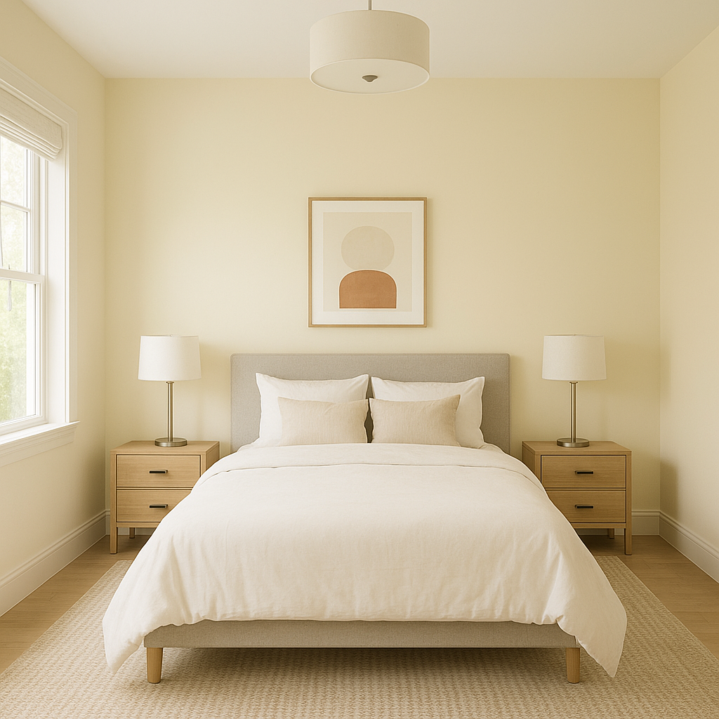
This soft neutral is perfect for bedrooms, where it fosters a sense of relaxation and calm. Combine Crème with plush textiles like velvet or linen in muted tones such as dusty blue, blush, or sage green for a serene retreat.
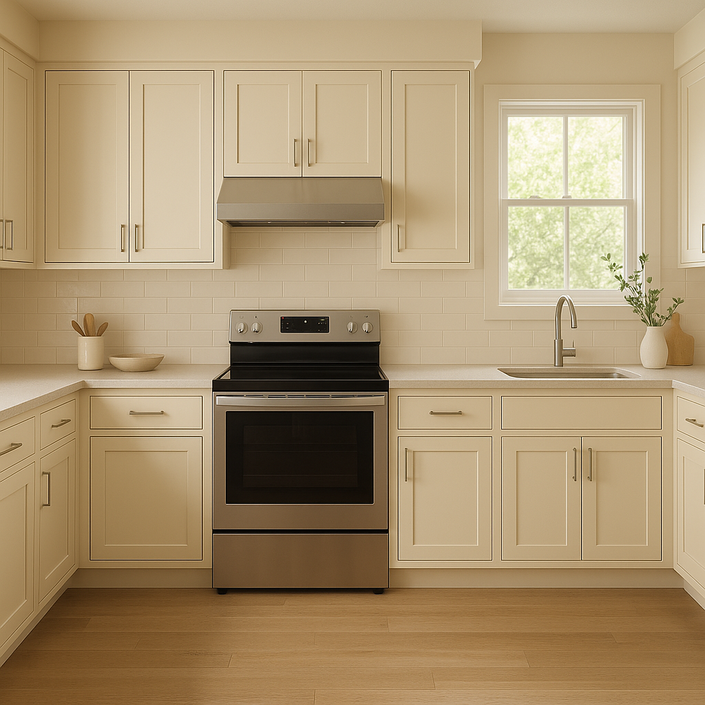
Crème adapts beautifully to kitchens and dining spaces, especially when paired with crisp white cabinetry or countertops. Its warmth encourages a welcoming environment, ideal for gatherings and shared meals.
In bathrooms, Crème feels luxurious and spa-like when paired with polished chrome or brushed gold fixtures. Consider adding a mosaic tile backsplash in coordinating neutral tones for added texture and elegance.
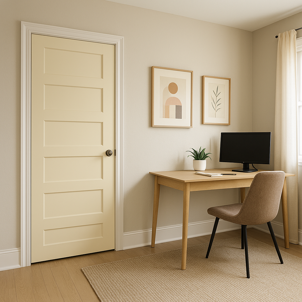
For home offices, Crème provides a neutral backdrop that promotes focus and productivity. Pair it with deep greens or navy blues for a rich, sophisticated workspace.
As a soft, welcoming hue, Crème is perfect for entryways and hallways, ensuring your home feels inviting right from the moment guests step inside. Pair it with bold artwork or statement lighting for added personality.
Benjamin Moore Crème is a go-to neutral for designers and homeowners alike, thanks to its ability to adapt to different spaces and styles. Its warm undertones make it a more lively alternative to cooler grays or stark whites, while its subtle sophistication ensures it never feels overwhelming. Whether you’re refreshing a single room or transforming an entire home, Crème is a reliable choice that delivers timeless elegance every time.
View Colors Only by Brand (No Imagery):
Sherwin-Williams
|
Benjamin-Moore
|
Behr
|
Valspar
Live on the Eastern Slope of Colorado and looking for a local painting professional, check out all our painting services and reach out for a free estimate.
Copyright © 2026 : Wild Fox Painting Inc. : 12435 Mead Way, Littleton, CO 80125


