Benjamin Moore Chartreuse (2024-10) is a bold and electrifying yellow-green hue that instantly infuses spaces with energy and personality. This striking color is perfect for those who want to make a statement in their interiors, combining the vivacity of yellow with the refreshing qualities of green. Its lively and modern presence makes it ideal for contemporary designs, eclectic spaces, and even artistic accents.
One of Chartreuse's most fascinating traits is its unique blend of undertones. It leans heavily into its green roots while incorporating a zesty yellow influence that warms the shade. These undertones give it a dynamic quality, making it feel vibrant and cheerful without being overly neon or jarring. Depending on the lighting and surrounding colors, Chartreuse can shift its character—appearing brighter in sunlight and more subdued under softer, ambient lighting. The yellow undertones add warmth, while the green base keeps the color grounded and fresh.
Pairing Benjamin Moore Chartreuse with complementary hues can enhance its boldness while creating a balanced and harmonious look. Here are some ideas for coordinating colors:
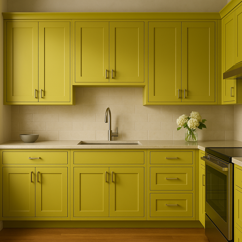
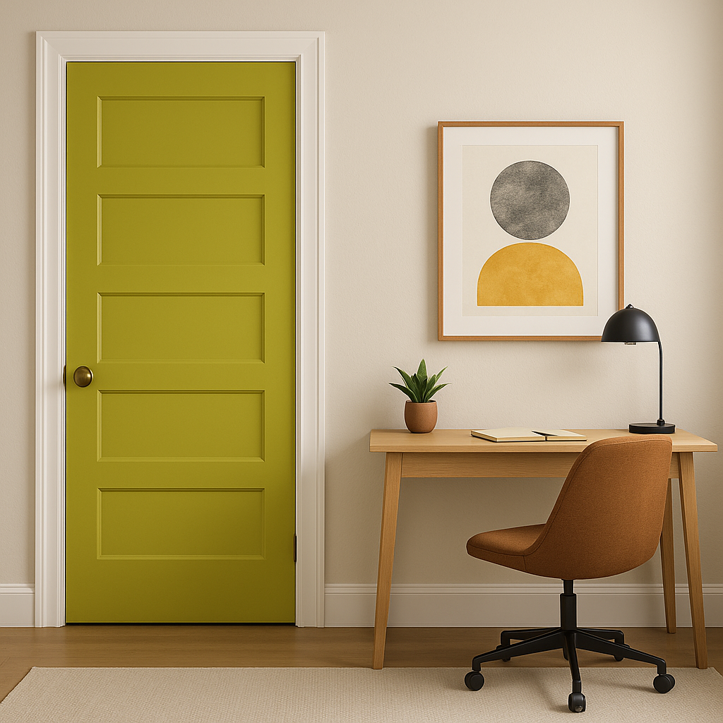
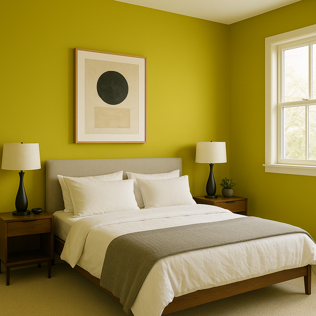
Chartreuse is a fearless color that can transform any area of your home into a dynamic focal point. Its versatility allows it to shine in both small doses and large-scale applications. Here are some creative ways to incorporate this vibrant hue:
Lighting plays a critical role in how Benjamin Moore Chartreuse appears in your space. In areas with ample natural light, Chartreuse will feel brighter and more dynamic, highlighting its yellow undertones. Under artificial lighting—particularly warm-toned bulbs—the green base becomes more pronounced, giving the hue a slightly softer and earthier feel. To fully embrace the color’s personality, test it in different lighting conditions and times of day to find the perfect balance for your room.
Benjamin Moore Chartreuse (2024-10) is not just a color; it’s a mood. It’s perfect for those who want to break away from traditional palettes and embrace something truly unique. Whether used sparingly as an accent or boldly across an entire room, Chartreuse brings a sense of optimism, creativity, and freshness to any interior. With its unique undertones and versatility, this vibrant hue can transform your home into a lively sanctuary filled with energy and style.
View Colors Only by Brand (No Imagery):
Sherwin-Williams
|
Benjamin-Moore
|
Behr
|
Valspar
Live on the Eastern Slope of Colorado and looking for a local painting professional, check out all our painting services and reach out for a free estimate.
Copyright © 2026 : Wild Fox Painting Inc. : 12435 Mead Way, Littleton, CO 80125


