Benjamin Moore Spring (2027-20) is a bold, refreshing green that captures the vitality and energy of nature's awakening. Infused with the essence of new growth and renewal, this hue brings a lively yet balanced ambiance to any space. Whether you're seeking to create a statement wall or add a pop of color to an accent piece, Spring (2027-20) is sure to invigorate your interiors with its dynamic charm.
Spring (2027-20) is a true green with subtle yellow undertones, giving it warmth and brightness without veering into neon territory. These yellow undertones make it feel approachable and optimistic, reminiscent of tender young leaves bathed in sunlight. The undertones ensure it remains versatile, pairing beautifully with both warm and cool palettes.
Benjamin Moore Spring (2027-20) can be paired with a variety of colors to create stunning combinations. Here are a few suggestions for coordinating colors:
Neutral Pairings:
To balance the vibrancy of Spring, pair it with soft neutrals like Benjamin Moore White Dove (OC-17) or Gray Owl (2137-60). These colors provide a calming backdrop that lets Spring shine as the focal point.
Earthy Complements:
Embrace its natural inspiration by pairing Spring with earthy tones such as Benjamin Moore Kendall Charcoal (HC-166) or Rich Clay (2084-20). These deep, grounding hues add sophistication while maintaining a connection to nature.
Playful Contrasts:
For a fun, modern look, combine Spring with bright, cheerful shades like Benjamin Moore Coral Reef (012) or Sunshine (2023-30). These pairings evoke a playful vibe that works beautifully in eclectic and youthful spaces.
Spring (2027-20) is incredibly versatile and can be used in a variety of applications to enhance your home or office decor:
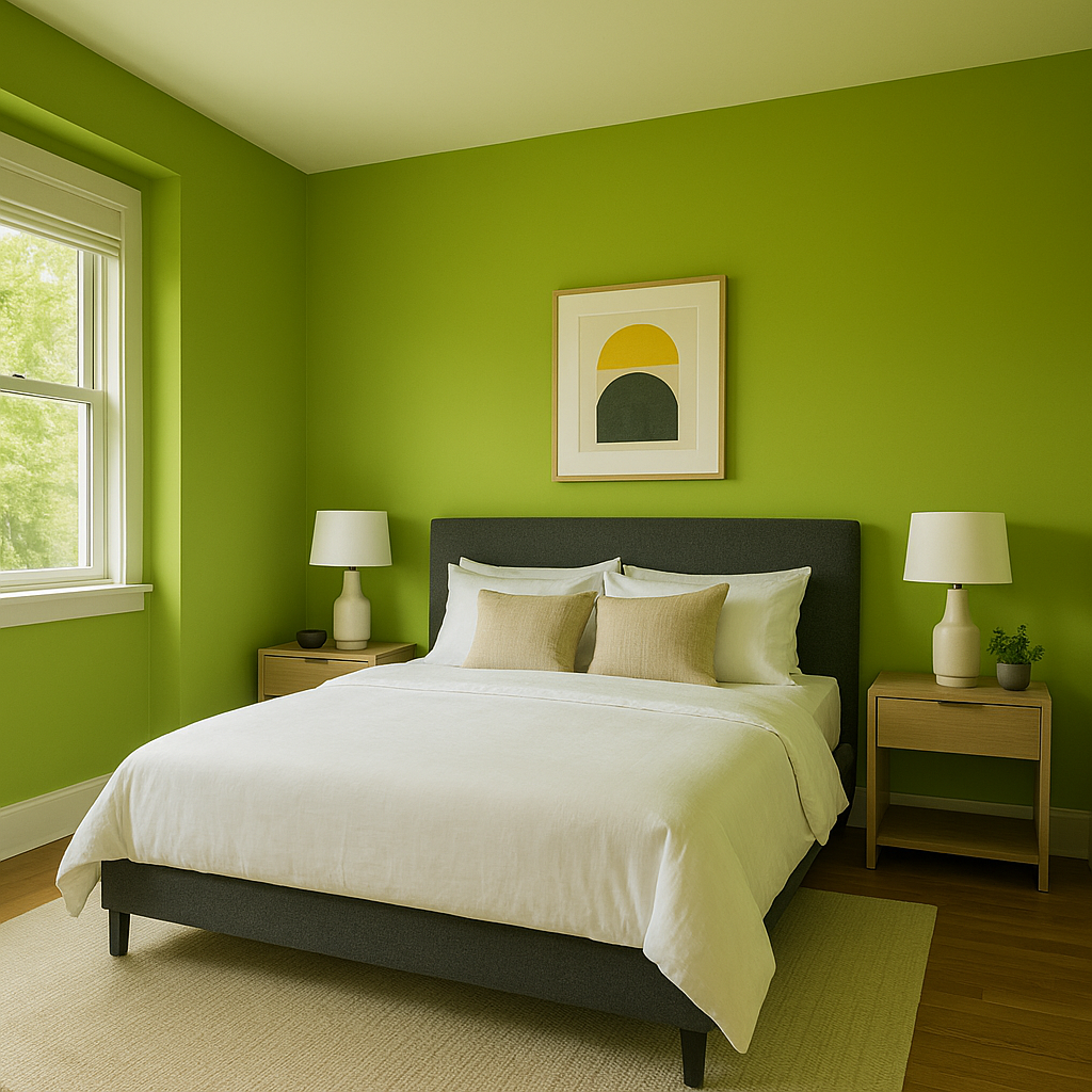
Living Rooms:
Create an inviting and lively living space with Spring as an accent wall or paired with neutral furnishings. Its cheerful tone brings a sense of energy and warmth, perfect for entertaining or relaxing.
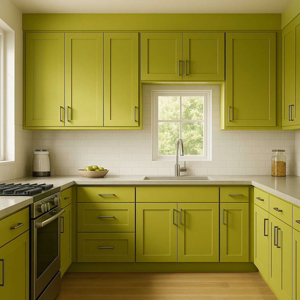
Kitchens and Dining Areas:
Infuse your culinary spaces with the vibrancy of Spring. It works wonderfully on cabinets, islands, or walls, especially when paired with white countertops and metallic accents like brushed gold or stainless steel.
Kids’ Rooms and Playrooms:
For spaces where creativity and joy are key, Spring is a perfect choice. Its playful nature inspires imagination and adds a dynamic touch to children's rooms or play areas.
Bathrooms:
Bring a spa-like freshness to your bathroom by pairing Spring with crisp whites and natural wood tones. This combination creates a serene yet uplifting retreat.
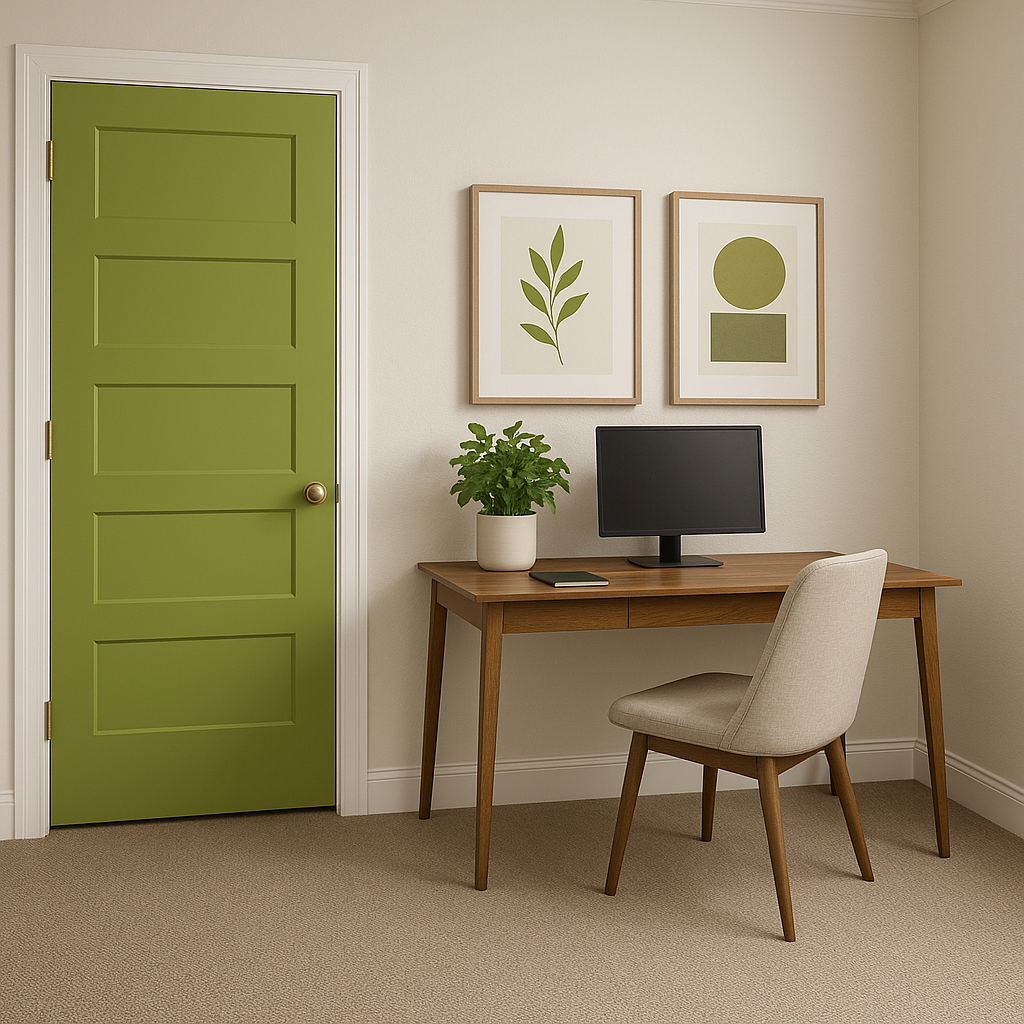
Outdoor Spaces:
Spring isn’t limited to interiors—it’s an excellent choice for exterior doors, shutters, or garden furniture. Its connection to nature makes it a harmonious addition to outdoor designs.
The vibrancy of Spring (2027-20) can shift slightly depending on the lighting in your space:
Benjamin Moore Spring (2027-20) is a celebration of life and renewal, making it an exciting choice for anyone seeking to transform their spaces with bold yet approachable color. Whether you’re designing a modern interior or a nature-inspired retreat, Spring (2027-20) offers endless possibilities to bring your vision to life.
View Colors Only by Brand (No Imagery):
Sherwin-Williams
|
Benjamin-Moore
|
Behr
|
Valspar
Live on the Eastern Slope of Colorado and looking for a local painting professional, check out all our painting services and reach out for a free estimate.
Copyright © 2026 : Wild Fox Painting Inc. : 12435 Mead Way, Littleton, CO 80125


