Benjamin Moore Potpourri (2029-50) is a delicate, blush-toned hue that exudes warmth, serenity, and charm. Perfect for creating inviting spaces, this soft pink color is an ideal choice for homeowners and designers seeking an understated yet sophisticated palette. Its gentle presence adds a layer of refinement to rooms, making it versatile for both contemporary and classic interiors.
Potpourri is a muted pink with subtle beige undertones, giving it an earthy softness that prevents it from feeling overly sweet or juvenile. The beige inflection grounds the color, making it versatile and easy to pair with neutral palettes. There’s also a whisper of peach in its undertone, adding warmth and a sunlit glow to any space. This gentle interplay of pink, beige, and peach creates a soothing ambiance, making Potpourri a perfect backdrop for relaxation and comfort.
Benjamin Moore Potpourri harmonizes beautifully with a variety of complementary colors, allowing for seamless integration into diverse design styles. Whether you're layering soft neutrals or adding bold accents, here are some coordinating colors to consider:
Neutral Pairings:
Potpourri pairs effortlessly with creamy whites like Chantilly Lace (OC-65) or White Dove (OC-17). These crisp neutrals highlight the subtle warmth of Potpourri, creating a clean and elegant aesthetic.
Earthy Tones:
Complement its beige undertones with soft taupes or greiges, such as Revere Pewter (HC-172) or Edgecomb Gray (HC-173). These combinations evoke a calming, grounded feel.
Bold Contrasts:
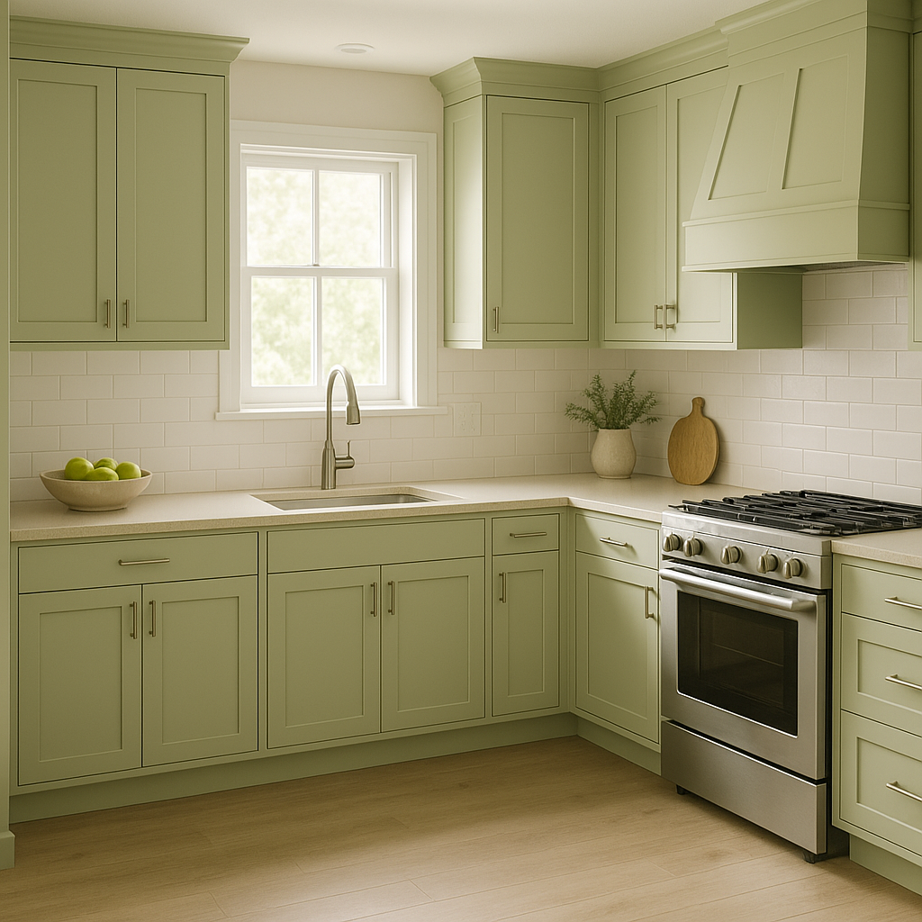
For a dramatic look, consider pairing Potpourri with deep charcoals like Kendall Charcoal (HC-166) or rich greens like Black Forest Green (HC-187). These darker shades create intriguing contrast while maintaining a sense of sophistication.
Playful Accents:
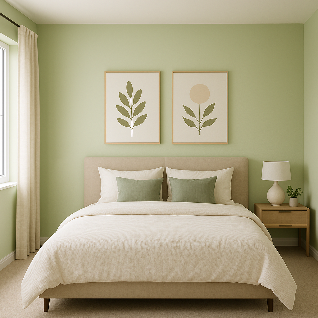
Potpourri also works well with cheerful pastels like Spring Mint (2040-70) or Soft Fern (2144-40). These lighter hues emphasize its whimsical side, making it ideal for playful spaces like nurseries or eclectic living rooms.
Potpourri’s versatility shines through in its ability to adapt to various spaces and moods. Here are some ways to incorporate this delightful hue into your home or project:
Bedrooms:
Potpourri is a natural fit for bedrooms where relaxation and coziness are key. Its soft pink tone creates an intimate and nurturing atmosphere, ideal for restful nights. Pair it with plush textiles such as velvet or linen for added depth and comfort.
Living Rooms:
Create an inviting living room by using Potpourri as a wall color or accent. Its understated charm makes it a perfect companion to furniture in neutral tones, and it works equally well with wood finishes, adding warmth to the overall space.
Nurseries and Kids' Rooms:
For a gender-neutral or softly feminine nursery, Potpourri offers a modern alternative to traditional pinks. Pair it with soft whites and playful pastels to craft a cheerful yet serene environment.
Bathrooms:
Transform your bathroom into a spa-like retreat by combining Potpourri with marble finishes and antique brass or gold fixtures. This combination creates a luxurious yet understated look.
Dining Rooms:
Potpourri can elevate dining spaces by introducing a sense of refinement and charm. Pair it with dark wood furniture and metallic accents to craft a sophisticated and inviting atmosphere.
Accent Walls and Décor:
If you're hesitant about committing to full walls, Potpourri works beautifully as an accent color. Use it on a single wall, furniture pieces, or décor items such as throw pillows and curtains to introduce a touch of warmth and elegance.
What makes Benjamin Moore Potpourri stand out is its ability to strike a perfect balance between playful and timeless. Whether you’re leaning toward a modern aesthetic or something more traditional, this soft hue adapts effortlessly to your vision. Its understated warmth and depth allow it to act as either a main color or a supporting player in your palette, making it a versatile choice for any design application.
With its harmonious undertones, wide range of coordinating colors, and suitability for various spaces, Benjamin Moore Potpourri (2029-50) is a color that invites creativity and inspires elegance.
View Colors Only by Brand (No Imagery):
Sherwin-Williams
|
Benjamin-Moore
|
Behr
|
Valspar
Live on the Eastern Slope of Colorado and looking for a local painting professional, check out all our painting services and reach out for a free estimate.
Copyright © 2026 : Wild Fox Painting Inc. : 12435 Mead Way, Littleton, CO 80125


