
Benjamin Moore Frosty (2029-70) is an exquisite, soft white paint color that exudes a sense of cool tranquility and understated elegance. This versatile shade is ideal for creating minimalist spaces or balancing more vibrant hues with its crisp, clean appearance. Frosty is a white that leans toward a cooler tone, making it both refreshing and modern in its aesthetic appeal. Whether you're looking to brighten up a room or set a clean canvas for bolder design elements, Frosty delivers with remarkable sophistication.
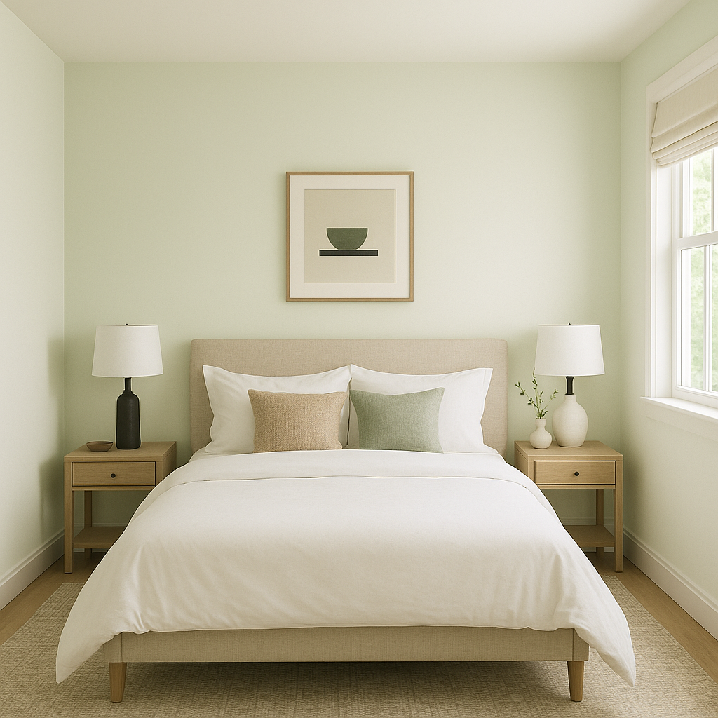
Frosty carries distinct blue and gray undertones, giving it a subtle icy quality that makes it stand out from warmer whites. These undertones lend a serene and calming feel to the color, making it perfect for spaces where relaxation and clarity are a priority. While it remains predominantly white, the cool undertones become more pronounced in certain lighting conditions, such as northern-facing rooms or spaces illuminated by LED and cooler artificial lighting.
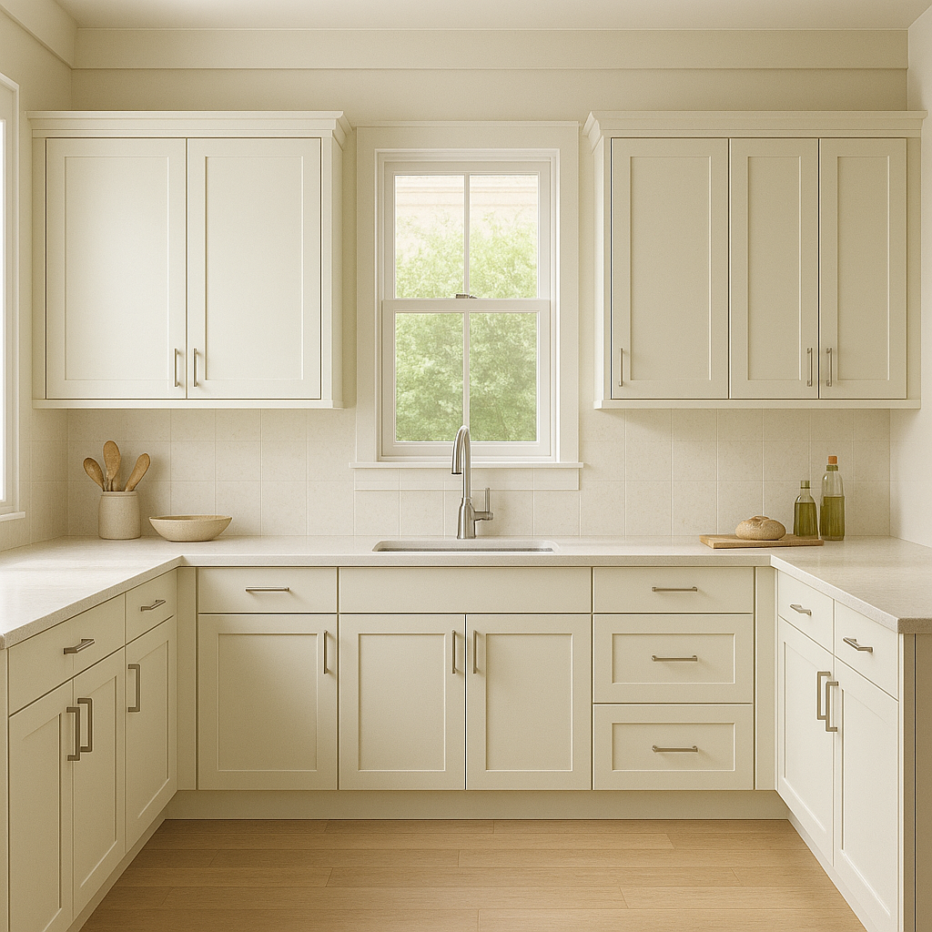
Its blue-gray undertones also make Frosty an excellent choice for rooms that incorporate water or natural elements, such as bathrooms, coastal-inspired spaces, or areas with large windows overlooking greenery or ocean views. These undertones are subtle, so they won't overpower your design but will instead complement the space with a refreshing touch.
One of the most appealing features of Frosty is its ability to pair beautifully with a wide range of colors. Whether you’re aiming for a monochromatic palette or a high-contrast design, this shade adapts seamlessly. Here are some excellent coordinating colors to consider:
Frosty’s adaptability and modern vibe make it a go-to choice for a variety of spaces and design styles. Here are some ways to incorporate this stunning shade into your home:
Frosty is highly dependent on lighting conditions, so it’s important to test it on your walls before committing. In rooms with ample natural light, particularly northern-facing light, the blue undertones may become more noticeable, enhancing its icy appearance. In warmer lighting, such as southern-facing rooms or spaces with incandescent bulbs, Frosty may appear softer and less stark, but its cool undertones will still shine through.
Benjamin Moore Frosty (2029-70) brings a contemporary edge to a classic white, offering a refreshing alternative for those who want a clean yet dynamic backdrop. Its cool undertones, ability to coordinate with a broad spectrum of colors, and versatility across various design styles make it a standout choice for modern homes. Whether you’re painting an entire room, accenting architectural details, or refreshing your trim, Frosty is a timeless white with a cool, modern twist.
View Colors Only by Brand (No Imagery):
Sherwin-Williams
|
Benjamin-Moore
|
Behr
|
Valspar
Live on the Eastern Slope of Colorado and looking for a local painting professional, check out all our painting services and reach out for a free estimate.
Copyright © 2026 : Wild Fox Painting Inc. : 12435 Mead Way, Littleton, CO 80125


