Benjamin Moore Peppermint 2033-20 is a vibrant and energetic shade of green that evokes the crispness of freshly picked mint leaves. This color is perfect for creating a lively and refreshing atmosphere in any space, making it an ideal choice for homeowners and designers seeking to infuse interiors with a sense of vitality and rejuvenation. Its bold yet versatile nature ensures it can be a standout feature or a complementary accent, depending on how it’s used.
Peppermint 2033-20 is a vivid medium-green with cool undertones. Its base leans toward blue, giving it a crisp, clean appearance rather than a warm or yellowish hue. The cool undertones add a touch of sophistication, making it a modern choice for contemporary interiors while still feeling fresh and playful.
These undertones allow Peppermint to thrive in spaces with ample natural light, where the color can fully display its vibrancy. In dimmer settings, the blue undertones subtly come forward, creating a moodier, richer green that feels cozy yet invigorating.
Benjamin Moore Peppermint 2033-20 works beautifully with a variety of coordinating colors to create balanced and visually appealing designs. Here are some suggestions:
Benjamin Moore Peppermint is a versatile color that can be used in various spaces within the home. Here are some ideas for incorporating it into your design:
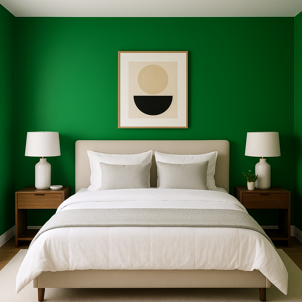
Use Peppermint as a statement wall in living rooms, dining areas, or bedrooms. It’s particularly effective in spaces with white trim or neutral furnishings, as it adds a bold yet refined splash of color.
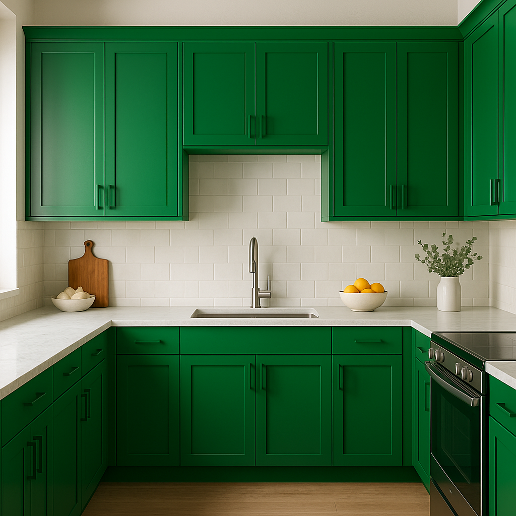
Peppermint is a fantastic choice for kitchens and bathrooms. On cabinetry, it creates a crisp, clean look that pairs wonderfully with white or marble countertops. In bathrooms, it evokes a spa-like atmosphere when paired with sleek metallic fixtures and simple tile designs.
The playful and energetic nature of Peppermint makes it a perfect fit for children’s bedrooms or playrooms. Combine it with soft pastels or bright accents to create a cheerful environment that inspires creativity.
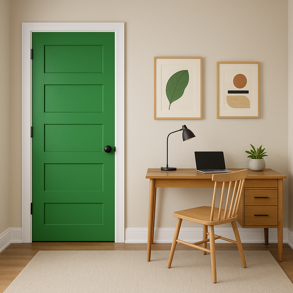
Peppermint is equally stunning in outdoor settings. Use it on front doors, shutters, or patio furniture to inject a lively, welcoming vibe into your home’s exterior. Its cool undertones make it especially fitting for landscapes with lots of greenery.
View Colors Only by Brand (No Imagery):
Sherwin-Williams
|
Benjamin-Moore
|
Behr
|
Valspar
Live on the Eastern Slope of Colorado and looking for a local painting professional, check out all our painting services and reach out for a free estimate.
Copyright © 2026 : Wild Fox Painting Inc. : 12435 Mead Way, Littleton, CO 80125


