Benjamin Moore Spruce (2035-50) is a striking medium green that brings energy and vitality to any space. With its bold presence, this color evokes the refreshing essence of nature, making it perfect for interiors seeking a vibrant yet grounded aesthetic. Whether you’re infusing a room with personality or creating a lush backdrop for decor, Spruce offers endless possibilities.
Spruce (2035-50) features balanced undertones that lean slightly warm, giving it an inviting and approachable feel despite its saturated green hue. The subtle warmth prevents the color from feeling overly stark, making it a great choice for both modern and traditional spaces. It carries a hint of yellow in its undertone, which softens its vibrancy and allows it to harmonize beautifully with other colors in the palette.
Benjamin Moore Spruce is highly versatile when paired with complementary shades. Here are some recommendations to create a cohesive and stunning color scheme:
Spruce is a versatile green that works beautifully across a variety of spaces. Its vibrant yet grounded personality makes it ideal for creating a statement or adding a touch of nature-inspired energy. Here’s how you can use Spruce in your home:
Introduce Spruce as an accent wall to energize your living space. Pair it with neutral furniture and natural textures like wood and linen for a balanced, inviting atmosphere. Add botanical prints or greenery to tie the look together.
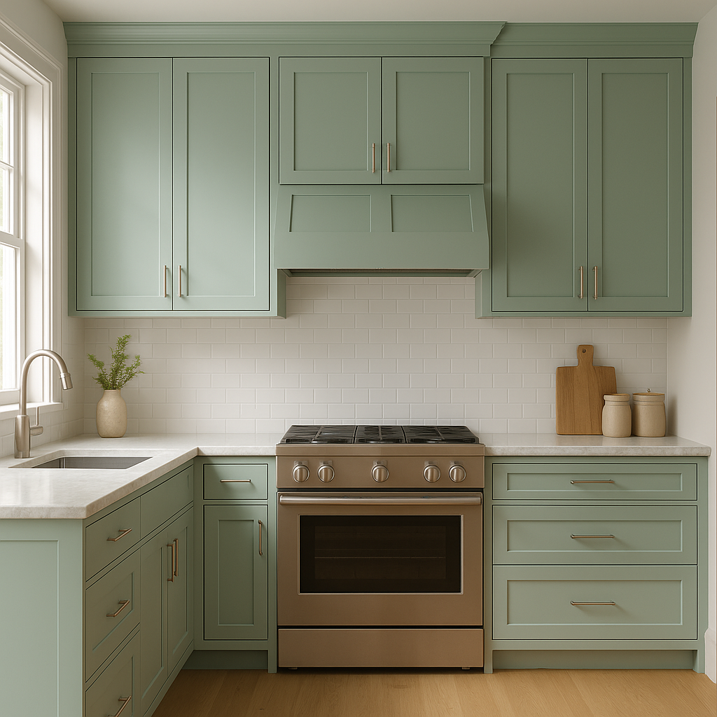
Spruce brings a refreshing pop of color to kitchens. Use it for cabinetry or as a backsplash to create a lively yet sophisticated space. Pair it with white countertops and brass hardware for a modern farmhouse vibe.
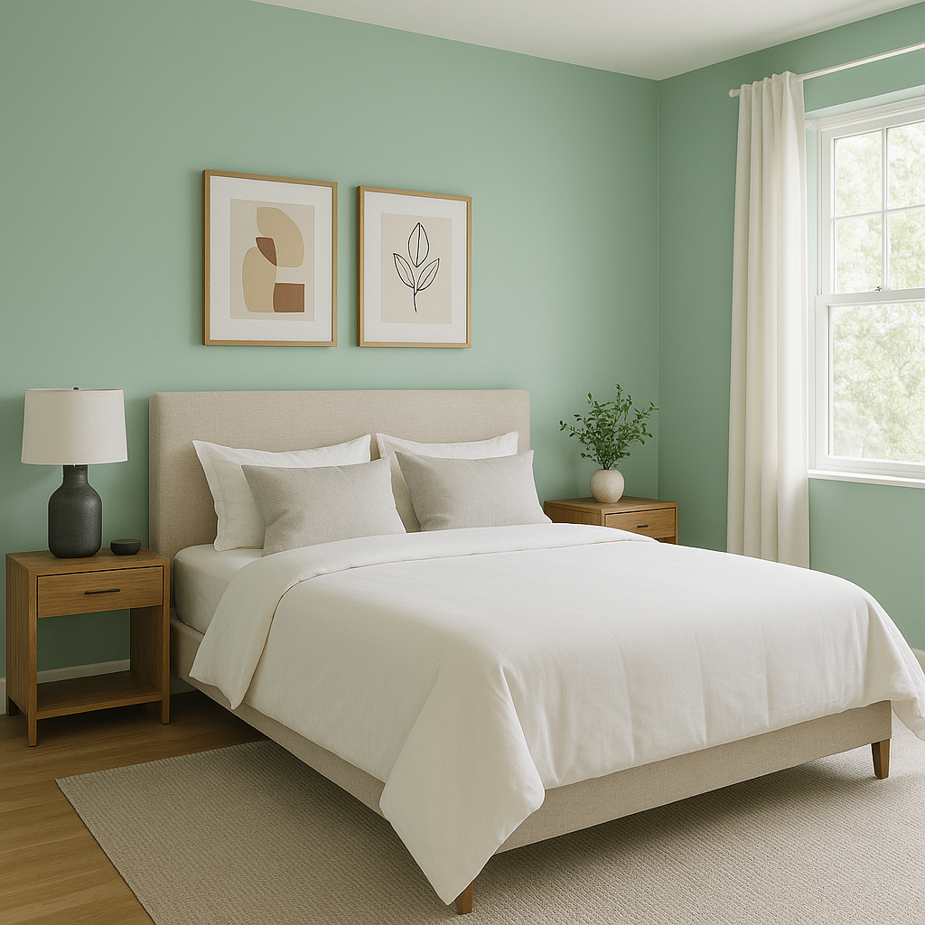
In bedrooms, Spruce can create a cozy and relaxing environment. Use it as an accent color on bedding or furniture, or paint the walls for a bold statement. Soft neutrals like beige or cream help maintain a tranquil and balanced feel.
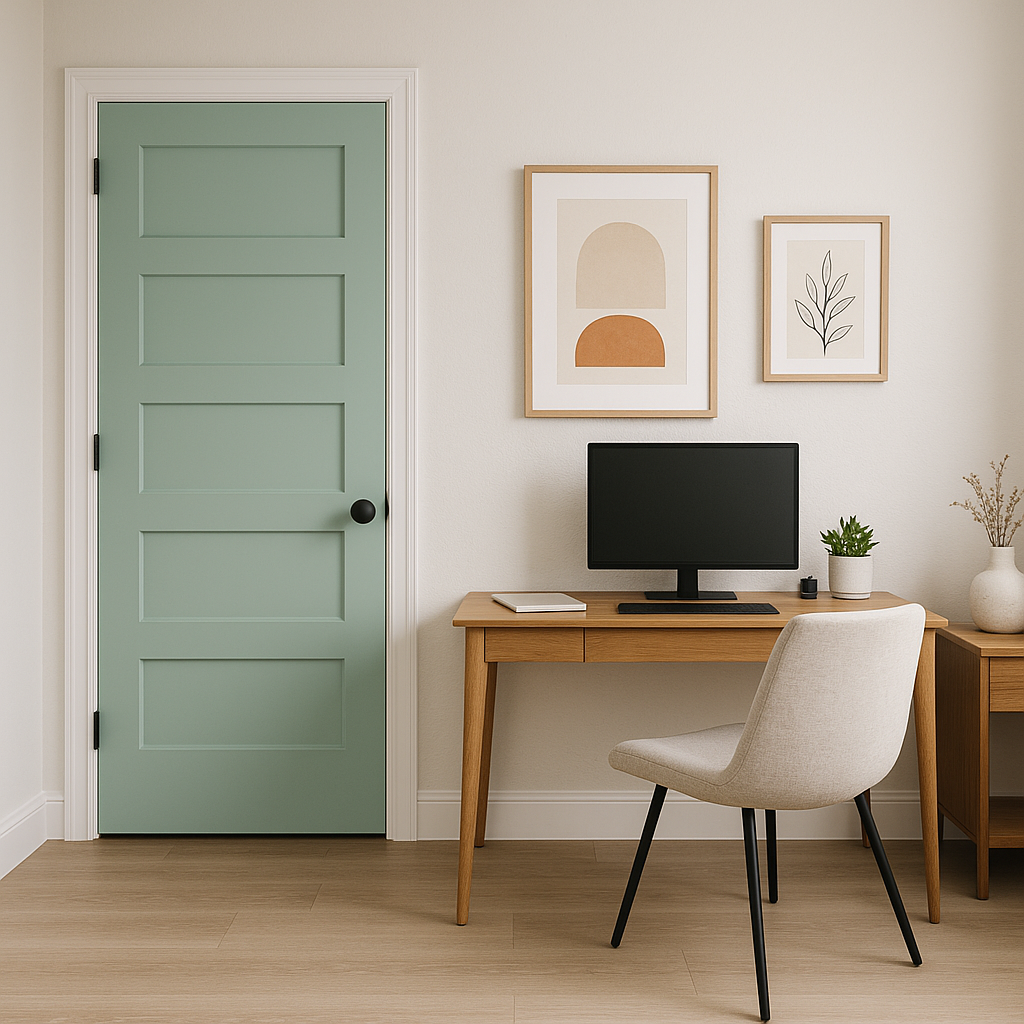
Spruce is an excellent choice for home offices, where it can inspire creativity and focus. Use it on walls or shelving and pair it with sleek white furniture for a crisp, modern look.
This color isn’t limited to interiors—it’s also a fantastic option for exterior spaces. Spruce works beautifully on shutters, front doors, or even siding. Pair it with white trim for a classic look or deep charcoal accents for a contemporary aesthetic.
Benjamin Moore Spruce (2035-50) is a bold yet versatile green that invites nature into your home while providing endless design possibilities. Its balanced undertones, ability to pair with a variety of colors, and adaptable uses make it a standout choice for homeowners and designers alike. Whether you’re looking to refresh a single room or transform your entire home, Spruce is sure to make a lasting impression.
View Colors Only by Brand (No Imagery):
Sherwin-Williams
|
Benjamin-Moore
|
Behr
|
Valspar
Live on the Eastern Slope of Colorado and looking for a local painting professional, check out all our painting services and reach out for a free estimate.
Copyright © 2026 : Wild Fox Painting Inc. : 12435 Mead Way, Littleton, CO 80125


