Benjamin Moore Italian (2035-70) is a refined, soft green that brings a subtle elegance to any space. This delicate shade offers a perfect balance between freshness and tranquility, making it an adaptable choice for a wide range of interior design styles. Whether used as a standalone color or paired with complementary hues, Italian is a versatile option that can elevate your home’s aesthetic with ease.
Italian is a light, muted green with distinct gray undertones that temper its vibrancy, ensuring a sophisticated and understated appearance. The gray infusion softens the green, making it less saturated and more versatile for interiors that call for a peaceful ambiance. This color leans toward a cool spectrum, offering a calm and soothing effect, which is ideal for creating serene environments.
The undertones in Italian allow it to harmonize beautifully with other muted shades, making it perfect for both modern and traditional spaces. Its subtle coolness ensures it won’t overwhelm the room, instead acting as a gentle backdrop that complements other design elements.
To create a cohesive and harmonious palette, pair Benjamin Moore Italian with other complementary hues. Here are some suggestions:
Neutral Coordinating Colors:
Bold Accent Colors:
Additional Pairings:
Benjamin Moore Italian is a versatile hue that can be used in a variety of spaces to achieve a serene and polished look. Here are some recommendations for incorporating this color into your home:
Living Rooms: Use Italian on the walls of your living room to create a tranquil atmosphere that encourages relaxation. Pair it with neutral furniture and natural textures like wood or linen for a timeless, understated elegance.
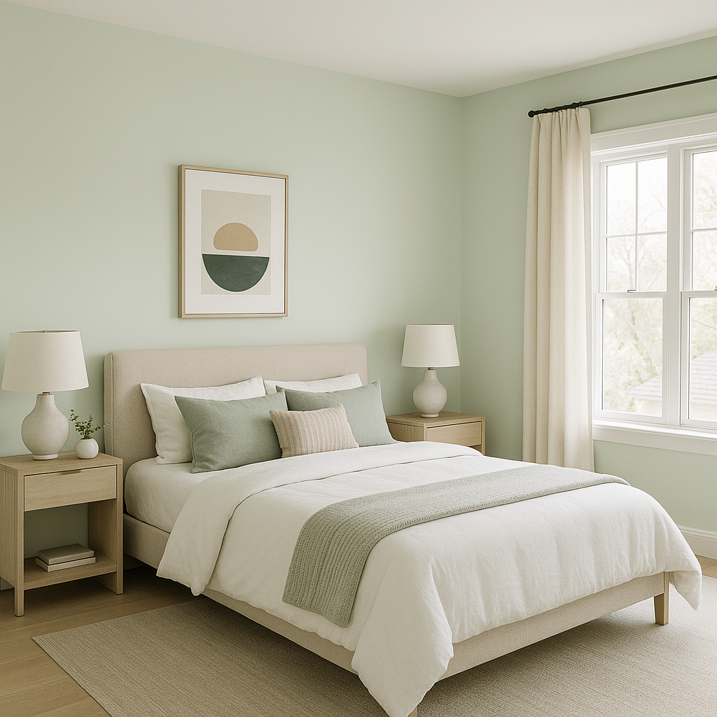
Bedrooms: Italian is an ideal choice for bedrooms, where its soothing undertones promote restfulness. Combine it with crisp white bedding and soft accent pillows in blush or navy for a chic, layered look.
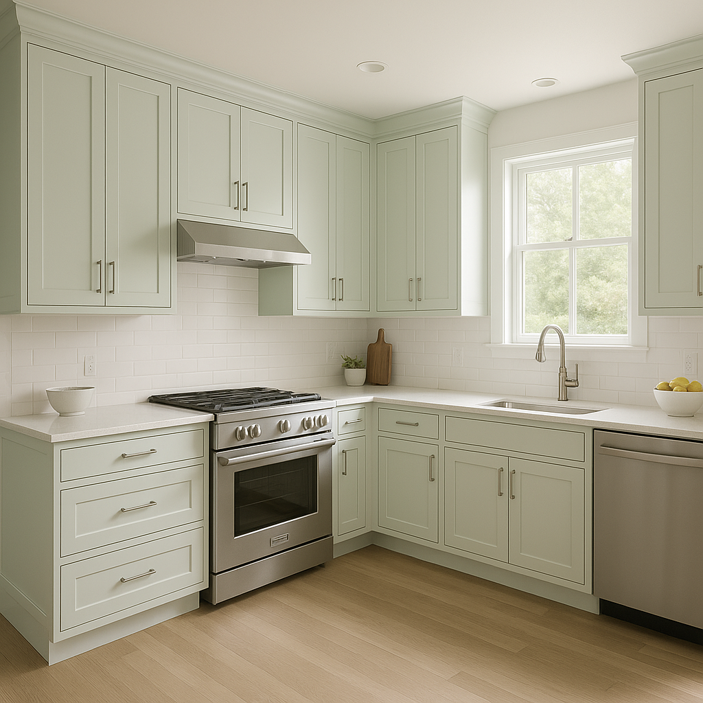
Kitchens: For a fresh and inviting kitchen space, consider using Italian on cabinetry or walls. Pair it with white quartz countertops, brushed nickel hardware, and subway tiles for a modern yet cozy vibe.
Bathrooms: Create a spa-like retreat by incorporating Italian into your bathroom design. Use it on walls and pair it with marble finishes, matte black fixtures, and soft white towels for a calming and luxurious setting.
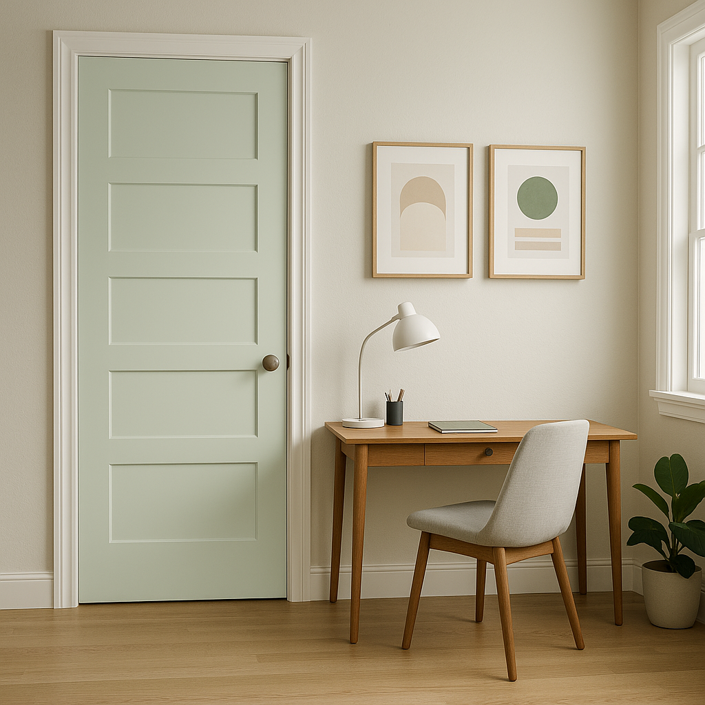
Entryways: Welcome guests with the soft elegance of Italian in your entryway. This color works beautifully as a backdrop for artwork or mirrors, creating a warm and inviting first impression.
Lighting Considerations: Italian’s undertones may shift slightly depending on lighting conditions. In spaces with ample natural light, the green will appear brighter and fresher, while in dimly lit areas, the gray undertones will become more pronounced, adding a sophisticated depth.
Texture Pairings: Enhance the beauty of Italian by incorporating textures like woven baskets, jute rugs, or velvet accent pieces. These details can add dimension and personality to the room.
Layered Palette: Don’t be afraid to layer Italian with other shades of green or gray for a monochromatic look. This approach works particularly well in minimalist or Scandinavian-style interiors.
Benjamin Moore Italian (2035-70) is a graceful shade that can transform any room into a sanctuary of style and comfort. Its muted green tone, enriched by subtle gray undertones, makes it a timeless choice for homeowners seeking to create a peaceful and sophisticated atmosphere. With its ability to coordinate effortlessly with a variety of hues and its versatility across different design applications, Italian is a color that promises both beauty and functionality in your interior spaces.
View Colors Only by Brand (No Imagery):
Sherwin-Williams
|
Benjamin-Moore
|
Behr
|
Valspar
Live on the Eastern Slope of Colorado and looking for a local painting professional, check out all our painting services and reach out for a free estimate.
Copyright © 2026 : Wild Fox Painting Inc. : 12435 Mead Way, Littleton, CO 80125


