Benjamin Moore Surf (2036-60) is a lively, refreshing color that instantly evokes the energy and tranquility of coastal living. This medium-toned blue-green shade is the epitome of casual sophistication, making it a versatile choice for a wide range of interior design styles. Whether you're designing a beach-inspired retreat or simply looking to inject a splash of personality into your home, Surf is a color that delivers playful elegance and a soothing presence in equal measure.
Surf is a harmonious mix of blue and green, with slightly cool undertones that lean toward aqua. These undertones make it an excellent choice for creating spaces that feel fresh, airy, and invigorating. The subtle coolness adds a calming element to the vibrancy, making Surf adaptable to both contemporary and classic designs.
When viewed under natural light, Surf reveals its sunlit coastal charm, emphasizing its soft green undertones. In artificial lighting, the color takes on a more saturated blue appearance, giving it a dynamic quality that shifts throughout the day.
Surf (2036-60) is a highly versatile shade that pairs beautifully with a variety of colors, allowing you to craft a cohesive and stylish palette for your space. Here are some coordinating color options to consider:
Surf (2036-60) is a versatile color that can be used in various spaces to add a sense of vitality and calm. Whether you’re designing an entire room or adding a splash of color to smaller areas, Surf can transform your interiors into welcoming havens.
Surf is perfect for living rooms, especially when paired with light neutrals or warm wood tones. It adds energy to the room while remaining grounded enough to create a cozy atmosphere.
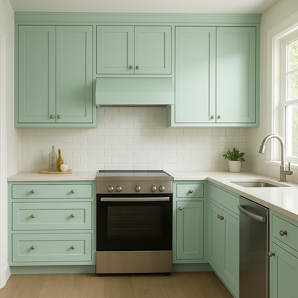
This shade works beautifully in kitchens and bathrooms, where its fresh, aquatic tones can create a spa-like feel. Consider using Surf for cabinetry, backsplashes, or walls to bring a touch of coastal charm into your home.
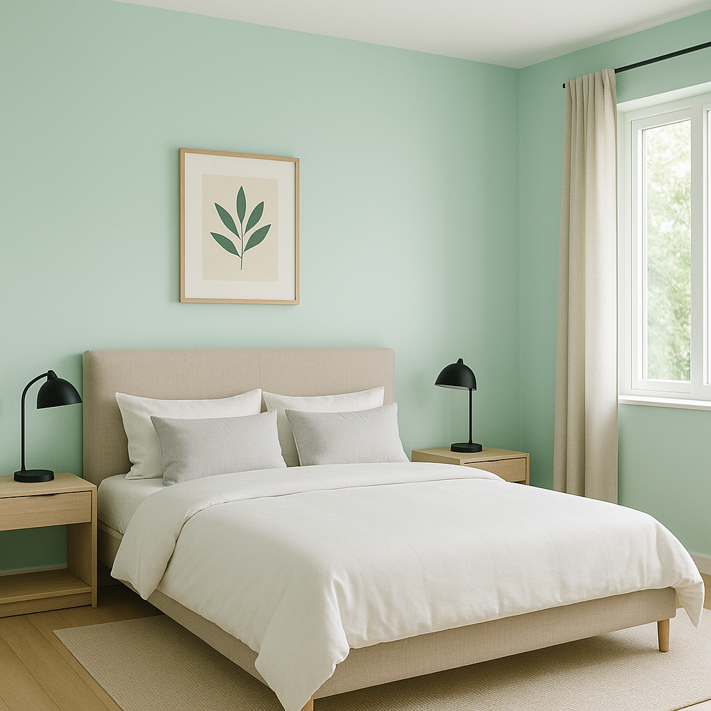
For bedrooms, Surf offers a tranquil and serene vibe that promotes relaxation. Pair it with soft white bedding and light wood furniture to create a peaceful retreat.
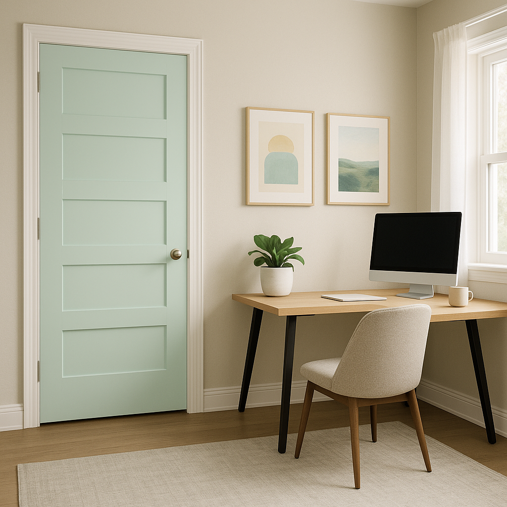
If you’re looking to experiment with color, Surf makes a fantastic choice for accent walls. It can also be incorporated into décor elements like throw pillows, area rugs, or artwork to add a subtle pop of color to neutral spaces.
Benjamin Moore Surf (2036-60) is a color that captures the essence of a breezy day by the ocean. Its balance of blue and green undertones makes it both refreshing and grounding, while its versatility ensures it can be paired with a wide range of coordinating colors. Whether you're designing a serene bedroom, a lively living room, or even a playful kitchen space, Surf is a shade that brings a breath of fresh air into any home.
View Colors Only by Brand (No Imagery):
Sherwin-Williams
|
Benjamin-Moore
|
Behr
|
Valspar
Live on the Eastern Slope of Colorado and looking for a local painting professional, check out all our painting services and reach out for a free estimate.
Copyright © 2026 : Wild Fox Painting Inc. : 12435 Mead Way, Littleton, CO 80125


