Benjamin Moore Return (2038-50) is a bold, invigorating green that exudes energy, vitality, and a connection to nature. This striking color has a modern edge that makes it a versatile choice for a variety of interior design styles, from contemporary to eclectic. Its lively hue is both refreshing and impactful, making it perfect for those looking to bring a dynamic burst of life into their space.
Return (2038-50) leans toward the cooler side of the green spectrum, with subtle blue undertones that give it a crisp, vibrant quality. These undertones prevent the color from feeling overly warm or tropical, instead imbuing it with a grounded yet energetic personality. The blue undertones also make it a fantastic choice for spaces where you want to evoke a sense of balance, creativity, or renewal.
Benjamin Moore Return (2038-50) is a standout color, but it pairs beautifully with a wide range of complementary and neutral tones. Here are some curated suggestions for coordinating colors:
Return (2038-50) is a versatile green that can be used to create a variety of moods, depending on the room and lighting conditions. Below are some of the best ways to incorporate this lively hue into your home or office:
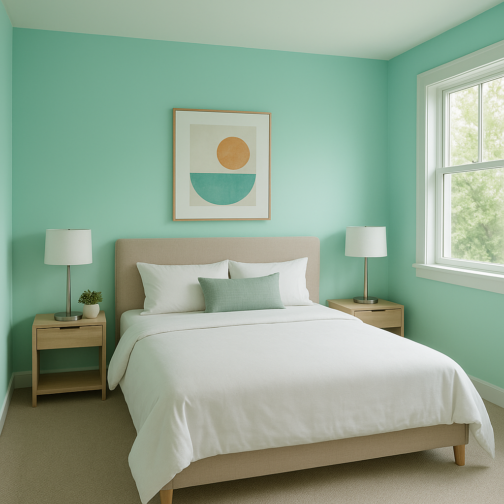
Make a bold statement by using Return as a feature wall in a living room, dining area, or bedroom. Its vibrant nature draws the eye and adds personality to the space without overwhelming it.
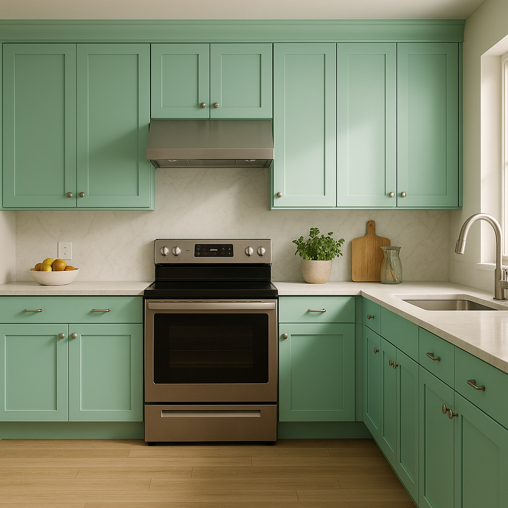
Green is known for its association with freshness and health, making Return an excellent choice for kitchens and dining spaces. Pair it with white cabinetry and light countertops for a bright, clean look, or contrast it with darker wood tones for a cozier vibe.
The energizing qualities of Return make it ideal for home offices, studios, or other creative spaces. This shade fosters a sense of focus and inspiration, helping you stay productive and motivated.
Inject a burst of playfulness and energy into children's spaces with this fun and lively green. It pairs well with other bright colors for a cheerful and engaging environment.
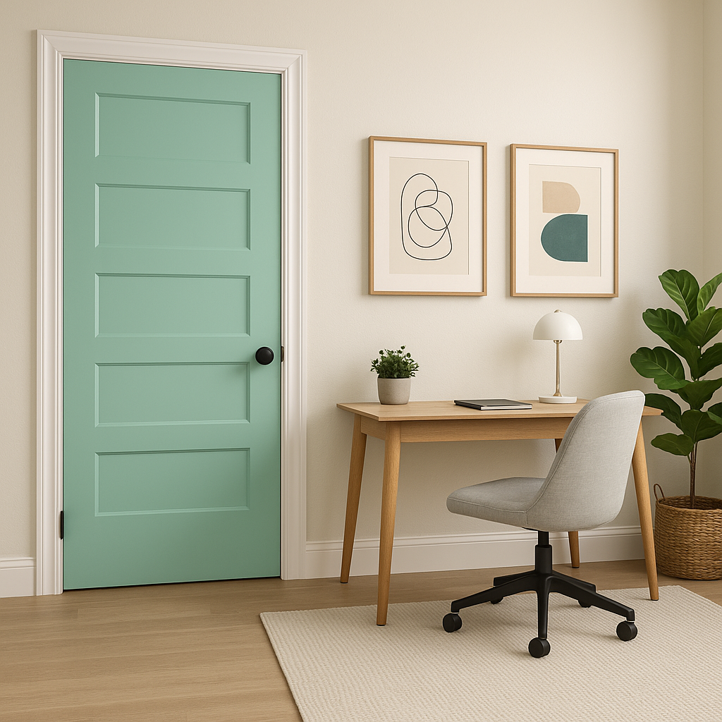
Extend the vibrancy of nature by using Return on exterior doors, shutters, or even patio furniture. Its connection to the natural world makes it an excellent choice for outdoor spaces.
Return (2038-50) can shift slightly in appearance depending on the lighting conditions. In spaces with ample natural light, the blue undertones become more apparent, giving the color a fresh and almost aquatic feel. In lower or artificial lighting, the green appears deeper and more saturated, creating a cozy and bold atmosphere. To ensure the color works in your space, test it in different lighting conditions throughout the day.
This vibrant green offers a unique blend of energy and sophistication, making it an excellent choice for homeowners and designers seeking a standout color. Whether used as a primary wall color, an accent, or a decorative element, Return (2038-50) brings a sense of life and vitality to any interior or exterior space. With its versatile undertones and ability to pair seamlessly with a variety of coordinating colors, this shade is a bold yet timeless option for any design project.
View Colors Only by Brand (No Imagery):
Sherwin-Williams
|
Benjamin-Moore
|
Behr
|
Valspar
Live on the Eastern Slope of Colorado and looking for a local painting professional, check out all our painting services and reach out for a free estimate.
Copyright © 2026 : Wild Fox Painting Inc. : 12435 Mead Way, Littleton, CO 80125


