Benjamin Moore Seafoam (2039-60) is a soft, refreshing green that evokes the tranquil essence of coastal waters and natural landscapes. This versatile color combines gentle vibrancy with soothing undertones, making it a perfect choice for creating a serene atmosphere in a variety of interior design styles. Whether you're looking to revitalize a room with a touch of nature or craft a light and airy ambiance, Seafoam delivers effortless charm and elegance.
Seafoam is a light green with subtle bluish undertones, giving it a cool and relaxed vibe reminiscent of ocean foam or delicate sea glass. These undertones contribute to its calming effect, making it ideal for spaces where you want to unwind or feel rejuvenated.
At certain times of day, depending on the light, you may notice that Seafoam leans slightly more toward its blue side, especially in rooms with northern light exposure. In warmer lighting, its green essence becomes more pronounced, creating a soft interplay that adds depth to the room without overwhelming the senses.
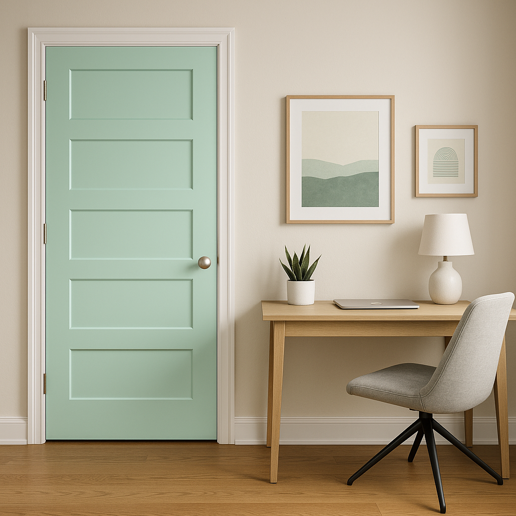
Seafoam’s versatility allows it to pair beautifully with a range of complementary colors. Here are some suggestions to help you create a cohesive and harmonious look:
These combinations work well across a variety of spaces, whether you’re designing a bedroom retreat, a welcoming entryway, or a modern coastal kitchen.
Seafoam’s light and airy character makes it an excellent choice for living rooms, especially if you're aiming to create a space that feels open and inviting. Pair it with neutral furniture and natural textures like rattan or light wood for an organic, coastal-inspired look.
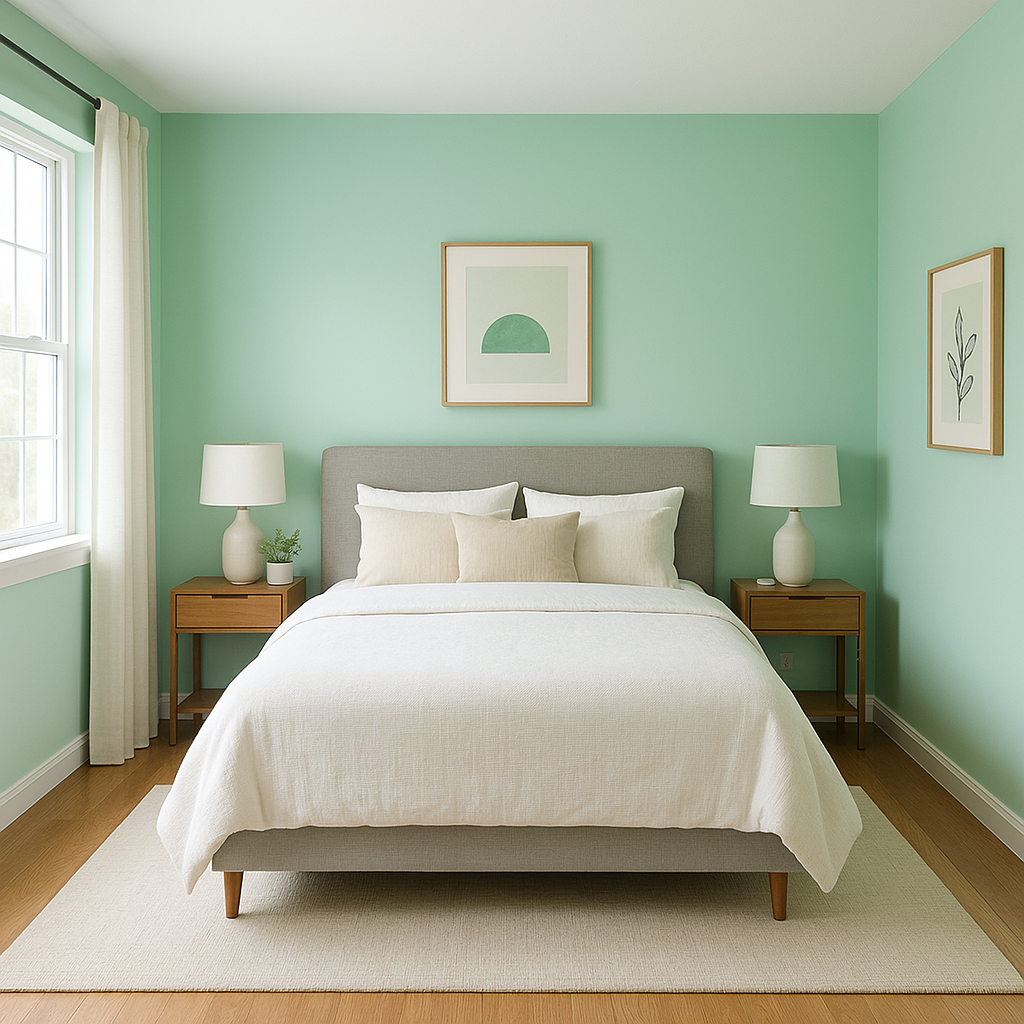
The calming undertones of Seafoam are perfect for bedrooms. Use it on the walls to promote restfulness and pair it with soft linens in whites or pale grays for a minimalist yet cozy retreat.
Seafoam’s fresh, clean vibe works beautifully in bathrooms. Combine it with white subway tile, brushed nickel fixtures, and soft teal accents for a spa-like atmosphere.
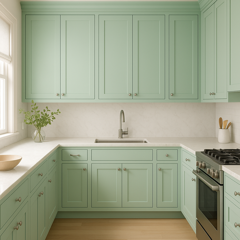
For kitchens, Seafoam can bring a touch of nature indoors. Consider using it on cabinetry or walls, complemented by white countertops and stainless steel appliances for a modern yet inviting design.
In nurseries or playrooms, Seafoam creates a cheerful and soothing environment. Pair it with pastel accents like blush or lavender to add a playful touch without overwhelming the design.
Lighting plays a significant role in how Benjamin Moore Seafoam is perceived in your space. In natural daylight, it feels bright and breezy, with its green tones taking center stage. Under warm artificial lighting, the bluish undertones soften further, creating a cozy ambiance. To make the most of its versatility, test Seafoam in your space with different lighting conditions before committing to its use on large surfaces.
Benjamin Moore Seafoam (2039-60) is more than just a paint color; it’s a design statement that brings tranquility and timeless beauty into your home. Whether you’re creating a coastal-inspired haven or simply refreshing a room with a touch of nature, Seafoam is a color that effortlessly adapts to your vision.
View Colors Only by Brand (No Imagery):
Sherwin-Williams
|
Benjamin-Moore
|
Behr
|
Valspar
Live on the Eastern Slope of Colorado and looking for a local painting professional, check out all our painting services and reach out for a free estimate.
Copyright © 2026 : Wild Fox Painting Inc. : 12435 Mead Way, Littleton, CO 80125


