Benjamin Moore Spring (2040-70) is a lively and refreshing green that brings the essence of rejuvenation and vitality into any space. This bold yet balanced hue captures the vibrant energy of nature’s awakening, making it a perfect choice for interiors where creativity, playfulness, and an invigorating atmosphere are desired. Whether used as a statement accent or a dominant wall color, Spring is sure to infuse your home with personality and charm.
Spring (2040-70) features warm yellow undertones that soften the intensity of its vivid green base. This subtle warmth prevents the color from veering into excessively cool territory, making it approachable and versatile. The yellow undertones add a cheerful quality to the paint, giving it a sunny disposition that pairs wonderfully with spaces designed to uplift and energize.
Benjamin Moore Spring pairs beautifully with a variety of complementary and contrasting tones, allowing for dynamic and harmonious color schemes. Here are some coordinating color options:
Neutral Pairings:
Use soft neutrals like White Dove (OC-17) or Chantilly Lace (OC-65) to balance Spring’s vibrancy. These whites create a clean and crisp backdrop, allowing the green to stand out while maintaining a sophisticated aesthetic.
Earthy Complements:
Incorporate warm browns and taupes like Kendall Charcoal (HC-166) or Stone Hearth (984) to ground the energy of Spring. These shades bring a natural, organic touch to your palette.
Bold Contrasts:
For a striking look, pair Spring with equally lively hues like Tangerine (AF-215) or Summer Sun (206). These combinations create a playful, energetic vibe perfect for eclectic interiors.
Cool Accents:
Add cooler tones like Blue Danube (2062-30) or Water’s Edge (1635) for a calming contrast that enhances the vibrancy of Spring without overwhelming the space.
Spring (2040-70) is highly versatile, and its bright, uplifting nature makes it suitable for a variety of applications across different interior design styles:
Spring is an excellent choice for creating a bold accent wall that adds depth and personality to a room. Ideal locations include living rooms, dining spaces, or even offices where a pop of color can inspire creativity and energy.
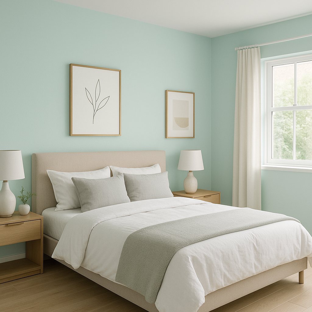
Its playful and cheerful vibe is perfect for nurseries, playrooms, or bedrooms designed for kids. Pair it with whimsical patterns or fun decor to create a lively environment where little ones can thrive.
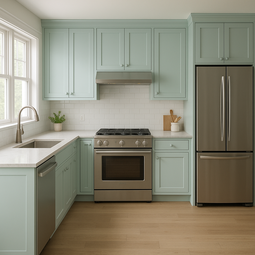
Bring a fresh, garden-inspired feel to your kitchen by using Spring on cabinetry or walls. Pair it with white countertops and backsplash tiles for a modern, clean aesthetic with a splash of vitality.
Spring works beautifully in outdoor areas, such as patio furniture, garden sheds, or front doors. Its nature-inspired color mimics the lush greenery of the outdoors and enhances curb appeal.
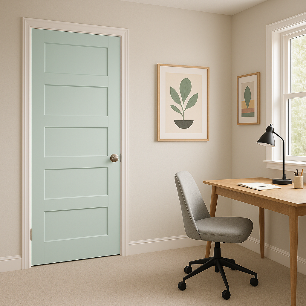
For those who love bold design, Spring can be used in unexpected ways, such as painting furniture, shelving units, or even ceilings. Its lively hue adds an artistic flair to any space.
Benjamin Moore Spring (2040-70) is more than just paint—it’s a mood, an energy, and a celebration of life. Whether you’re aiming to create an uplifting sanctuary, a playful retreat, or a vibrant statement in your home, this green hue offers endless opportunities for creativity and design.
View Colors Only by Brand (No Imagery):
Sherwin-Williams
|
Benjamin-Moore
|
Behr
|
Valspar
Live on the Eastern Slope of Colorado and looking for a local painting professional, check out all our painting services and reach out for a free estimate.
Copyright © 2026 : Wild Fox Painting Inc. : 12435 Mead Way, Littleton, CO 80125


