Benjamin Moore Capri (2047-40) is a stunning, bold turquoise that captures the essence of coastal elegance and lively sophistication. This vibrant shade is a perfect marriage of blue and green tones, offering a refreshing and energetic aesthetic wherever it's used. Capri brings a sense of optimism and vitality to interiors, making it a standout choice for both residential and commercial spaces.
Capri is characterized by its clean and saturated turquoise base, with subtle undertones of green that give it a tropical and oceanic feel. These undertones make it versatile, as the color can appear slightly cooler or warmer depending on the surrounding lighting and decor. In spaces with natural light, Capri tends to lean toward its brighter blue side, while in dimmer environments, the green undertones become more pronounced, adding depth and richness to the color.
Benjamin Moore Capri pairs beautifully with a wide range of colors, making it a dynamic choice for creating layered palettes. Here are some suggestions for coordinating colors:
Capri’s vibrant personality lends itself to a variety of applications, making it a versatile choice for homeowners and designers alike. Here are some ideas for incorporating this bold turquoise into your space:
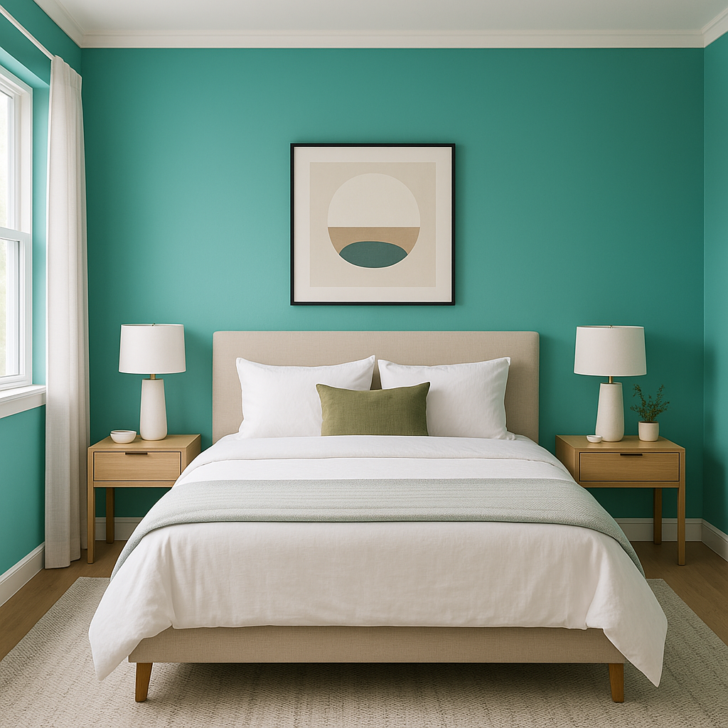
Capri is ideal as an accent wall in living rooms, bedrooms, or dining areas where a pop of personality is desired. Its boldness draws the eye and creates a focal point, especially when paired with neutral furnishings and decor.
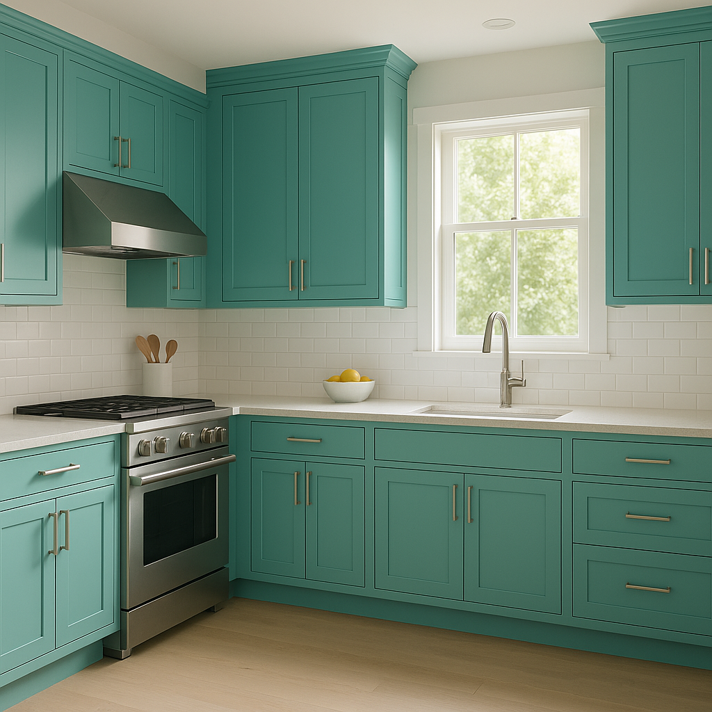
Bring a refreshing coastal vibe to kitchens or bathrooms by using Capri on cabinetry or walls. It pairs beautifully with white countertops, brass fixtures, and natural wood accents for a modern yet timeless look.
Capri’s playful energy makes it a fantastic choice for children’s spaces. Combine it with bright accessories and soft neutral bedding for a space that feels cheerful and inviting.
Capri can also be used outdoors, such as on patio furniture, shutters, or doors. Its vibrant tone adds a splash of color to exterior spaces, complementing greenery and enhancing curb appeal.
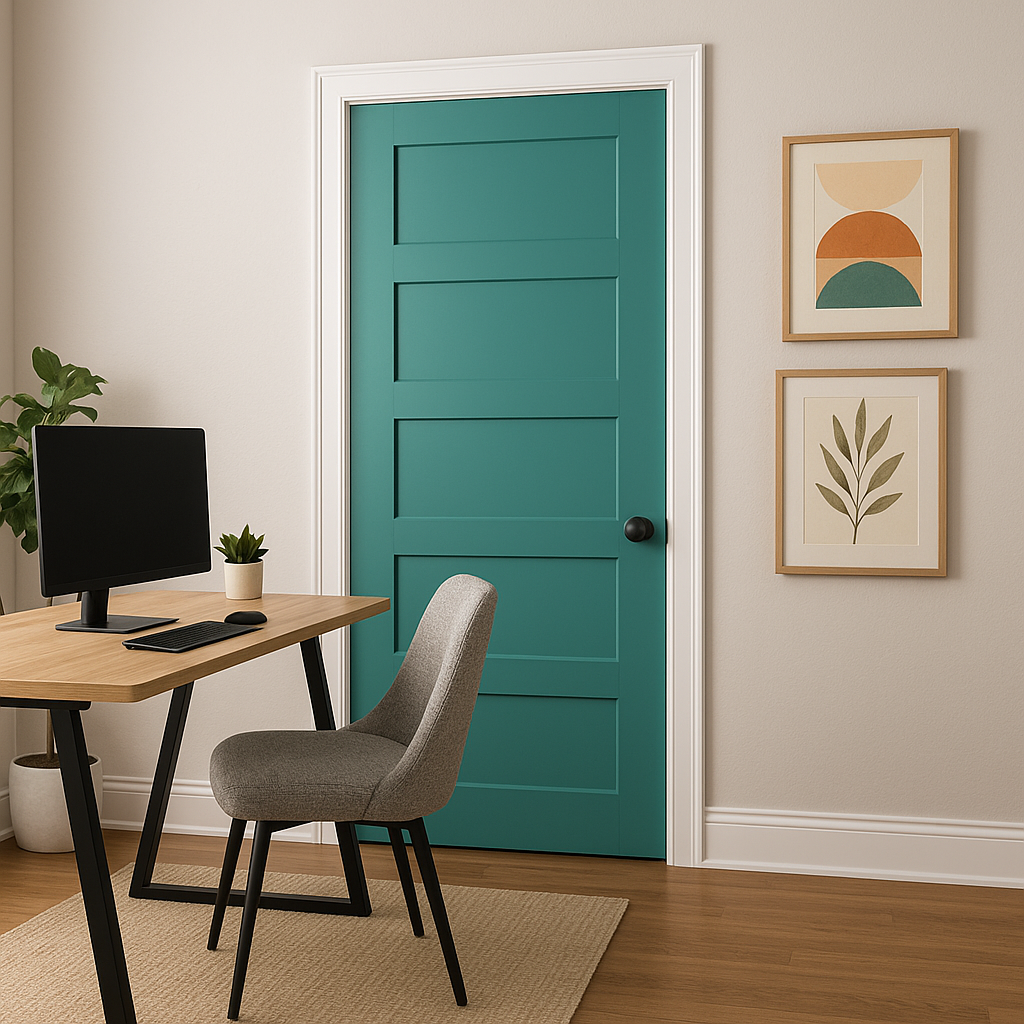
For those with creative spaces or home offices, Capri is a color that inspires energy and imagination. Its boldness can help foster a sense of creativity and motivation, making it a great choice for artistic environments.
Capri is a color that transforms beautifully under different lighting conditions. In bright, natural light, it radiates its true turquoise brilliance, while in artificial or dim lighting, the green undertones add richness and warmth. As with any bold color, testing Capri in your space before application is recommended to ensure it complements your specific lighting and design needs.
Benjamin Moore Capri (2047-40) is more than just a color—it’s an experience. Its vibrant turquoise hue evokes feelings of tropical bliss, making it perfect for those who want to add a sense of energy and adventure to their interiors. Whether used as an accent, a statement piece, or in a more expansive application, Capri brings character, charm, and a touch of coastal luxury to any space.
View Colors Only by Brand (No Imagery):
Sherwin-Williams
|
Benjamin-Moore
|
Behr
|
Valspar
Live on the Eastern Slope of Colorado and looking for a local painting professional, check out all our painting services and reach out for a free estimate.
Copyright © 2026 : Wild Fox Painting Inc. : 12435 Mead Way, Littleton, CO 80125


