Benjamin Moore Forget (2049-60) is a delicate and tranquil blue that evokes a sense of calm and serenity. Its softness makes it an ideal choice for creating spaces that feel peaceful and rejuvenating, while its understated charm ensures it complements a variety of design styles, from modern coastal to Scandinavian-inspired minimalism. Delicate yet sophisticated, Forget is perfect for anyone seeking a color that feels timelessly elegant and effortlessly soothing.
Forget (2049-60) is a light blue with subtle gray undertones that temper its vibrancy, giving it a muted, soft appearance. These gray undertones ensure it doesn’t lean overly bright or saturated, making it a versatile shade that works well in both natural and artificial lighting conditions. The gentle gray influence also helps to ground the blue, creating a refined hue that feels mature and sophisticated rather than overly playful.
This delicate balance of blue and gray undertones makes Forget ideal for spaces where relaxation is key, such as bedrooms, bathrooms, or reading nooks. It's a color that invites quiet contemplation and pairs beautifully with neutral palettes.
Benjamin Moore Forget (2049-60) pairs seamlessly with a variety of other colors, making it easy to design a harmonious space. Here are some excellent coordinating options to consider:
Forget (2049-60) shines in spaces where you want to cultivate a sense of calm, lightness, and sophistication. Here are some ideas for incorporating this shade into your home:
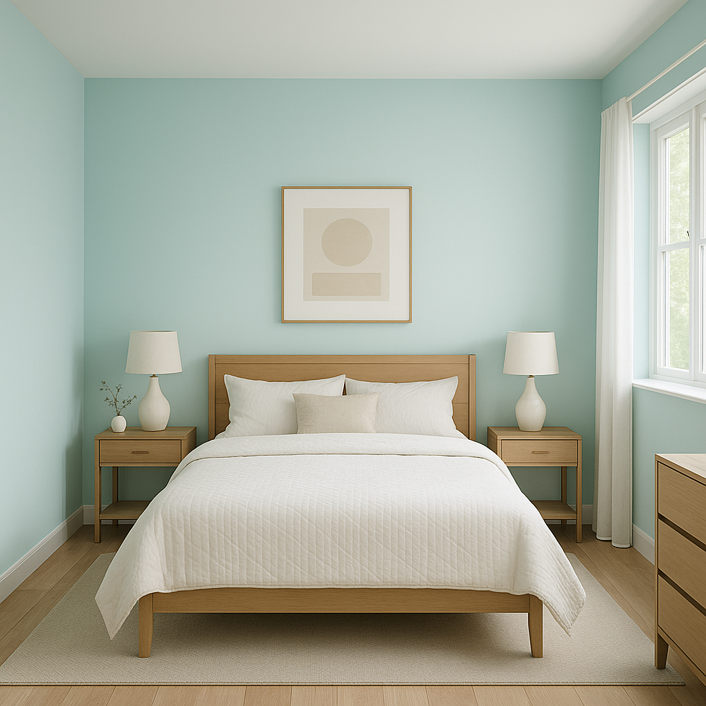
Forget is tailor-made for bedrooms. Its soothing blue-gray tones create a restful atmosphere that promotes relaxation and sleep. Pair it with crisp white linens, soft gray throws, and light wood furniture for a Scandinavian-inspired retreat.
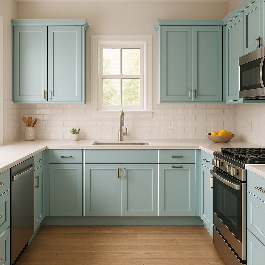
This hue is perfect for bathrooms, where it can evoke the feeling of a spa-like sanctuary. Paint the walls Forget and complement the look with marble countertops, brushed nickel fixtures, and white subway tiles for a clean, elegant aesthetic.
In living rooms, Forget serves as a versatile backdrop that allows furniture and décor to shine. Pair it with warm neutrals, like beige or taupe, and layer in textures like woven baskets, plush throws, and natural wood finishes for a cozy yet sophisticated look.
Use Forget to elevate smaller spaces such as powder rooms, laundry rooms, or entryways. Its soft color will open up the space while adding a touch of personality. Complement the look with metallic accents or vibrant accessories for added interest.
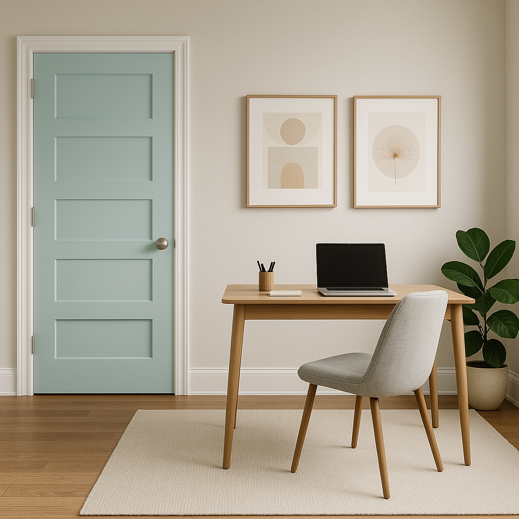
For a creative twist, use Forget on ceilings to create a subtle “sky effect” that draws the eye upward. Similarly, it can work as a trim or door color in spaces where white feels too stark, adding a gentle hint of color without overwhelming the design.
Benjamin Moore Forget (2049-60) is a soft, versatile blue that invites tranquility and elegance into any space. Whether you're crafting a serene bedroom retreat or a spa-like bathroom oasis, its muted undertones and effortless coordination with other colors make it a standout choice for any project.
View Colors Only by Brand (No Imagery):
Sherwin-Williams
|
Benjamin-Moore
|
Behr
|
Valspar
Live on the Eastern Slope of Colorado and looking for a local painting professional, check out all our painting services and reach out for a free estimate.
Copyright © 2026 : Wild Fox Painting Inc. : 12435 Mead Way, Littleton, CO 80125


