Benjamin Moore Waterfall (2050-50) is a captivating blue-green paint color that effortlessly combines tranquility and vibrancy. Its soothing yet invigorating presence makes it a favorite choice among homeowners and designers seeking to create spaces that feel fresh, serene, and subtly energized. Whether you're crafting a coastal-inspired retreat or a modern oasis, Waterfall delivers with its unique charm and versatility.
Waterfall (2050-50) is a balanced blend of blue-green tones that lean slightly toward green. It carries soft aquatic undertones that evoke the calming essence of cascading water or the gentle hues of a tropical lagoon. These undertones make it a versatile color that can adapt to various lighting conditions, appearing fresher and brighter in spaces with ample natural light or deeper and moodier in dimly-lit environments.
Its subtle saturation ensures that it remains vibrant without overwhelming a space, striking a perfect balance between boldness and sophistication.
Benjamin Moore Waterfall pairs beautifully with a variety of complementary shades, allowing you to craft a layered and harmonious palette. Here are some coordinating colors to consider:
Neutral Partners:
Pair Waterfall with soft neutrals like White Dove (OC-17) or Chantilly Lace (OC-65) to allow its refreshing tones to stand out while maintaining a crisp and clean aesthetic. These whites provide a perfect canvas for Waterfall's vibrant energy.
Earthy Companions:
Incorporate warm earth tones like Natural Cream (OC-14) or Edgecomb Gray (HC-173) to create a soothing balance between organic warmth and cool aquatic vibes.
Bolder Adjacents:
For a more adventurous approach, complement Waterfall with deeper hues like Newburyport Blue (HC-155) or Kendall Charcoal (HC-166) to add drama and contrast.
Accent Colors:
Introduce pops of coral, soft peach, or sunny yellow to infuse energy into your design. Try Benjamin Moore’s Coral Reef (012) or Golden Straw (2152-50) for playful accents that enhance Waterfall’s vibrancy.
Waterfall is a versatile color that can be adapted to various rooms and styles. Below are some creative ways to use Waterfall in your home:
Transform your living room into a serene retreat by using Waterfall as the primary wall color. Pair it with soft neutral furniture and natural textures like rattan or linen for a breezy coastal vibe. Add artwork with oceanic motifs to tie the space together.
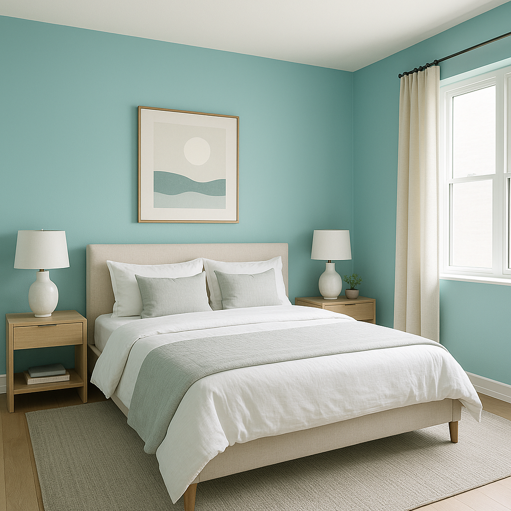
Waterfall’s calming undertones make it an excellent choice for bedrooms. Use it to foster a sense of relaxation and rejuvenation. Pair it with crisp white bedding and warm wood tones for a balanced and inviting atmosphere.
Channel spa-like serenity in your bathroom by using Waterfall on the walls or cabinetry. Its aquatic hues naturally complement spaces designed for relaxation. Pair it with polished chrome fixtures and marble accents for a timeless, luxe look.
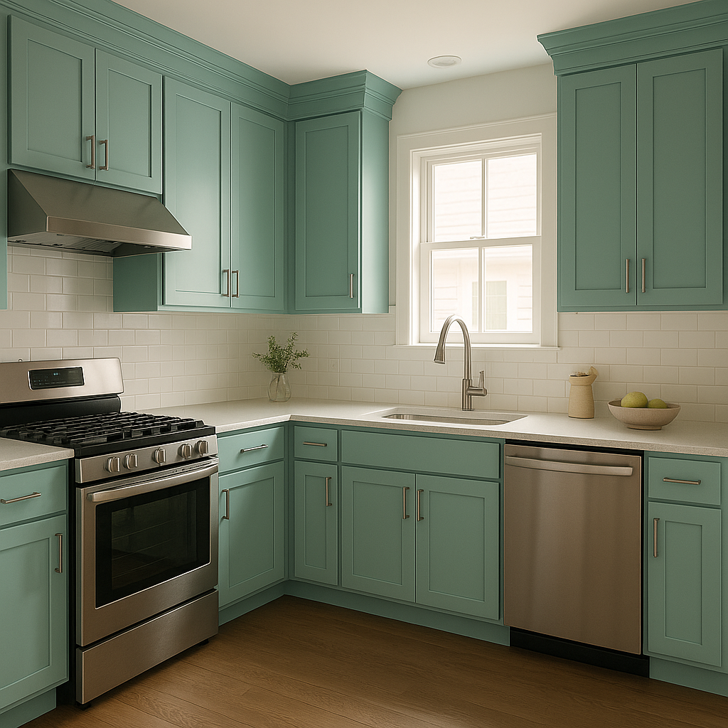
For a fresh and modern kitchen design, try Waterfall on your cabinetry or as an accent wall. Pair it with white countertops and subway tile to create a crisp, clean aesthetic. Add natural wood or brass hardware for a touch of warmth.
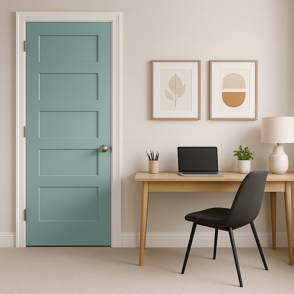
If you want to experiment with Waterfall without committing to an entire room, use it as an accent wall. This works particularly well in spaces like home offices or reading nooks where its energizing yet calming tones boost focus and creativity.
Benjamin Moore Waterfall (2050-50) is the perfect choice for homeowners and designers seeking a color that bridges the gap between tranquility and vibrancy. Its aquatic undertones, ability to pair seamlessly with a variety of palettes, and versatility across rooms make it a standout option for elevating your interior design.
Whether you’re envisioning a coastal-inspired sanctuary, a modern minimalist space, or a room infused with playful energy, Waterfall’s refreshing charm can bring your vision to life.
View Colors Only by Brand (No Imagery):
Sherwin-Williams
|
Benjamin-Moore
|
Behr
|
Valspar
Live on the Eastern Slope of Colorado and looking for a local painting professional, check out all our painting services and reach out for a free estimate.
Copyright © 2026 : Wild Fox Painting Inc. : 12435 Mead Way, Littleton, CO 80125


