Benjamin Moore Tranquil 2051-50 is a soft, sophisticated blue with a calming presence that lives up to its name. This versatile paint color offers a serene ambiance, making it an excellent choice for a variety of spaces. Its subtle undertones and timeless appeal make it a favorite among interior designers looking to create a peaceful, inviting environment.
Tranquil 2051-50 features cool blue undertones with a gentle hint of gray. These undertones give the color a subdued quality, steering it away from feeling overly bright or stark. The touch of gray adds depth and dimension, making it ideal for spaces where you want to evoke calm and relaxation without overwhelming the senses. This balance of coolness and softness makes Tranquil 2051-50 a highly adaptable shade that works well in both modern and traditional interiors.
To maximize the beauty of Benjamin Moore Tranquil 2051-50, consider pairing it with complementary and coordinating colors that enhance its soft, soothing quality. Some excellent choices include:
These complementary hues allow you to craft a color scheme tailored to your personal style, whether you're leaning toward a minimalist, coastal, or classic aesthetic.
Thanks to its soothing and versatile nature, Benjamin Moore Tranquil 2051-50 can be used in a variety of rooms and settings. Here are a few ways to incorporate it into your interior design projects:
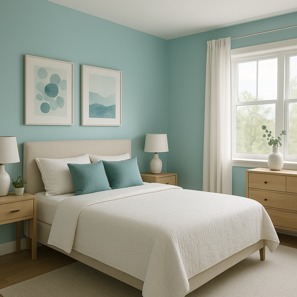
Tranquil 2051-50 is a perfect choice for bedrooms due to its calming presence. Pair it with soft white linens, plush textiles, and natural wood tones to create a peaceful retreat that promotes rest and relaxation.
This shade brings a spa-like quality to bathrooms, evoking the tranquility of water. Use it on walls or cabinetry and pair it with marble countertops, brushed nickel fixtures, and crisp white accents for a clean, refreshing vibe.
In living spaces, Tranquil 2051-50 can serve as an elegant backdrop for both contemporary and traditional decor. Combine it with neutral furniture, textured throws, and metallic accents to add a touch of sophistication.
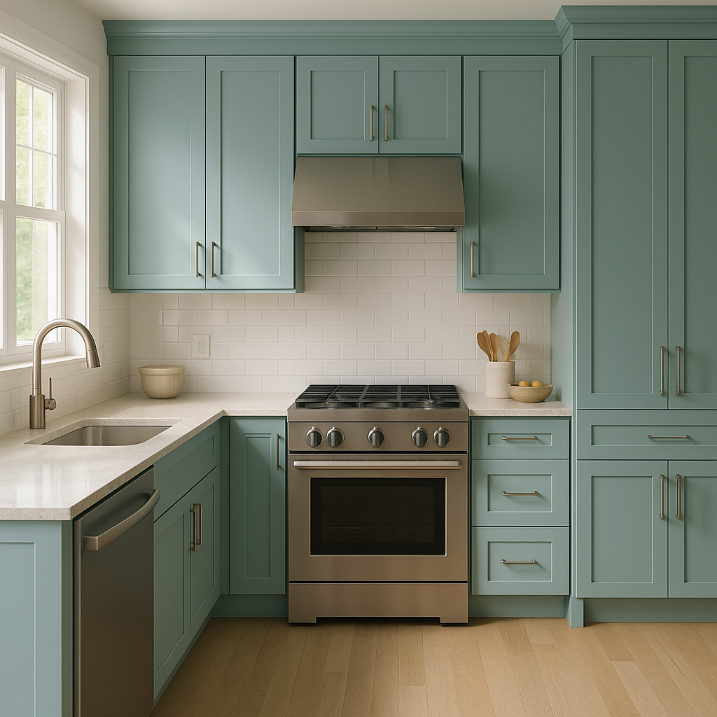
For a modern and airy kitchen, consider using Tranquil 2051-50 on upper cabinets or walls. Pair it with white subway tiles, light gray lower cabinets, and polished chrome hardware for a timeless design.
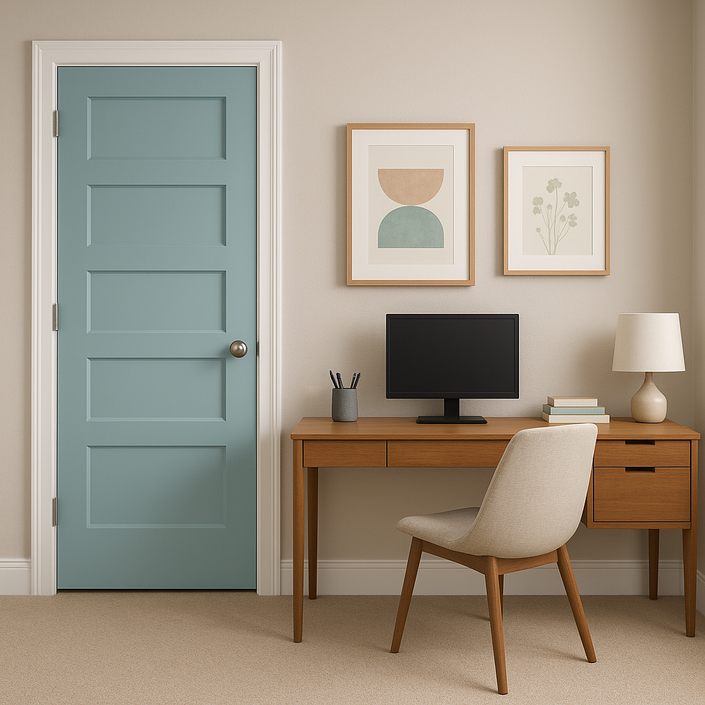
Enhance focus and relaxation in workspaces or reading nooks with this calming blue. Its subdued tone helps reduce visual distractions, making it a thoughtful choice for productivity and creativity.
Tranquil 2051-50 is more than just a paint color—it's a mood. Its ability to create a serene,
View Colors Only by Brand (No Imagery):
Sherwin-Williams
|
Benjamin-Moore
|
Behr
|
Valspar
Live on the Eastern Slope of Colorado and looking for a local painting professional, check out all our painting services and reach out for a free estimate.
Copyright © 2026 : Wild Fox Painting Inc. : 12435 Mead Way, Littleton, CO 80125


