Benjamin Moore Pacific (2055-20) is a captivating, deep blue that evokes the tranquility and majesty of the ocean. With its rich and intense hue, Pacific is a versatile color that can add a sense of depth, drama, and sophistication to any space. Whether you're designing a modern interior or a classic coastal retreat, this color brings a bold yet serene vibe to your walls, furniture, or accent pieces.
Pacific (2055-20) has subtle green undertones that give it a nuanced, complex character. These undertones soften the depth of its blue, making it feel less stark and more inviting. The green hints also contribute to its oceanic quality, making it ideal for spaces inspired by nature or water. Depending on the lighting, Pacific can shift between a vibrant medium blue and a rich, moody navy—adding a dynamic, ever-changing quality to your interiors.
To create a harmonious palette, pair Benjamin Moore Pacific with complementary and contrasting tones that highlight its boldness. Here are some suggestions:
Benjamin Moore Pacific is a bold statement color that works beautifully in various design contexts. Here’s how you can incorporate it into your home or commercial space:
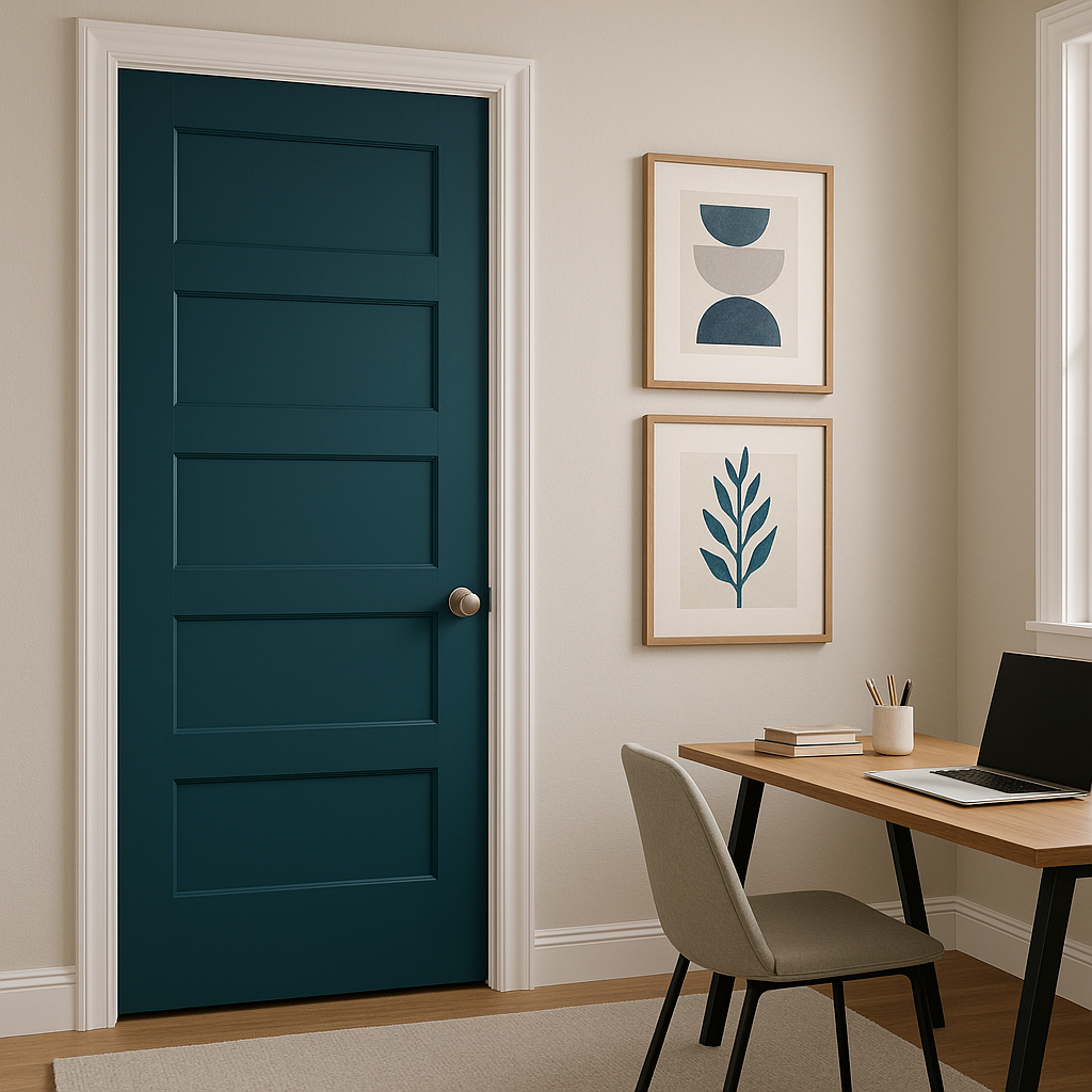
Make an impact by using Pacific on an accent wall. This rich, dramatic blue can serve as a focal point in living rooms, bedrooms, or dining rooms, drawing attention while creating a sense of intimacy and coziness.
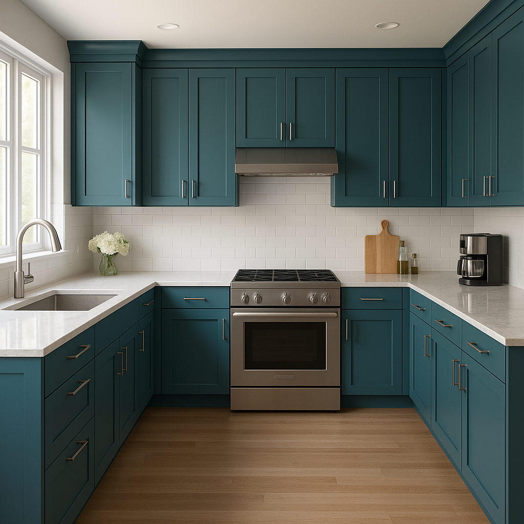
Revitalize your kitchen or bathroom by painting cabinets in Pacific. Its bold yet elegant tone adds a modern, upscale feel to these spaces. Similarly, incorporating Pacific into furniture pieces like bookshelves or dressers can create stunning contrast against neutral backgrounds.
Pacific is a natural choice for spaces inspired by the sea. Pair it with light, airy whites and sandy beiges to emulate the look and feel of a breezy coastal retreat. Add nautical-inspired accessories like rope details, brass accents, or striped textiles for a cohesive design.
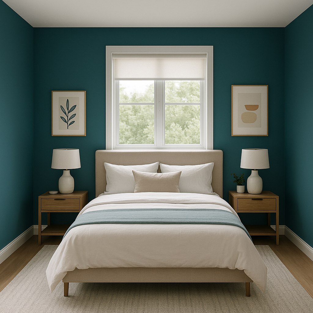
For a serene and restful bedroom, Pacific can be used on all four walls. Pair it with soft textures like velvet bedding or linen curtains to enhance its luxurious feel. Incorporate warm metallics such as gold or brass in lighting fixtures and decor to balance its cool tone.
In restaurants, boutique hotels, or offices, Pacific can create a sense of sophistication and creativity. Use it in conference rooms or reception areas to set the tone for a refined and innovative space.
Benjamin Moore Pacific (2055-20) looks best in spaces with ample natural light or layered artificial lighting. In dimly lit rooms, its depth can feel more pronounced, creating a cozy and dramatic atmosphere. In contrast, bright lighting enhances its vibrancy, allowing its green undertones to shine subtly.
Benjamin Moore Pacific (2055-20) is more than just a paint color—it’s a design tool that can transform your space into a bold yet calming sanctuary. With its rich oceanic tones, versatile undertones, and ability to coordinate beautifully with a range of shades, Pacific is perfect for those who want to make a statement while embracing timeless elegance.
View Colors Only by Brand (No Imagery):
Sherwin-Williams
|
Benjamin-Moore
|
Behr
|
Valspar
Live on the Eastern Slope of Colorado and looking for a local painting professional, check out all our painting services and reach out for a free estimate.
Copyright © 2026 : Wild Fox Painting Inc. : 12435 Mead Way, Littleton, CO 80125


