Benjamin Moore Fairy (2055-50) is a captivating turquoise that evokes a sense of playful charm and tranquil sophistication. Nestled between vibrant blue and serene green, this shade offers an enchanting balance that can inject personality into any space. Its medium intensity makes it versatile, allowing it to shine as either a statement color or a complementary accent.
Fairy (2055-50) carries subtle green undertones, giving it a soft aquatic vibe that feels refreshing and organic. These undertones prevent it from leaning overly bold, making the color approachable and adaptable to various interior styles. The green hints in Fairy add depth, ensuring the shade is neither too cool nor too warm, perfect for creating spaces that feel balanced and harmonious.
Benjamin Moore Fairy pairs beautifully with an array of coordinating colors, allowing you to design spaces that range from modern and lively to serene and understated. Consider these options:
Benjamin Moore Fairy (2055-50) is a versatile shade that can be used in a variety of applications throughout your home:
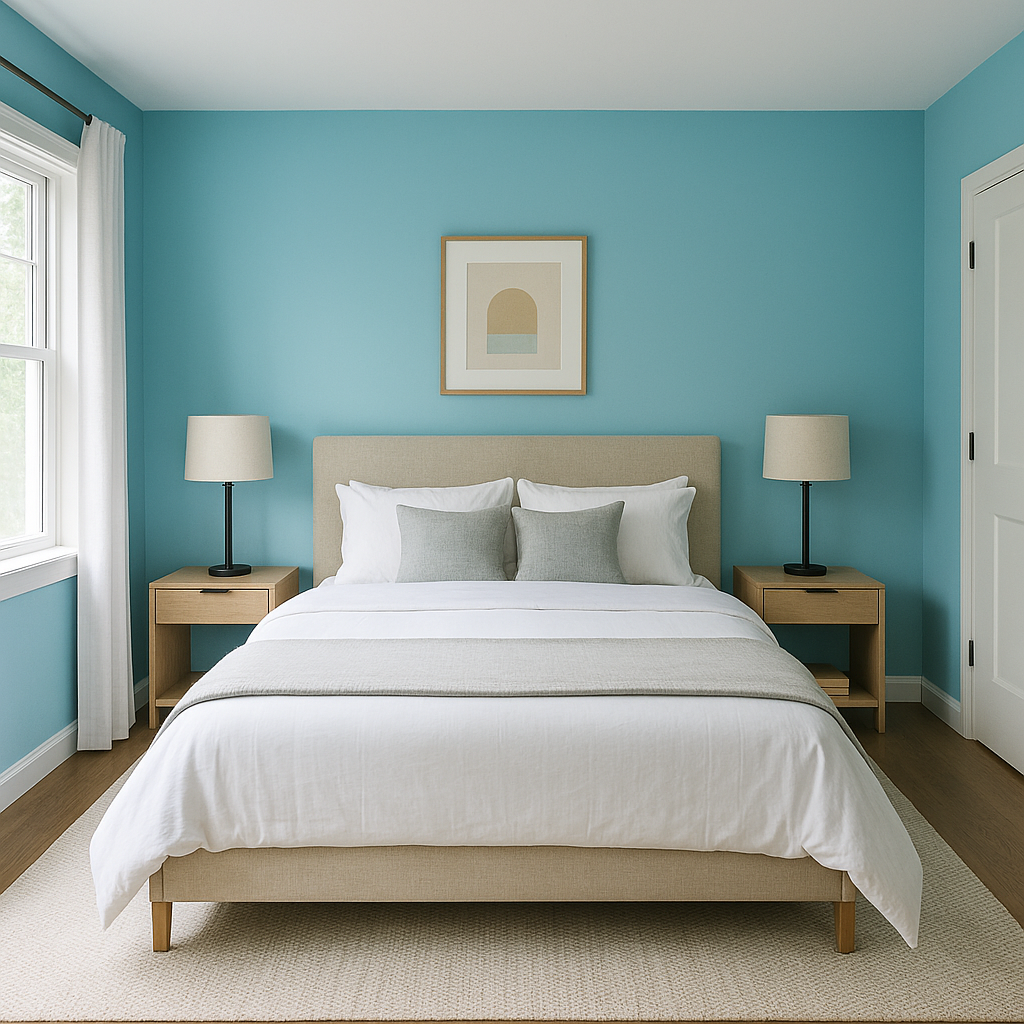
Fairy works wonderfully in living rooms, creating a cheerful yet calming ambiance. Use it on an accent wall to bring depth to the space, or pair it with neutral furniture for a harmonious look.
Fairy’s aquatic undertones make it an ideal choice for bathrooms. Combine it with white subway tiles, chrome fixtures, and soft lighting to evoke a spa-like retreat.
The playful and whimsical nature of Fairy makes it a delightful choice for kids’ bedrooms or playrooms. Pair it with colorful decor to create an imaginative and inspiring environment.
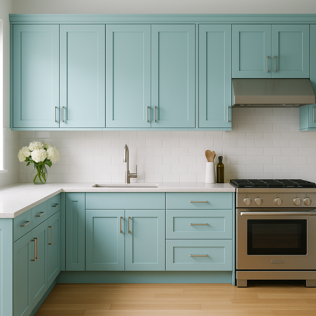
Fairy can add a fresh and invigorating feel to kitchens when used on cabinetry or as a backsplash. Pair it with natural wood tones or light countertops for a balanced, inviting look.
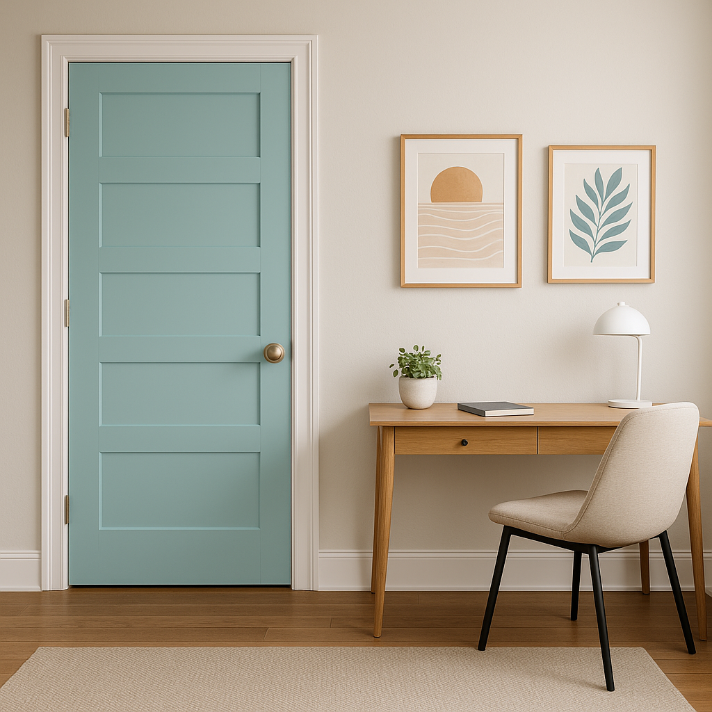
Fairy’s calming undertones can promote focus and creativity, making it a great choice for home offices. Pair it with muted accents and sleek furniture to strike the perfect balance between energy and calm.
Benjamin Moore Fairy (2055-50) responds beautifully to different lighting conditions. In natural light, its green undertones become more pronounced, offering a refreshing vibe. Under artificial warm lighting, it leans slightly cozier, while cool LED lighting enhances its blue notes.
By blending whimsy and sophistication, Benjamin Moore Fairy (2055-50) is a versatile turquoise that can breathe life into any room. Whether used sparingly or generously, it’s a color that transforms spaces into places of joy and relaxation.
View Colors Only by Brand (No Imagery):
Sherwin-Williams
|
Benjamin-Moore
|
Behr
|
Valspar
Live on the Eastern Slope of Colorado and looking for a local painting professional, check out all our painting services and reach out for a free estimate.
Copyright © 2026 : Wild Fox Painting Inc. : 12435 Mead Way, Littleton, CO 80125


